Quick text summary
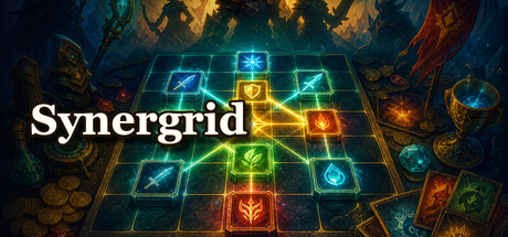
Synergrid scored 75/100 on Steam Analyzer — Good for a Strategy capsule. Top priority fix: [brand_consistency] Introduce a distinctive character, icon, or symbol motif visible in the capsule that appears consistently across marketing materials to build memorable brand identity.
Capsule scores by dimension
- Genre Clarity: 8/10 — Strong deck-building strategy signal. The glowing grid board with symbol cards immediately communicates a tactical deck-building game. The neon blue-green-gold color scheme and geometric layout clearly suggest a strategy/puzzle mechanic rather than action or narrative focus. At tiny size, the grid pattern and card symbols remain distinct enough to read as a board-based strategy game.
- Title Readability: 8/10 — Clean sans-serif title, good contrast. The word 'Synergrid' is rendered in white sans-serif font positioned in the upper-left to center area with clear separation from the noisy background. The title maintains legibility at full and small sizes due to its bold weight and bright white color against the darker blue backdrop. At tiny size, the text remains readable, though fine letterform detail is lost but word shape persists.
- Contrast & Color: 8/10 — Vibrant neon palette with strong separation. The central grid features bright cyan, lime, orange, and gold neon symbols that pop distinctly against the dark teal-blue background. The warm-cool color contrast and high saturation create clear silhouettes that survive the squint test well. The layered lighting from the glowing cards creates depth and visual hierarchy that reads strongly even at tiny thumbnail size.
- Uniqueness & Polish: 7/10 — Polished neon aesthetic, minor generic risk. The neon grid aesthetic is visually striking and well-executed with clean lighting effects on each card symbol, suggesting professional craft. However, the glowing game board theme has become a recognizable indie game visual trope (similar to Hades II, Balatro), so while polished, it carries some visual familiarity risk. The execution is solid but not entirely distinctive in the current landscape of neon-grid strategy games.
- Brand Consistency: 6/10 — Functional grid identity, lacks memorability. The neon grid board is internally consistent with the game's core mechanic and creates a recognizable visual anchor. However, there are no distinctive character, motif, or signature design elements visible that would make this capsule uniquely memorable or recognizable beyond the grid itself. The color palette and lighting are clean but don't suggest a strong, iconic brand identity separate from the mechanic.
- Composition: 8/10 — Strong focal hierarchy, centered and balanced. The glowing grid occupies the center with a clear focal point, while the tarot-like cards and ambient orbs frame the composition without competing for attention. The title placement in the upper region maintains safe margins and does not collide with edge crops. The depth layering from background mystical elements to the bright foreground grid creates clear visual separation that persists at small and tiny sizes.
What works
- Neon grid immediately communicates deck-building strategy. The glowing board with symbol cards is an iconic visual language for tactical card games that reads clearly even at thumbnail size.
- Bold white title with excellent background separation. The white sans-serif 'Synergrid' text maintains legibility across all sizes due to high contrast and strategic placement away from visual noise.
- Vibrant color harmony and lighting depth. The warm-cool neon palette and layered glow effects create visual polish and dimensionality that feels premium and intentional.
- Balanced composition with protected margins. Critical elements avoid edge collision and the grid focal point is centered, surviving Steam's likely cropping scenarios without loss of core message.
What hurts the capsule
- Visual aesthetic risks commodity recognition. The neon grid style has become a visual shorthand in indie strategy, limiting uniqueness compared to genre leaders like Balatro which have more distinctive artistic voices.
- No iconic character or symbol identity visible. The capsule relies entirely on the mechanic visualization rather than a distinctive mascot, motif, or brand signature that could aid recognition and recall.
- Ambient frame elements feel generically mystical. The background tarot-like cards and orbs support the aesthetic but don't reinforce the game's core differentiator or unique selling proposition.
Priority fixes
- [brand_consistency] Introduce a distinctive character, icon, or symbol motif visible in the capsule that appears consistently across marketing materials to build memorable brand identity.
- [uniqueness_polish] Consider a subtle art direction shift—perhaps a thematic visual hook (e.g., specific cultural aesthetic, unique card design language) that sets Synergrid visually apart from other neon-grid strategy games.
- [genre_clarity] Ensure the 5 store screenshots reinforce the synergy chain mechanic visually so players understand the unique depth of the deck-building loop beyond a standard grid game.
Store copy priority fixes
- [uniqueness] Add one sentence explaining how grid placement creates a unique decision space compared to hand-based roguelites (e.g., 'every placement decision locks into the board, forcing you to read ahead and chain combos spatially').
- [hook_strength] Replace '40 escalating rounds' with an emotional or mechanical hook (e.g., 'survive 40 rounds of escalating chaos' or 'turn a few weak cards into unstoppable chain reactions').
- [feature_communication] Add one concrete example of a synergy trigger (e.g., 'place three red cards in a row to double your score for that round').
- [audience_targeting] Add a one-sentence signal about difficulty and intended audience (e.g., 'perfect for players who love puzzle strategy and short roguelite runs' or 'a relaxing deckbuilder that rewards spatial thinking').
Related guides
Steam app ID: 4708620 · Tags: Strategy, Card Battler, Turn-Based Tactics, Casual, Roguelite