Scoring genre clarity...
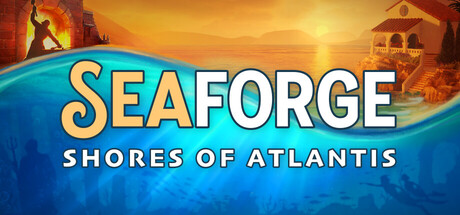
Seaforge: Shores of Atlantis capsule

Seaforge: Shores of Atlantis

Beneath the waves, the world of Atlantis is waiting. Build your home base on sunlit shores, then dive into sunken ruins to uncover secrets of the deep. Get stronger, dive deeper, and battle dark forces with up to 3 friends in this underwater survival crafting odyssey!

Open World Survival CraftSurvivalUnderwater
Glowbug GamesTo be announced

Seaforge: Shores of Atlantis scores 82/100 — better than 96% of Open World Survival Craft capsules (n=134).

Released To be announced · By Glowbug Games

Quick text summary

Seaforge: Shores of Atlantis scored 82/100 on Steam Analyzer — Good for a Open World Survival Craft capsule. Top priority fix: [genre_clarity] Add a subtle visual hint of crafting or survival—such as a resource icon, tool, or inventory element—to reinforce the 'crafting odyssey' pillar mentioned in the description

Capsule scores by dimension

  • Genre Clarity: 8/10 — Strong underwater adventure identity. The split composition clearly signals an underwater exploration game with the sunlit surface settlement above and submerged ruins below, supported by the aquatic color palette and architectural silhouettes. At tiny size, the water horizon line and contrasting environments still read as adventure/exploration focused, though the specific 'crafting survival' angle is less apparent. The imagery effectively communicates a water-based game with both discovery and base-building elements.
  • Title Readability: 9/10 — Excellent logo clarity and placement. The SEAFORGE title uses a bold, golden serif letterform with strong outline definition that maintains legibility at all sizes, positioned confidently in the center-upper region against a controlled blue gradient background. The subtitle 'SHORES OF ATLANTIS' sits cleanly below in white caps with good spacing, remaining readable even at tiny 120x45 size due to color separation and font weight. Strategic placement avoids competing with the busy environment art behind it.
  • Contrast & Color: 9/10 — Striking value separation and saturation. The golden yellow title pops dramatically against the cool blue water and warm orange sky, creating strong complementary contrast that reads clearly against the Steam dark background. The lighting split between warm sunset tones (upper) and cool blue depths (lower) uses natural color temperature opposition for visual punch. At tiny size, the warm-cool divide remains the dominant read with no muddy mid-tones or silhouette confusion.
  • Uniqueness & Polish: 8/10 — Cohesive underwater fantasy aesthetic. The capsule presents a unified visual concept blending Atlantean architecture, ocean exploration, and base-settlement themes with intentional art direction and themed environmental storytelling. The split-world composition technique is distinctive enough to stand apart from generic adventure game templates while remaining accessible. The golden typography treatment and sunset-to-depths gradient create a premium, deliberate aesthetic rather than asset-pile feel, though the architectural silhouettes remain somewhat recognizable rather than entirely unique.
  • Brand Consistency: 7/10 — Coherent Atlantean theme with clear identity. The capsule establishes a recognizable visual identity through the Atlantean architectural motif, golden/blue color palette, and the split biome composition that likely threads through store screenshots. The styling is internally consistent with no conflicting art directions or rendering mismatches. While the theme is thematically strong, it does not present an iconic character or symbol distinct enough to be instantly recognizable across all contexts—it relies on the established Atlantis fantasy aesthetic.
  • Composition: 8/10 — Strong focal hierarchy with intentional depth. The horizontal split composition creates natural eye flow: title anchors the center, golden sun draws upward attention to the surface settlement, and the water horizon guides downward to underwater ruins, establishing clear foreground-midground-background layering. Safe margins protect the title from edge cropping, and the centered alignment prevents awkward framing at any size. At small/tiny sizes, the simplified shapes maintain the two-region read without visual collapse, though individual architectural details become abstract silhouettes.

What works

  • Golden title stands out at all sizes. The SEAFORGE logo uses bold letterforms with outline definition that remains legible and striking from full header down to tiny 120x45 thumbnail without degradation.
  • Complementary warm-cool color strategy. The sunset-to-ocean depth gradient creates natural visual separation and pop against the Steam dark background through intuitive color temperature opposition.
  • Thematic visual storytelling. The split-world composition immediately communicates the surface base-building and underwater exploration core mechanics without text explanation.
  • Clean, protected text placement. Title and subtitle are positioned against controlled gradient backgrounds with sufficient spacing and contrast, avoiding overlap with busy architectural elements.

What hurts the capsule

  • Generic Atlantis silhouettes lack distinctiveness. The architectural elements, while thematically correct, use common fantasy ruin templates that don't create a memorable visual signature unique to Seaforge.
  • No iconic character or motif anchor. The capsule relies entirely on environmental theme rather than a recognizable symbol, character, or branded visual element that could identify the game in isolation.
  • Crafting/survival mechanics not visually apparent. While exploration and base-building read clearly, the crafting and survival gameplay elements have no visual callouts or iconography to hint at their presence.

Priority fixes

  1. [genre_clarity] Add a subtle visual hint of crafting or survival—such as a resource icon, tool, or inventory element—to reinforce the 'crafting odyssey' pillar mentioned in the description
  2. [brand_consistency] Introduce a distinctive character, creature, or branded motif (e.g., a signature Seaforge symbol or player character silhouette) that could serve as a recognizable franchise anchor across marketing materials
  3. [uniqueness_polish] Refine the architectural silhouettes to include one or two highly distinctive structural elements (asymmetrical towers, unique roof shape, glowing accent) that differentiate Seaforge ruins from generic fantasy templates

Related guides

Steam app ID: 4712440 · Tags: Open World Survival Craft, Survival, Underwater, Co-op, Base Building