Scoring genre clarity...

Space Burger capsule

Space Burger

Run a burger joint in zero gravity with your friends. Jetpack around a tiny spaceship, stack floating burgers, feed chatty aliens and keep the place in one piece while meteors, fires and hull breaches tear it apart.

CasualSimulationAction
PlimptonQ2 2027

Space Burger scores 87/100 — better than 98% of Casual capsules (n=11,333).

Released Q2 2027 · By Plimpton

Quick text summary

Space Burger scored 87/100 on Steam Analyzer — Excellent for a Casual capsule. Top priority fix: [title_readability] Ensure any tagline or secondary text remains readable at tiny size by testing at 120x45 or removing it entirely

Capsule scores by dimension

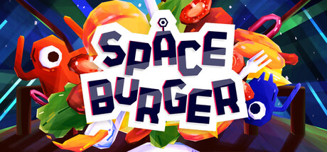
  • Genre Clarity: 9/10 — Vibrant casual chaos game premise. The capsule immediately communicates a colorful, chaotic party game through floating burger elements, bright primary colors, and playful alien characters in a space setting. At tiny size, the stacked burger visuals and whimsical alien designs still read clearly as lighthearted indie chaos, distinctly different from puzzle or narrative-driven games.
  • Title Readability: 9/10 — Bold, legible title with strong contrast. The 'SPACE BURGER' title uses a thick, dark navy sans-serif with white outline on a bright white circular badge, ensuring excellent readability at all sizes. The title maintains clarity even at tiny size due to the controlled background, strong value contrast, and generous letter spacing with no competing visual noise.
  • Contrast & Color: 9/10 — High-saturation vibrant palette pops. The capsule features bright oranges, reds, blues, greens, and yellows against a dark space background that creates strong silhouette separation and visual pop. The white badge housing the title provides luminous contrast, and even in grayscale the value distribution between foreground elements and background remains clear and distinct at all viewing sizes.
  • Uniqueness & Polish: 8/10 — Polished indie charm with memorable hook. The design avoids generic space or burger tropes by combining playful alien characters, dynamic floating food physics, and a colorful explosion of activity that suggests chaotic multiplayer fun. The craft is clean with intentional composition and a distinctive visual personality that matches the core mechanic of zero-gravity burger chaos.
  • Brand Consistency: 8/10 — Cohesive vibrant palette recognizable across frames. The color palette—bright saturated hues with a dark space backdrop—appears consistent and distinctive enough to be recognizable in other marketing materials. The whimsical art style, alien character designs, and burger-stacking visual motif create a clear brand identity that would likely carry through store screenshots and promotional imagery.
  • Composition: 9/10 — Balanced focal point with dynamic hierarchy. The title badge sits centered as the primary focal point, supported by floating burger and alien elements arranged in a balanced radial composition that draws the eye inward without clustering or dead space. At small and tiny sizes, the central badge remains dominant while surrounding colorful elements guide attention without competing, and safe margins prevent important assets from being cropped.

What works

  • Title clarity and contrast. The white-outlined navy title on bright circular badge reads perfectly at all sizes with zero ambiguity.
  • Immediate genre and tone communication. Floating burgers, aliens, and vibrant chaos instantly signal a colorful casual indie game with multiplayer energy.
  • Strong visual hierarchy and composition. The centered badge draws primary focus while surrounding elements create balanced depth and eye movement without competing for attention.
  • High-saturation vibrant palette. Bright primary colors pop dramatically against the dark space background, ensuring excellent visibility in Steam browsing.

What hurts the capsule

  • Slight visual busyness. The multitude of floating elements around the badge may feel slightly scattered at full size, though this does reinforce the chaotic theme.
  • Limited tagline visibility. Any supporting descriptive text below or near the title would be unreadable at tiny size given the current element density.

Priority fixes

  1. [title_readability] Ensure any tagline or secondary text remains readable at tiny size by testing at 120x45 or removing it entirely
  2. [composition] Verify safe margins around the badge are maintained in Steam store's crop and scaling to prevent edge clipping of surrounding elements

Store copy priority fixes

  1. [audience_targeting] Add one sentence clarifying that the game is playable solo or explaining how solo mode differs, to avoid deterring single-player audiences listed in categories.
  2. [feature_communication] Briefly mention progression depth or customization scope (e.g., 'unlock new ship layouts, ingredients, or alien encounters') to reinforce the 'grow your restaurant' section and justify the Immersive Sim tag.

Related guides

Steam app ID: 4717840 · Tags: Casual, Simulation, Action, Arcade, Life Sim