Quick text summary
Hellsino Pokerlike scored 78/100 on Steam Analyzer — Good for a Roguelike Deckbuilder capsule. Top priority fix: [uniqueness_polish] Redesign or stylize the playing cards with Hellsino-specific art direction (custom card backs, themed suits, or infernal card styles) to increase premium feel and brand distinction
Capsule scores by dimension
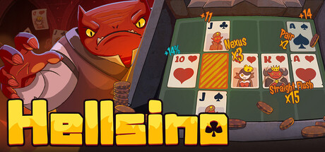
- Genre Clarity: 8/10 — Poker roguelike identity clear. The capsule immediately communicates a poker-themed game through the visible playing cards, grid layout, and card UI on the right. The demonic character (angry red demon) and hellish setting establish the roguelike dark fantasy tone. At tiny size, the poker cards and demon silhouette still read clearly enough to suggest a strategy card game with supernatural themes, though the roguelike-deckbuilder specifics fade.
- Title Readability: 9/10 — Bold yellow title stands firm. The title 'Hellsino' uses a thick, bright yellow sans-serif font with a strong black outline that contrasts sharply against the darker background. The letterforms remain completely legible at full, small, and tiny sizes. Strategic placement in the lower half avoids overlap with busy visual elements, ensuring the title never collapses or becomes obscured.
- Contrast & Color: 8/10 — Strong warm-cool value separation. The bright yellow title pops dramatically against the dark blue background (#1b2838 equivalent), and the warm orange-red demon contrasts well against cooler blue tones. The playing cards on the right use light values that separate from the darker left side, creating depth. In grayscale, the value range is clean and readable, though some mid-tone card details lose edge clarity at tiny size.
- Uniqueness & Polish: 7/10 — Polished concept with some generics. The demon character design feels intentional and specific to Hellsino's branding, with expressive angry features and a distinctive red silhouette. The poker-grid-demon mashup is conceptually strong and sets this apart from generic roguelikes. However, the playing cards and overall layout follow familiar casual game aesthetic conventions, preventing this from reaching 8+ premium distinction.
- Brand Consistency: 7/10 — Recognizable demon motif present. The red demon character appears to be a signature visual element of Hellsino's identity, creating internal recognition value. The color palette (warm oranges, yellows, cool blues) and the poker-meets-demons theme are cohesive. However, without reference to other store materials, the exact breadth of brand identity signals cannot be fully assessed; the demon is strong but the overall visual language feels somewhat standard for indie poker games.
- Composition: 8/10 — Balanced focal point with good depth. The composition uses clear foreground-midground-background layering: angry demon on left (primary focal point), poker cards and UI on right (supporting secondary focus), with the title anchoring the bottom. At small and tiny sizes, the demon remains the dominant element while the card grid provides context without overwhelming. Safe margins are maintained and the crop feels resilient across sizes.
What works
- Excellent title legibility. Thick yellow font with black outline reads perfectly at all sizes including tiny thumbnails.
- Strong genre identity fusion. Poker cards combined with demonic character clearly signals a unique poker-roguelike-strategy hybrid at first glance.
- Effective focal point hierarchy. The angry red demon draws the eye immediately while the card grid provides supporting context without competing for attention.
- High value contrast. Warm oranges and bright yellows pop sharply against the dark blue background, maintaining clarity in quick scroll scenarios.
What hurts the capsule
- Card details soft at tiny size. Individual playing card values and suits on the right side blur and lose readability when scaled to thumbnail dimensions.
- Generic card aesthetic. Standard playing cards lack distinctive Hellsino visual treatment, missing an opportunity to reinforce unique branding.
- Limited environmental storytelling. The hellish setting feels more like a background fill than a detailed world that communicates gameplay stakes or narrative depth.
Priority fixes
- [uniqueness_polish] Redesign or stylize the playing cards with Hellsino-specific art direction (custom card backs, themed suits, or infernal card styles) to increase premium feel and brand distinction
- [contrast_color] Increase saturation or add subtle glow effects to the card grid to ensure individual card values remain readable at small thumbnail sizes
- [composition] Strengthen the hellish environment with more detailed background elements or atmospheric effects that reinforce the roguelike tone without cluttering the primary focal points
- [brand_consistency] Consider adding a subtle repeating motif or frame element that appears across other game materials to improve long-term brand recall
Related guides
Steam app ID: 4730280 · Tags: Roguelike Deckbuilder, Card Game, Tactical, Card Battler, Strategy