Scoring genre clarity...
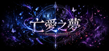
Reverie Unbound capsule

Reverie Unbound

Search for the truth within a fantastical dream. Play as a world-weary office worker drawn into a beautiful illusion. Is it a heavenly gift, or poison wrapped in sugar? Begin your adventure, uncover its secrets, and find your answer.

$3.991 user reviews
AdventureRPGTurn-Based Strategy
MISHRA GAMESJun 14, 2026

Reverie Unbound scores 67/100 — better than 17% of Adventure capsules (n=8,231).

1 user reviews · $3.99 · Released Jun 14, 2026 · By MISHRA GAMES

Quick text summary

Reverie Unbound scored 67/100 on Steam Analyzer — Solid for a Adventure capsule. Top priority fix: [title_readability] Add a contrasting solid background bar or outline to 'Reverie Unbound' to ensure legibility at small capsule size without competing against particle effects

Capsule scores by dimension

  • Genre Clarity: 7/10 — Fantasy RPG with dream aesthetic. The ornate magical circle, ethereal particle effects, and glowing blue-purple color scheme clearly signal a fantasy or narrative RPG set in a dreamlike world. The Asian-inspired character at the center and mystical symbols reinforce adventure genre expectations. At tiny size, the glowing central motif and particle field still read as fantasy-themed, though specific genre details become harder to distinguish.
  • Title Readability: 5/10 — Chinese text hard, subtitle readable. The large Chinese characters (七愛之夢) at the center are visually prominent but not readable to non-native readers at any size. The English subtitle 'Reverie Unbound' sits below and is legible at full size but becomes soft and difficult to parse at tiny size due to small font weight and placement over noisy background. The title design prioritizes visual spectacle over accessibility across viewing conditions.
  • Contrast & Color: 8/10 — Strong glow separation against dark. Brilliant blue and purple glowing elements create excellent value separation against the near-black background, with bright whites in the ornamental frame adding dramatic silhouette clarity. The grayscale squint test shows strong contrast between the bright central glow and dark surroundings, which reads effectively even at tiny size. The warm purple-to-cool blue gradient adds visual interest without sacrificing clarity.
  • Uniqueness & Polish: 7/10 — Polished mystical aesthetic, familiar formula. The execution is clean with intentional typography layering, coherent glow effects, and a dreamlike art direction that matches the narrative premise of a fantastical illusion. The ornate circular frame and particle choreography feel deliberate and high-craft. However, the composition relies on familiar mystical tropes (glowing circles, ethereal particles, blue-purple palette) common in fantasy and visual novel marketing, reducing distinctiveness versus genre benchmarks like Slay the Princess or Chants of Sennaar.
  • Brand Consistency: 6/10 — Cohesive dream aesthetic, limited identity. The visual language is internally consistent with a unified purple-blue glow palette, ornate frame, and particle system that all reinforce the 'reverie' theme. Without access to in-game assets, the brand motifs here (the circular frame, the glowing Japanese/Chinese characters) feel serviceable but not particularly iconic or memorable across future promotional materials. The style is competent but does not establish a unique visual signature that would be instantly recognizable outside this capsule.
  • Composition: 7/10 — Clear central focus, text placement risk. The ornate circular frame creates a strong focal point in the center with the character silhouette and magical symbols drawing the eye inward, supported by radiating particle effects that frame the composition well. The layout has good depth with foreground glow, midground frame, and background particle field. At small and tiny sizes, the composition holds cohesion, though the subtitle text placement low and centered risks cropping or becoming illegible on the Steam store.

What works

  • Excellent contrast and silhouette clarity. The bright blue and purple glows pop dramatically against the dark background and maintain clear visual separation even when squinting or viewing at tiny size.
  • Cohesive dream-world art direction. The ornate frame, particle effects, and color palette work together to communicate the fantastical reverie premise promised in the description.
  • Strong central focal point hierarchy. The composition guides the eye to the center character and magical symbols without scattered competing elements.

What hurts the capsule

  • Chinese title text unreadable to most players. The prominent Chinese characters occupy prime real estate but provide no value to non-native readers and create accessibility friction at first glance.
  • Subtitle loses legibility at small size. The 'Reverie Unbound' text is thin, small, and placed over busy particle effects, making it difficult to read below medium capsule size.
  • Generic mystical visual tropes. The glowing circle, ethereal particles, and blue-purple gradient are familiar across many fantasy titles, limiting memorability and distinctiveness from competitors like Slay the Princess or Chants of Sennaar.

Priority fixes

  1. [title_readability] Add a contrasting solid background bar or outline to 'Reverie Unbound' to ensure legibility at small capsule size without competing against particle effects
  2. [genre_clarity] Consider replacing or supplementing the Chinese title with a prominent English equivalent or visual glyph that communicates title meaning to international audiences
  3. [uniqueness_polish] Introduce a character-specific icon, unique frame motif, or signature visual element that differentiates the brand from generic fantasy aesthetic templates
  4. [composition] Move subtitle text further from bottom edge to prevent Steam crop clipping and ensure it remains visible across thumbnail sizes

Store copy priority fixes

  1. [feature_communication] Add one concrete gameplay example to the short description: replace 'Begin your adventure, uncover its secrets' with something like 'Balance time between investigation, turn-based battles, and puzzle-solving to uncover the truth.'
  2. [feature_communication] Expand feature bullets with concrete examples—e.g., change 'Ever-Changing Dungeons and Puzzles' to 'Solve environmental puzzles using inventory items and environmental interactions (Resident Evil-style) to progress.'
  3. [genre_clarity] Clarify the platformer claim: either remove '2D Platformer' from tags if it's not core, or add a line in features explaining if vertical movement mechanics are used in dungeons.
  4. [audience_targeting] Add a sentence specifying playstyle expectations—e.g., 'Designed for players who value story and decision-making over fast reflexes' or note if combat is purely turn-based auto-resolve.

Related guides

Steam app ID: 4736620 · Tags: Adventure, RPG, Turn-Based Strategy, JRPG, Strategy RPG