Scoring genre clarity...

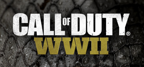
Call of Duty®: WWII capsule

Call of Duty®: WWII

Call of Duty®: WWII - a breathtaking experience that redefines World War II.

$59.99Mixed(269)
World War IIFPSSingleplayer
Sledgehammer Games, Raven SoftwareNov 2, 2017

Call of Duty®: WWII scores 88/100 — better than 99% of World War II capsules (n=123).

Mixed (269 reviews) · $59.99 · Released Nov 2, 2017 · By Sledgehammer Games

Quick text summary

Call of Duty®: WWII scored 88/100 on Steam Analyzer — Excellent for a World War II capsule. Top priority fix: [uniqueness_polish] Consider a subtle environmental context layer (e.g., distant battlefield, era-specific detail) to add narrative depth without sacrificing the soldier focal point.

Capsule scores by dimension

  • Genre Clarity: 9/10 — Military FPS, WWII setting instantly clear. The steel helmet, olive drab uniform, battle-worn face, and rusted dog tags unmistakably communicate a gritty WWII first-person shooter. At tiny size, the iconic helmet silhouette and soldier's focused expression remain recognizable and convey military action tension without ambiguity.
  • Title Readability: 9/10 — Bold white text with strong hierarchy. The white "CALL OF DUTY®" logotype contrasts sharply against the dark background and soldier's face, maintaining excellent legibility at all sizes down to tiny thumbnails. The gold "WWII" subtitle sits cleanly below and reads clearly without competing for attention at small size.
  • Contrast & Color: 9/10 — High value separation, desaturated palette. The pure white title pops decisively against the dark gray soldier and moody background, with strong light-to-dark separation that survives the Steam dark theme. Grayscale squint test confirms the helmet, face, and text all maintain clean silhouettes and edge definition at any viewing size.
  • Uniqueness & Polish: 8/10 — Iconic soldier portrait, premium photography. The close-up soldier face with intense stare and weathered features creates a memorable, visceral hook that communicates grit and authenticity beyond generic military imagery. The lighting, texture detail, and emotional resonance elevate this above template-based competitors, though the core soldier-portrait approach is somewhat familiar to the franchise.
  • Brand Consistency: 9/10 — Signature Call of Duty visual identity. The stark white logotype, desaturated color palette, and intense soldier portraiture align with established Call of Duty brand conventions and are immediately recognizable. The WWII subtitle and overall grounded aesthetic reinforce the specific franchise entry while maintaining the series' premium military shooter identity.
  • Composition: 9/10 — Clear focal point, balanced typography placement. The soldier's face anchors the composition as the primary visual focus, with title text positioned at the top in a safe margin that avoids edge clipping. The symmetrical, centered layout creates a strong hierarchy where text and subject work together without competing, and depth layering (face forward, background soft) guides attention effectively at small and tiny sizes.

What works

  • Iconic brand recognition. The white Call of Duty logotype is instantly identifiable and maintains full legibility from full header down to tiny thumbnail size.
  • Emotional soldier portraiture. The weathered, intense soldier face with direct gaze creates a visceral connection and communicates the game's gritty, grounded tone effectively.
  • Strong contrast on dark background. White text and pale soldier features pop cleanly against the desaturated dark background, ensuring visibility in quick-scroll Steam browsing conditions.
  • Clear genre and setting at glance. WWII military iconography (helmet, uniform, dog tags) leaves no doubt about the game's historical setting and action FPS genre.

What hurts the capsule

  • Generic soldier portrait approach. While well-executed, the close-up soldier face is a familiar visual trope in military shooters and lacks a distinctive mechanical or narrative hook that differentiates this entry.
  • Limited visual storytelling. The capsule communicates tone and setting but does not hint at unique campaign moments, multiplayer depth, or what makes this WWII iteration stand out from competitors.

Priority fixes

  1. [uniqueness_polish] Consider a subtle environmental context layer (e.g., distant battlefield, era-specific detail) to add narrative depth without sacrificing the soldier focal point.
  2. [composition] Verify safe margins on all edges to ensure title and soldier features remain fully visible if Steam crops the edges on certain display contexts.

Store copy priority fixes

  1. [hook_strength] Replace the short description opening with a concrete gameplay or narrative hook: e.g., 'Land in Normandy on D-Day and fight across occupied Europe in the Call of Duty® franchise's return to boots-on-the-ground WWII combat.'
  2. [uniqueness] Add a sentence clarifying what sets this WWII entry apart: e.g., 'This is the first modern Call of Duty to abandon advanced movement, focusing on authentic squad-based tactics and era-accurate weapons.'
  3. [feature_communication] Expand the campaign and co-op descriptions with one concrete detail each: e.g., campaign story focus or co-op mission type/length.
  4. [audience_targeting] Signal difficulty/play style: e.g., 'Whether you're a casual WWII history fan or a competitive multiplayer veteran, three distinct modes deliver [X]' to help self-selection.

Related guides

Steam app ID: 476600 · Tags: World War II, FPS, Singleplayer, Multiplayer, Zombies