Scoring genre clarity...

The Inspector capsule

The Inspector

a Train has been infected with mysterious anomalies. G.O.A.B has secretly hired you to inspect the train. It's your job to find the anomalies and terminate them.

ExplorationPuzzleImmersive Sim
Yagel RavidComing soon

The Inspector scores 62/100 — better than 3% of Exploration capsules (n=5,073).

Released Coming soon · By Yagel Ravid

Quick text summary

The Inspector scored 62/100 on Steam Analyzer — Solid for a Exploration capsule. Top priority fix: [genre_clarity] Redesign character pose and visual context to telegraph inspection/puzzle-solving (e.g., examining instruments, forensic stance) rather than tactical combat stance, or use UI elements that hint at simulation mechanics.

Capsule scores by dimension

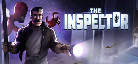
  • Genre Clarity: 5/10 — Ambiguous genre messaging. The capsule presents a protagonist in tactical/action pose with glowing anomalies, which reads more like action-thriller than casual simulation. The visual language—armed stance, intense lighting, mysterious creatures—conflicts with the actual genre positioning as a casual inspection/simulation game. At tiny size, the silhouette reads as combat-focused rather than puzzle or management-focused, which misaligns with the core game loop.
  • Title Readability: 8/10 — Strong title with clean contrast. The title 'THE INSPECTOR' uses bold white sans-serif typography with a thick outline, positioned in the upper right against darker background areas. The lettering remains legible at small and tiny sizes due to high value contrast and generous sizing. The integrated shield icon adds recognition but doesn't interfere with word clarity.
  • Contrast & Color: 7/10 — Good separation with purple dominance. The capsule uses warm orange/yellow lighting on the character and cool purple/blue background tones, creating decent value separation against the dark Steam background. The glowing anomalies provide bright focal points that stand out well at small size. However, the mid-tone areas on the character's clothing and the ambient haze lack sharp silhouette definition, reducing clarity in grayscale viewing at tiny sizes.
  • Uniqueness & Polish: 5/10 — Competent but generic sci-fi aesthetic. The image uses well-rendered 3D character work and professional lighting setup, but the overall composition—mysterious agent with glowing threats—feels like a familiar sci-fi trope repeated across many game capsules. The execution is clean and polished, but there's no distinctive visual hook that communicates the unique inspection/anomaly-hunting mechanic or sets this apart from generic thriller games. The capsule prioritizes atmosphere over clarity of the actual gameplay experience.
  • Brand Consistency: 6/10 — Minimal identity markers present. The capsule features the protagonist and G.O.A.B shield icon, which could serve as brand markers, but without access to store screenshots, these elements are not evaluated for consistency with broader marketing assets. The purple/blue color palette and sci-fi aesthetic are generic enough that they don't establish a memorable or distinctive brand voice that would persist across marketing materials.
  • Composition: 6/10 — Balanced layout with title integration. The composition places the character prominently in center-left with glowing anomalies creating depth and visual interest, while the title occupies the right side in a controlled white text block. The layout avoids dead space and uses the full frame effectively. However, at small and tiny sizes, the mid-ground anomalies and background environment create visual clutter that competes with the primary character, and the right-aligned title placement could be vulnerable to Steam interface cropping on narrow viewport widths.

What works

  • Clear white title typography. Bold sans-serif 'THE INSPECTOR' with outline maintains excellent legibility across full, small, and tiny viewing sizes.
  • Professional lighting and rendering. 3D character work and atmospheric lighting create a polished, premium visual presentation that avoids cheap asset vibe.
  • Focal point hierarchy at full size. The protagonist is clearly the primary subject with secondary glowing anomalies supporting rather than competing for attention.

What hurts the capsule

  • Genre-narrative mismatch. Action-thriller visual language conflicts with casual simulation game design, potentially misleading players about gameplay type and tone.
  • Silhouette clarity at tiny size. Mid-tone clothing and ambient haze reduce character definition in grayscale, making identity harder to parse at small viewport sizes.
  • Generic sci-fi aesthetic. The mysterious agent and glowing threats motif lacks distinctive visual hooks that communicate the unique inspection/anomaly-hunting core mechanic.
  • Background clutter at small size. Environment details and anomalies in mid-ground create competing visual elements that reduce clarity when scaled down to thumbnail sizes.

Priority fixes

  1. [genre_clarity] Redesign character pose and visual context to telegraph inspection/puzzle-solving (e.g., examining instruments, forensic stance) rather than tactical combat stance, or use UI elements that hint at simulation mechanics.
  2. [contrast_color] Add stronger value separation around the character silhouette by increasing outline definition or simplifying background mid-tones to improve grayscale readability at tiny size.
  3. [uniqueness_polish] Introduce a distinctive visual hook specific to train inspection gameplay—such as a scanner device, anomaly detector, or unique uniform detail—that differentiates this from generic sci-fi thrillers.
  4. [composition] Reduce background environment detail or use depth-of-field blur to minimize mid-ground clutter and ensure the character remains the unambiguous focal point at all sizes including tiny thumbnails.

Store copy priority fixes

  1. [hook_strength] Rewrite the short description to lead with a stronger verb and emotional angle: e.g., 'Inspect a cursed train where anomalies hide in plain sight—one wrong choice and you start over' to immediately signal the high-stakes puzzle loop.
  2. [feature_communication] Add 1–2 concrete examples of anomalies or cabin variations in the detailed description to help players visualize the inspection puzzle and understand the detection challenge.
  3. [uniqueness] Clarify what makes the anomaly-detection mechanic or narrative twist distinct by adding a sentence that hints at the philosophical or mechanical core unique to this game.

Related guides

Steam app ID: 4767740 · Tags: Exploration, Puzzle, Immersive Sim, Walking Simulator, Horror