Scoring genre clarity...

THE LAST LOGIN capsule

THE LAST LOGIN

THE LAST LOGIN is a psychological hacker thriller where you use GHOST//OS to exploit websites, intercept data, control cameras, and make dangerous choices as the voice in your head pushes you deeper into crime.

ActionAdventureSimulation
IS-TLOctober 2026

THE LAST LOGIN scores 77/100 — better than 78% of Action capsules (n=8,871).

Released October 2026 · By IS-TL

Quick text summary

THE LAST LOGIN scored 77/100 on Steam Analyzer — Good for a Action capsule. Top priority fix: [uniqueness_polish] Integrate a GHOST//OS visual element (e.g., holographic code, system interface motif, or glitch effect) to signal the game's specific hacking mechanic and create a distinctive brand hook.

Capsule scores by dimension

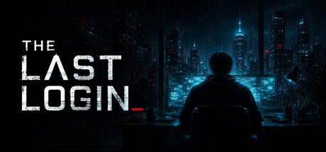
  • Genre Clarity: 8/10 — Cyberpunk thriller with hacker focus. The silhouetted figure at a computer overlooking a neon-lit cityscape immediately signals a hacker/cyberpunk narrative. The blue-tinted urban environment with glowing skyscrapers reinforces the technological thriller theme, and the solitary pose suggests psychological isolation or surveillance. At TINY size, the city glow and figure silhouette remain legible enough to convey 'tech-focused crime thriller,' though finer narrative details are lost.
  • Title Readability: 8/10 — Clean sans-serif, high contrast white. THE LAST LOGIN uses a bold, geometric sans-serif in crisp white against the dark background, positioned in the upper left with ample breathing room. The title maintains excellent contrast and letterform clarity even at SMALL and TINY sizes. The strategic placement on a relatively clean text-safe area ensures no collision with the central figure or city elements, preserving readability across all viewing scales.
  • Contrast & Color: 9/10 — Striking cyan-blue against dark void. The palette leverages high-value separation: pure white title text, deep black background, and vibrant cyan-blue neon cityscape create a strong silhouette that reads instantly even when squinted. The figure remains a dark focal point against glowing buildings, and the value hierarchy is clean and unambiguous. At TINY size, the color blocks remain distinct and the overall composition does not collapse into muddy mid-tones.
  • Uniqueness & Polish: 7/10 — Premium cyberpunk aesthetic, familiar trope. The execution is polished with atmospheric lighting, intentional color grading, and a cohesive cinematic feel that reads as high-quality. However, the 'lone hacker gazing at a neon city' is a well-worn visual archetype in cyberpunk media, lacking a distinctive hook or unique selling point that sets it apart from similar thrillers. The image communicates mood and tone effectively but does not reveal a unique mechanic or narrative hook beyond the genre standard.
  • Brand Consistency: 6/10 — Moody atmosphere, no distinctive motif. The capsule establishes a coherent dark, technologically-focused brand identity with consistent color treatment and cinematic framing. However, there are no iconic symbols, signature motifs, or memorable visual cues that would make THE LAST LOGIN immediately recognizable on sight alone without the title. The aesthetic is competent and genre-aligned but not distinctive enough to build lasting brand recall.
  • Composition: 8/10 — Clear hierarchy, strong focal point. The layout uses effective layering: title anchored upper left, central dark figure silhouette, and vibrant city backdrop creating depth and visual interest. The focal point (figure at computer) is unambiguous and guides attention naturally. Safe margins are respected and the composition remains stable across SMALL and TINY sizes without edge-hugging or awkward cropping; the centered figure and surrounding space scales gracefully.

What works

  • Strong value contrast and silhouette. The cyan neon against deep black creates instant visual separation that reads clearly even at tiny thumbnail size and survives squinting without collapse.
  • Title placement and legibility. White sans-serif positioned safely in the upper left with no background noise interference, maintaining perfect readability across all sizes.
  • Atmospheric cohesion and craft. The cinematic lighting, color grading, and layered depth communicate premium production quality and psychological thriller tone consistently.

What hurts the capsule

  • Generic cyberpunk archetype. The 'lone hacker with city view' setup is a familiar visual cliché that does not differentiate THE LAST LOGIN from competing hacker thrillers or establish a unique identity.
  • No iconic brand symbol or motif. The capsule lacks a memorable symbol, UI element, or signature visual that would make the game recognizable without the title text.
  • Limited narrative clarity. The image conveys mood and genre but does not visually hint at the game's core mechanic (GHOST//OS, hacking websites, intercept data) or the psychological pressure element that differentiates it.

Priority fixes

  1. [uniqueness_polish] Integrate a GHOST//OS visual element (e.g., holographic code, system interface motif, or glitch effect) to signal the game's specific hacking mechanic and create a distinctive brand hook.
  2. [genre_clarity] Add a subtle UI or digital artifact overlay (scanning lines, data stream, or system window) to reinforce the hacker simulation aspect and differentiate from generic cyberpunk imagery.
  3. [brand_consistency] Develop a signature visual motif (logo mark, recurring symbol, or color accent) that appears consistently across capsule and screenshots to build recognizable brand identity.

Related guides

Steam app ID: 4773940 · Tags: Action, Adventure, Simulation, Action-Adventure, Education