Scoring genre clarity...

Super Bouncer Henry capsule

Super Bouncer Henry

Fight and Bounce your way through endless waves of enemies and grow powerful! Grab loot, level up and upgrade your Character to create unique and crazy builds as you fend off hordes of creatures!

ActionCasualPlatformer
Super Peperoni AllstarsTo be announced

Super Bouncer Henry scores 70/100 — better than 28% of Action capsules (n=8,838).

Released To be announced · By Super Peperoni Allstars

Quick text summary

Super Bouncer Henry scored 70/100 on Steam Analyzer — Good for a Action capsule. Top priority fix: [brand_consistency] Develop a distinctive visual motif or signature character trait (unique outfit detail, recurring symbol, or color accent) to make Henry iconic and recognizable across all marketing

Capsule scores by dimension

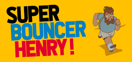
  • Genre Clarity: 7/10 — Clear casual action gameplay. The bouncing character pose and dynamic jumping silhouette immediately communicate action and movement-based gameplay. The casual, colorful art style and exaggerated character proportions signal indie action rather than hardcore combat. At tiny size, the character's airborne pose and chunky build still read as an action platformer with arcade energy.
  • Title Readability: 8/10 — Strong legible title hierarchy. The three-line title breaks effectively with bold sans-serif letterforms in contrasting colors: black 'SUPER', blue 'BOUNCER', and red 'HENRY!'. The exclamation mark adds personality and readability. At tiny size the title remains legible due to high contrast against the yellow background and clear letterform spacing, though the three-line stack compresses slightly.
  • Contrast & Color: 8/10 — Vibrant high-saturation palette. The bright yellow background (#FFD700 or similar) creates strong value separation against the dark Steam background #1b2838. The blue and red title text pop cleanly, and the character's brown and gray tones provide mid-tone relief without washing out. Grayscale test shows clear silhouette definition and strong luminosity separation across all elements.
  • Uniqueness & Polish: 6/10 — Competent but generic indie styling. The cartoon character art and bold typography feel professional and clean, but the execution is straightforward without memorable visual hooks or distinctive art direction. The design communicates the game's casual tone but lacks a signature visual identity or unique selling point that would differentiate it from similar indie action titles. The character design is functional but not particularly iconic or surprising.
  • Brand Consistency: 6/10 — Functional but non-iconic identity. The character 'Henry' is the primary brand element, with a consistent cartoon style and recognizable silhouette. However, without reference to other marketing materials, the character lacks a memorable distinctive trait or signature visual motif that would make him instantly recognizable. The color palette (yellow, blue, red) is vibrant but not uniquely associated with the brand.
  • Composition: 7/10 — Well-balanced with clear focal point. The character is positioned right of center in a dynamic jumping pose, creating a strong focal point that draws the eye immediately. The title occupies the upper left with clear hierarchy and breathing room. At small and tiny sizes, the composition remains readable with the character and title maintaining distinct zones. The yellow background ensures nothing gets lost to visual clutter, though the character sits slightly close to the right edge for extreme cropping scenarios.

What works

  • High contrast against Steam background. The bright yellow field and saturated title colors create immediate visual pop and strong separation from the dark Steam interface.
  • Clear readable typography. The bold sans-serif title with three distinct color blocks maintains legibility from full size down to tiny thumbnail without collapse or muddy overlap.
  • Energetic action pose communication. The character's jumping stance and dynamic angle effectively convey movement and arcade-style casual action gameplay at all sizes.

What hurts the capsule

  • Generic character design. Henry is a competent but unmemorable cartoon character without distinctive features or iconic traits that would make him recognizable across marketing touchpoints.
  • Derivative visual approach. The bright primary-color palette and cartoon style, while polished, follow familiar indie game conventions without a unique visual signature or artistic hook.
  • Limited brand identity cues. The capsule lacks a signature motif, symbol, or visual pattern that would allow instant brand recognition outside this specific image.

Priority fixes

  1. [brand_consistency] Develop a distinctive visual motif or signature character trait (unique outfit detail, recurring symbol, or color accent) to make Henry iconic and recognizable across all marketing
  2. [uniqueness_polish] Enhance the art style with a unique visual hook such as stylized outlines, special effects, or an unexpected art direction that differentiates from generic indie action titles
  3. [composition] Shift character slightly left to create safer margin from right edge in case of Steam cropping at different aspect ratios

Store copy priority fixes

  1. [uniqueness] Add a sentence explaining what the 'Bounce' mechanic does and how it sets Super Bouncer Henry apart—e.g., 'Use bouncing to dodge attacks, reach platforms, and chain damage multipliers.'
  2. [feature_communication] Fix spelling errors: 'wich' → 'which,' 'rewared' → 'rewarded,' 'Rouge Like' → 'Roguelike' to improve perceived quality.
  3. [hook_strength] Replace 'grow powerful' with a more specific, evocative phrase that hints at build synergy or transformation—e.g., 'become an unstoppable force by combining ridiculous item synergies.'
  4. [tone_match] Maintain the energetic, casual tone from the short description throughout the detailed description by removing formal phrasing and adding personality to the mechanics list.

Related guides

Steam app ID: 4774520 · Tags: Action, Casual, Platformer, Roguelike, Action Roguelike