Scoring genre clarity...
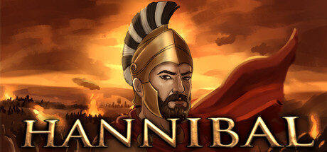
Hannibal capsule

Hannibal

Hannibal is a grand strategy game with real-time tactical battles. Choose regions on the campaign map, command your army, and take direct control when war begins. Build formations, break enemy lines, and lead your empire to victory through smart strategy and battlefield decisions.

CasualStrategy2D Fighter
ISD StudioQ4 2026

Hannibal scores 70/100 — better than 28% of Casual capsules (n=10,372).

Released Q4 2026 · By ISD Studio

Quick text summary

Hannibal scored 70/100 on Steam Analyzer — Good for a Casual capsule. Top priority fix: [brand_consistency] Introduce a distinctive visual motif or symbol—such as a unique helmet marking, insignia, or signature visual element—that reinforces Hannibal's identity and can be recognized across other store materials.

Capsule scores by dimension

  • Genre Clarity: 7/10 — Historical strategy, clear but generic. The ancient military leader aesthetic with helmet, red cloak, and sunset battlefield immediately signal strategy or historical grand strategy gameplay. At tiny size, the silhouette of an armored commander remains recognizable, though the specific subgenre (real-time tactical) is not immediately apparent from visuals alone. The composition suggests leadership and empire-building rather than casual gameplay, which slightly misaligns with the Casual tag but fits Strategy.
  • Title Readability: 8/10 — Strong, readable title placement. HANNIBAL is rendered in bold, all-caps gold serif lettering positioned in the lower third with clear contrast against the warm orange-brown gradient background. The letterforms remain legible at small size due to generous letter spacing and thick weight. At tiny size the text becomes compressed but remains identifiable as a word rather than abstract shapes, though specific letter details blur.
  • Contrast & Color: 8/10 — Excellent warm-to-cool separation. The golden title and illuminated character face stand out sharply against the deep orange-brown sky and shadowed landscape background, creating strong value contrast. The red cloak provides additional saturation pop that reads at all sizes. In grayscale, the character's face and title maintain clear silhouette separation from the background, though the upper landscape blends somewhat into mid-tone sky.
  • Uniqueness & Polish: 6/10 — Competent but familiar historical aesthetic. The execution is clean with polished lighting on the character's face and a cohesive warm color palette, but the overall composition—ancient general against dramatic sunset—is a common template for strategy games and historical titles. There is no distinctive mechanical hook or unique visual selling point that differentiates this from dozens of other grand strategy game capsules; it relies on familiar historical iconography rather than a memorable unique idea.
  • Brand Consistency: 6/10 — Generic historical branding without identity. The visual identity is locked into historical realism and period-appropriate aesthetics, which is consistent with the title and genre but offers no distinctive character, motif, or signature visual element that would be uniquely recognizable as Hannibal across marketing materials. The warm golden palette and armor styling are standard for ancient world strategy games and do not create memorable brand recall cues beyond the title itself.
  • Composition: 7/10 — Strong focal point, good hierarchy. The character's face occupies the clear primary focal point in the upper-center, naturally drawing attention with lighting and color temperature contrast. The title is anchored in the lower third with strong spatial separation, creating good visual hierarchy. The distant cityscape and landscape provide layered depth context; however, the character's right edge approaches the frame boundary, risking crop loss on some Steam display configurations, and the title placement leaves the bottom-center region slightly empty.

What works

  • Bold, legible title treatment. Gold serif lettering with strong contrast reads reliably from full size down to tiny thumbnail without collapse or blurring into illegibility.
  • Clear character focal point and lighting. The illuminated face and decisive red cloak create immediate visual hierarchy and guide the eye naturally at all viewing scales.
  • Warm cohesive color palette. The orange-gold-brown temperature range is unified and evocative of ancient Mediterranean settings, maintaining strong mood throughout.

What hurts the capsule

  • Generic historical strategy template. The composition and visual language closely mirror dozens of other grand strategy and ancient warfare game capsules, offering no distinctive visual hook.
  • No memorable brand identity cues. Beyond the character's generic armored appearance and the title text, there are no iconic motifs, symbols, or design signatures that would create lasting brand recognition.
  • Character edge framing risk. The commander's right shoulder and helmet detail sit very close to the frame boundary, creating potential crop and composition issues on non-standard Steam displays.

Priority fixes

  1. [brand_consistency] Introduce a distinctive visual motif or symbol—such as a unique helmet marking, insignia, or signature visual element—that reinforces Hannibal's identity and can be recognized across other store materials.
  2. [composition] Reframe to move the character slightly left of center, ensuring the helmet and shoulder have safe margin clearance and improving crop resilience across all Steam display sizes.
  3. [uniqueness_polish] Consider adding a tactical UI element, map overlay, or battle formation hint in the background to visually communicate the real-time tactical gameplay core mechanic rather than relying purely on historical portrait aesthetic.

Related guides

Steam app ID: 4777080 · Tags: Casual, Strategy, 2D Fighter, Board Game, Grand Strategy