Scoring genre clarity...
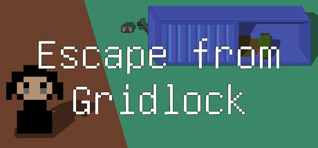
Escape from Gridlock capsule

Escape from Gridlock

A single-player turn-based pixel-art tactical extraction game. Enter the sealed-off zone, scavenge supplies, complete tasks, fight enemies, and extract before things fall apart. Bring loot back to your base, craft gear, unlock weapon skills, and prepare for the next expedition.

AdventureStrategyRPG
FOGMOE2026

Escape from Gridlock scores 73/100 — better than 61% of Adventure capsules (n=8,231).

Released 2026 · By FOGMOE

Quick text summary

Escape from Gridlock scored 73/100 on Steam Analyzer — Good for a Adventure capsule. Top priority fix: [uniqueness_polish] Strengthen the facility or extraction point silhouette with more readable detail or a distinct visual motif that signals the 'extraction' hook at TINY size.

Capsule scores by dimension

  • Genre Clarity: 7/10 — Tactical strategy with pixel art style. The pixelated character sprite, grid-based visual hints in the top-right facility, and retro aesthetic clearly signal an indie tactical/strategy game. At TINY size, the pixel art style and composed scene still read as strategy-focused adventure, though the specific extraction mechanic is not immediately obvious from visuals alone. The brown-green angular background suggests exploration or base building.
  • Title Readability: 8/10 — Clear pixel font, good contrast separation. The title 'Escape from Gridlock' uses a readable monospace pixel font with white letters that contrast sharply against the darker background split. At FULL size it reads cleanly; at SMALL size the letters remain distinct and separated; even at TINY size the word shapes are recognizable despite size reduction. The two-line layout provides good visual hierarchy and avoids crowding.
  • Contrast & Color: 8/10 — Strong value separation, readable silhouette. The design uses a high-contrast split: warm brown left, cool green-teal right, with the blue facility structure providing a distinct focal accent. The white title text stands out clearly against both background regions, and the pixelated character sprite maintains strong silhouette definition. In grayscale, the value difference between foreground and background remains clear and supports readability at all scales.
  • Uniqueness & Polish: 7/10 — Polished pixel aesthetic, cohesive retro style. The capsule commits fully to a clean, retro pixel art direction with intentional color blocking and a distinctive angular background design that suggests tactical gameplay. The facility structure top-right and the composed character pose indicate purposeful visual storytelling rather than generic asset placement. However, the overall execution, while solid, does not push beyond expected indie tactical game presentation—it reads as well-executed but not groundbreaking compared to the high-performing benchmark list.
  • Brand Consistency: 7/10 — Recognizable pixel style, consistent world language. The capsule establishes a clear pixel art identity with a muted, earthy palette (brown, green, blue-purple) and retro character design that suggests a cohesive game world. The angular, geometric background and facility silhouettes reinforce a tactical extraction theme consistently. Without access to the 5 store screenshots, this score reflects strong internal consistency cues; the pixel aesthetic and color scheme feel proprietary enough to distinguish from generic tactical games, though not yet iconic.
  • Composition: 7/10 — Clear focal hierarchy, balanced elements. The layout uses a strong left-right division with the pixel character anchoring the left and the facility structure providing visual interest on the right, guiding the eye naturally across the composition. The title is centered and elevated in the upper portion, creating clear hierarchy without blocking key visuals. At TINY size, the character silhouette remains the primary focal point and the overall balance holds, though the facility detail becomes less readable; safe margins are respected and cropping risk is minimal.

What works

  • Strong contrast and silhouette clarity. White title and pixel character read distinctly against the angular background split, maintaining legibility and visual pop even at TINY size.
  • Committed pixel art direction. The retro aesthetic is intentional and cohesive, avoiding generic asset look and reinforcing indie tactical game identity.
  • Effective two-line title layout. The 'Escape from / Gridlock' split balances readability with visual composition and does not crowd the character or facility elements.

What hurts the capsule

  • Limited facility detail at small scales. The top-right blue structure becomes harder to parse at SMALL and TINY sizes, reducing its ability to reinforce the tactical grid concept.
  • Generic pixel aesthetic execution. While well-polished, the retro style does not yet feel distinctly proprietary or iconic compared to established indie benchmarks like DREDGE or Balatro.
  • Extraction mechanic not visually telegraphed. The core gameplay hook (scavenging, extraction, progression) is implied by the pixel style but not clearly communicated through composition or specific visual cues.

Priority fixes

  1. [uniqueness_polish] Strengthen the facility or extraction point silhouette with more readable detail or a distinct visual motif that signals the 'extraction' hook at TINY size.
  2. [genre_clarity] Add a subtle visual element (e.g., loot icon, resource counter, or grid overlay hint) that reinforces the scavenging and tactical grid mechanics without cluttering the design.
  3. [brand_consistency] Reference the 5 store screenshots to ensure capsule palette and character design match in-game UI and visual language for stronger brand recognition.

Store copy priority fixes

  1. [uniqueness] Add 1–2 sentences that clarify what makes this extraction game distinct from other extraction or tactical RPGs—e.g., 'Unlike X, Gridlock combines Y mechanic with Z' or 'The only turn-based extraction game where [unique feature].'
  2. [audience_targeting] Add a brief mention of difficulty or progression pacing—e.g., 'Brutal and unforgiving,' 'Accessible for new tactics players,' or 'Scales with your build'—to help players self-select.
  3. [hook_strength] Consider adding the Early Access status to the opening line or first paragraph to set expectations and build trust ('Early Access turn-based tactical extraction game…').

Related guides

Steam app ID: 4823520 · Tags: Adventure, Strategy, RPG, Turn-Based Strategy, Turn-Based Tactics