Scoring genre clarity...

Escape Them capsule

Escape Them

Navigate a locked environment to find an escape while avoiding an intelligent, adaptive hunter that reacts to player noise and hiding patterns. Survival hinges on silence, environmental awareness, and outsmarting.

StrategyActionAdventure
ExtaceComing soon

Escape Them scores 70/100 — better than 28% of Strategy capsules (n=5,329).

Released Coming soon · By Extace

Quick text summary

Escape Them scored 70/100 on Steam Analyzer — Good for a Strategy capsule. Top priority fix: [composition] Shift the left building icon further into the safe margin to prevent edge-crop losses at small sizes.

Capsule scores by dimension

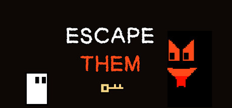
  • Genre Clarity: 7/10 — Survival horror stealth tension clear. The red menacing silhouette (hunter character) paired with the white rectangular building (locked environment) and yellow key icon immediately communicate a stealth-escape scenario with an active threat. At TINY size, the hunter shape reads as hostile and the architectural elements suggest confinement, though the specific 'adaptive AI' mechanic is not visually obvious.
  • Title Readability: 8/10 — Clean bold two-tone typography. The title uses stark white 'ESCAPE' with orange 'THEM' in a crisp sans-serif that maintains legibility at all sizes, including TINY. The two-color split creates hierarchy and reinforces the subject (THEM = the hunter) while the white and orange contrast holds against the dark background without losing form at small scale.
  • Contrast & Color: 8/10 — High contrast silhouettes read cleanly. The red-orange hunter silhouette, white building, and yellow key all maintain strong value separation against the pure black background (#1b2838). At TINY size, the silhouettes remain distinct and readable; the grayscale test shows clear edge definition with no muddy mid-tones or subject blending.
  • Uniqueness & Polish: 6/10 — Minimal geometric but slightly generic. The pixel-art aesthetic with geometric shapes feels intentional and fits the indie puzzle-stealth space, but the execution is functional rather than distinctive. The hunter icon and key are recognizable symbols but lack the polish or unique visual hook seen in top-tier competitor capsules like COCOON or Slay the Princess that leverage more sophisticated art direction.
  • Brand Consistency: 6/10 — Simple iconography no signature style. The capsule uses repeatable pixel-art elements (hunter shape, key, building silhouette) that could form a consistent visual identity, but without reference to gameplay screenshots, the internal cohesion feels generic. The red-white-yellow palette is functional but not uniquely memorable as a brand marker.
  • Composition: 7/10 — Balanced layout with clear hierarchy. The title occupies top-center with strong anchor, the red hunter on the right provides focal weight, and the building and key on the lower left create supporting depth without clutter. At SMALL and TINY sizes, the composition remains balanced and the eye moves title → hunter → environment; however, the building icon sits very close to the left edge and risks cropping.

What works

  • High-contrast palette pops against Steam dark. Red, white, and yellow elements create immediate visual separation and remain readable at TINY size without muddy blending.
  • Title typography hierarchy and readability. White 'ESCAPE' and orange 'THEM' split reinforces subject and maintains crisp letterforms at all viewing scales.
  • Genre and threat communicated clearly. The hunter silhouette and enclosed building immediately signal a threat-based puzzle or stealth scenario to quick scrollers.

What hurts the capsule

  • Generic pixel-art aesthetic lacks distinctiveness. While functional, the geometric shapes and minimal style do not stand out against top-tier indie competitors with stronger art direction or character presence.
  • Building icon positioned too close to left edge. At TINY size and during Steam cropping, the left building silhouette risks being cut off or compressed, reducing compositional balance.
  • No unique visual hook or signature motif. The capsule relies on recognizable symbols (key, hunter, building) but lacks a memorable or distinctive brand identity element that would set it apart in genre browsing.

Priority fixes

  1. [composition] Shift the left building icon further into the safe margin to prevent edge-crop losses at small sizes.
  2. [uniqueness_polish] Add a distinctive visual style or signature element—such as a more expressive hunter design, atmospheric lighting effect, or unique palette accent—to compete with stronger indie capsules.
  3. [brand_consistency] Develop a recognizable iconic mark or character silhouette that could serve as a memorable brand identifier across all marketing materials.

Related guides

  • Steam page optimisationCapsule, copy, screenshots, tags — the full Steam page conversion stack.
  • Steam tags guideTag selection, ordering, and how it shapes Steam's recommendation rails.

Steam app ID: 4879540 · Tags: Strategy, Action, Adventure, Puzzle, 2D