Scoring genre clarity...
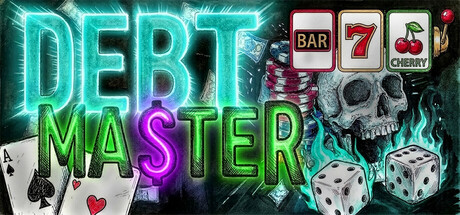
DEBTMASTER capsule

DEBTMASTER

You're drowning in debt and the interest never stops. Grind every hustle you can find -- card games, crypto mining, gig deliveries, content farming, and more -- while stacking upgrades from a pool of 1,000+. Automate with bots. Pay off your debt or drown trying. A roguelite capitalism satire.

RogueliteRoguelike DeckbuilderRoguelike
ZeusComing soon

DEBTMASTER scores 72/100 — better than 39% of Roguelite capsules (n=2,398).

Released Coming soon · By Zeus

Quick text summary

DEBTMASTER scored 72/100 on Steam Analyzer — Good for a Roguelite capsule. Top priority fix: [genre_clarity] Add a subtle UI element or visual cue (e.g., a bot icon, upgrade indicator, or money stack) to hint at the simulation and roguelite progression mechanics beyond gambling.

Capsule scores by dimension

  • Genre Clarity: 7/10 — Clear casino and hustle vibes. The slot machine imagery (BAR, 7, CHERRY symbols), skull, dice, and playing cards immediately signal a gambling-adjacent, chaotic money-grinding theme that aligns with the roguelite capitalism satire premise. At tiny size, the neon slot symbols and casino aesthetic remain recognizable, though the specific 'debt' narrative requires reading the title text rather than visual cues alone. The composition suggests grind mechanics and risk-taking gameplay without being explicitly clear about the simulation or strategy depth.
  • Title Readability: 8/10 — Bold neon text, legible throughout. DEBT and MASTER are rendered in large, high-contrast neon glowing letters (cyan and green with purple accent on the S) that maintain excellent readability at full, small, and tiny sizes. The outline glow effect provides strong separation from the dark background and textured elements behind. Even at tiny thumbnail size, the word stack reads cleanly without collapsing, and the neon effect aids recognition rather than hindering it.
  • Contrast & Color: 8/10 — Strong neon-to-dark separation. The bright cyan and lime green neon text pops dramatically against the dark #1b2838 background, with high value separation and saturated hues that catch the eye in quick scroll. The skull, dice, and card suit symbols are rendered in light grays and whites that contrast well against darker midtones. In grayscale, the composition holds strong silhouettes, though some mid-tone busy textures in the background slightly soften the overall clarity at tiny size.
  • Uniqueness & Polish: 7/10 — Stylish neon aesthetic, familiar motifs. The neon glow treatment and vibrant color palette feel premium and intentional, distinct from generic capsule templates in the indie strategy space. The mashup of casino iconography (slots, cards, dice, skull) creates a cohesive visual hook that communicates the 'hustle and debt' core concept. However, the individual elements (neon text, skull, casino symbols) are well-worn visual tropes in games marketing, so while the execution is clean, the originality is moderate rather than exceptional.
  • Brand Consistency: 6/10 — Coherent aesthetic, limited iconic identity. The neon cyberpunk gambling theme is internally consistent across typography, lighting, color palette (cyan, green, purple), and asset choices. However, there are no highly distinctive brand identity signals (no signature character, motif, or unique visual shorthand) that would make this capsule instantly recognizable in future marketing or sequels. The style is thematic to the game concept but does not establish a memorable brand icon beyond the neon treatment itself.
  • Composition: 7/10 — Balanced layout, clear focal hierarchy. The title occupies the left-center as the primary focus, with casino icons and skull anchoring the right side to create depth and guide the eye without overwhelming. The layout uses the full width effectively and avoids dead space, with supporting elements arranged to frame rather than compete with the title. At small and tiny sizes, the composition remains legible with no critical elements getting dangerously close to crop edges, though the scattered right-side icons could read as slightly busy at the smallest scale.

What works

  • Excellent title contrast and glow. The neon cyan and green text with purple accent maintains perfect readability from full size down to tiny thumbnail, with the glow effect enhancing legibility rather than degrading it.
  • Thematic visual hook. The mashup of slot machine, dice, skull, and cards immediately communicates gambling, risk, and the dark hustle mechanics at the game's core.
  • Strong value separation and pop. Bright neon hues against dark background create excellent contrast that works in quick scroll and maintains silhouette clarity in grayscale.
  • Coherent neon aesthetic. Consistent color palette, lighting treatment, and cyberpunk visual language feel intentional and premium across all elements.

What hurts the capsule

  • Generic casino tropes. While well-executed, the skull, dice, slots, and card symbols are overused visual shorthand that don't differentiate the game from other gambling or crime-themed indie titles.
  • Limited brand identity signals. No unique character, icon, or motif that would create lasting brand recognition independent of the neon treatment, making future marketing tie-ins harder to link visually.
  • Right-side icon scatter. The cluster of slot symbols, skull, and dice on the right side reads as slightly chaotic at tiny size and could benefit from tighter grouping or primary focal consolidation.

Priority fixes

  1. [genre_clarity] Add a subtle UI element or visual cue (e.g., a bot icon, upgrade indicator, or money stack) to hint at the simulation and roguelite progression mechanics beyond gambling.
  2. [brand_consistency] Develop a signature character or mascot (e.g., a debt collector character or bot) that appears in future capsules and store assets to create a recognizable brand anchor.
  3. [composition] Tighten the right-side icon arrangement to reduce visual scatter and create a more unified supporting frame that doesn't compete with the title hierarchy.

Store copy priority fixes

  1. [uniqueness] Add 1-2 sentences in the 1,000+ EDGES section explicitly comparing how this upgrade system differs from traditional deck-builders (e.g., 'Unlike single-deck roguelikes, every run mixes hustles and combos the base game never designed').
  2. [feature_communication] Clarify in the BOTS DO THE WORK section whether bot grinding is optional or required for end-game progression, and whether players can win runs without ever using bots.
  3. [audience_targeting] Remove 'Family Sharing' from categories or add a note that the game is rated for mature audiences, to prevent tonal confusion for parents or casual players.

Related guides

Steam app ID: 4884590 · Tags: Roguelite, Roguelike Deckbuilder, Roguelike, Card Game, Gambling