Scoring genre clarity...

KEYKRUNCHER™ capsule

KEYKRUNCHER™

KEYKRUNCHER™ is the fun and effective treatment for all your keyboard-eating needs! Look down, follow the monitor, press the correct KEY, and KRUNCH. EAT the whole keyboard before IT eats you.

PuzzleRhythmPoint & Click
Sunscorched StudiosTo be announced

KEYKRUNCHER™ scores 72/100 — better than 44% of Puzzle capsules (n=4,541).

Released To be announced · By Sunscorched Studios

Quick text summary

KEYKRUNCHER™ scored 72/100 on Steam Analyzer — Good for a Puzzle capsule. Top priority fix: [composition] Replace textured background with solid or subtly gradient dark surface to maximize contrast and reduce visual noise at TINY size

Capsule scores by dimension

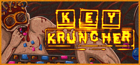
  • Genre Clarity: 7/10 — Quirky indie action with clear hook. The visual of a hand reaching toward a keyboard with aggressive yellow typography immediately signals an unconventional, humorous indie game mechanic. At TINY size, the hand-keyboard interaction is still recognizable and the neon yellow branding reads as indie/casual game, though the specific 'keyboard eating' premise is not immediately obvious without context.
  • Title Readability: 8/10 — Bold, readable neon title treatment. The KEY KRUNCHER text uses a strong yellow/gold outline against dark background with clear letter separation and stacked layout. At both FULL and TINY sizes the text remains legible due to high contrast and simple sans-serif construction; however, the decorative underscore/flourish beneath KRUNCHER adds visual flair that holds at small size without collapsing readability.
  • Contrast & Color: 8/10 — Strong yellow-on-dark separation. The bright yellow neon outline of the logo and hand creates excellent value separation against the dark brown/black textured background, with the skin tone of the hand providing warm mid-tone depth. In grayscale, the yellow maintains clear silhouette definition and the hand remains distinctly separated from background; at TINY size the yellow logo still pops clearly due to high saturation and edge definition.
  • Uniqueness & Polish: 7/10 — Distinctive neon aesthetic, simple execution. The retro arcade/neon treatment with the glowing yellow title and the physical interaction of a hand-keyboard premise creates a memorable hook that differentiates it from typical action-adventure capsules. The execution is clean and intentional, though the overall composition feels relatively straightforward without elaborate visual storytelling or premium effects; it succeeds through concept boldness rather than technical craft.
  • Brand Consistency: 6/10 — Cohesive neon theme, limited iconic elements. The neon yellow treatment, dark industrial background, and arcade-game aesthetic form an internally consistent visual identity that would likely carry across game materials. However, there are no memorable character, symbol, or unique motif that creates strong brand recall beyond the color scheme; the hand is generic and the keyboard is literal rather than iconic.
  • Composition: 7/10 — Clear focal hierarchy, safe layout. The left-side title and right-side hand-keyboard action create a balanced two-part composition with the logo anchored in top-left safe zone and the hand interaction centered-right for visual interest. At SMALL and TINY sizes both elements remain readable and the eye naturally flows from title to action; however, there is some empty space in the lower-left that could be better utilized, and the dark background texture, while atmospheric, adds minor noise that slightly reduces clarity at smallest sizes.

What works

  • Neon yellow logo pops instantly. The glowing yellow outline with black interior creates exceptional contrast against the dark Steam background and remains clearly readable at all sizes including TINY.
  • Memorable, quirky concept premise. The hand-keyboard interaction visually communicates the core game mechanic immediately and the neon arcade aesthetic stands out from typical action-adventure genre conventions.
  • Balanced composition across sizes. Logo placement in safe top-left zone with action element on right creates natural eye flow that works well at FULL, SMALL, and TINY viewing scales.

What hurts the capsule

  • Generic hand lacks personality. The hand is anatomically standard with no distinctive characteristics, failing to create a recognizable brand icon or character that viewers would remember later.
  • Dark textured background adds visual noise. The grainy brown-black background, while atmospheric, introduces mid-tone clutter that slightly reduces contrast clarity and crisp readability at TINY size compared to a solid dark field.
  • Limited visual storytelling depth. The capsule shows the mechanic but doesn't establish tone, setting, or game world beyond the neon aesthetic—compared to top-performing indie capsules, there's minimal narrative or visual intrigue.

Priority fixes

  1. [composition] Replace textured background with solid or subtly gradient dark surface to maximize contrast and reduce visual noise at TINY size
  2. [uniqueness_polish] Add a distinctive character or symbol (e.g., a mascot creature, UI element, or keyboard fragment art) that creates brand recall beyond the neon treatment
  3. [genre_clarity] Introduce subtle gameplay visual cues (scoring, particles, UI hints) that clarify the action-casual mechanic loop at TINY size

Store copy priority fixes

  1. [feature_communication] Rewrite the bulleted features to replace atmospheric items ("A long hallway," "IT is in the hallway") with one concrete sentence per mechanic: e.g., "Earn tokens by eating keys to unlock new keycap designs" and "Survive escalating difficulty as IT approaches."
  2. [genre_clarity] Add one sentence after the short description clarifying the gameplay loop: e.g., "Match keys on your real keyboard to the scrambled layout and consume them before time runs out."
  3. [feature_communication] Explain the gumball machine mechanic and round structure explicitly in the detailed description, e.g., "Collect tokens to pull keycaps and customize your keyboard between lessons, each presenting a new scrambled layout and a tighter deadline."

Related guides

Steam app ID: 4887630 · Tags: Puzzle, Rhythm, Point & Click, Arcade, Roguelike