Scoring genre clarity...

SHENZHEN I/O capsule

SHENZHEN I/O

BUILD CIRCUITS. WRITE CODE. RTFM.

$14.99Overwhelmingly Positive(17)
ProgrammingAutomationPuzzle
ZachtronicsNov 17, 2016

SHENZHEN I/O scores 88/100 — better than 99% of Programming capsules (n=119).

Overwhelmingly Positive (17 reviews) · $14.99 · Released Nov 17, 2016 · By Zachtronics

Quick text summary

SHENZHEN I/O scored 88/100 on Steam Analyzer — Excellent for a Programming capsule. Top priority fix: [No critical fixes required] This is already a high-quality, cohesive capsule with strong genre clarity, excellent contrast, and distinctive branding that performs well across all viewing sizes.

Capsule scores by dimension

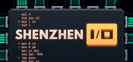
  • Genre Clarity: 8/10 — Programming puzzle clear signal. The capsule immediately communicates a code-based engineering game through visible assembly-like syntax (mul, tcp, mov, sub, jmp commands) and the iconic yellow I/O module schematic in the center. At tiny size, the code snippets remain partially readable and the geometric I/O box is unmistakably recognizable as a circuit interface. The cyan grid and neon aesthetic reinforce tech/programming context perfectly.
  • Title Readability: 9/10 — Bold sans-serif crisp legibility. SHENZHEN appears in large, clean white sans-serif type with excellent contrast against the dark code-filled background, maintaining full legibility at full, small, and tiny sizes. The I/O module icon functions as a visual subtitle and logo anchor, creating a cohesive title treatment. No decorative fonts or competing elements interfere with instant recognition.
  • Contrast & Color: 9/10 — Neon cyan and warm gold pop. Strong value separation between the bright cyan neon grid lines, warm golden-yellow I/O box, and deep near-black background creates immediate visual hierarchy and pop against Steam's #1b2838. The grayscale contrast remains clear with the light text and module standing apart sharply from dark regions. Silhouettes hold solid definition even at tiny size due to saturated neon edges.
  • Uniqueness & Polish: 9/10 — Distinctive tech aesthetic memorable. The capsule avoids generic game imagery by committing fully to a retro-futuristic circuit board and code editor visual identity that directly reflects gameplay. The attention to authentic assembly language syntax, precise neon grid layout, and intentional color palette (cyan, gold, charcoal) signals premium craft and a unique hook. This immediately differentiates it from action-adventure or narrative-focused indie games in competitor lists.
  • Brand Consistency: 9/10 — Iconic grid motif recognizable. The cyan grid pattern, neon accent colors, and I/O module symbol form a distinctive visual language that strongly supports brand identity and would be immediately recognizable in future marketing. The code syntax integration and retro-tech aesthetic create a coherent internal identity that aligns with core gameplay. These elements consistently signal a programming/engineering simulation without any tonal conflict.
  • Composition: 9/10 — Balanced grid with strong focal point. The yellow I/O module sits centered as a clear primary focal point, while code snippets and neon grid create supporting compositional depth without competing for attention. Safe margins are respected, and the layout remains legible and balanced across all size reductions without edge-hugging or wasted space. The layering of background grid, mid-tone code area, and bright module creates natural depth hierarchy.

What works

  • Authentic code syntax storytelling. Real assembly-like commands visible in the background communicate game mechanics and technical authenticity, immediately signaling a programming-focused experience.
  • Iconic I/O module branding. The warm golden circuit board icon functions as a memorable, recognizable symbol that differentiates the game and anchors the title treatment.
  • Neon grid aesthetic distinctiveness. The cyan neon grid and retro-futuristic color palette create a premium, cohesive visual identity that stands apart from typical indie game thumbnails.
  • Excellent legibility at all sizes. Title and key visual elements remain sharp and readable from full header down to tiny thumbnail due to clean typography and high contrast.

What hurts the capsule

  • No human character presence. Unlike top-performing indie capsules with recognizable protagonists, SHENZHEN I/O relies entirely on abstract technical imagery, which may have lower immediate emotional appeal.
  • Code density may obscure at extreme scale. At the tiniest thumbnail size, individual code line details become illegible noise, though the module and grid structure still register visually.

Priority fixes

  1. [No critical fixes required] This is already a high-quality, cohesive capsule with strong genre clarity, excellent contrast, and distinctive branding that performs well across all viewing sizes.

Store copy priority fixes

  1. [feature_communication] Add one sentence clarifying the learning curve or progression—e.g., 'Start with simple logic puzzles and build toward complex multi-component systems' to set expectations for difficulty.
  2. [genre_clarity] Expand the sandbox sentence with a concrete example of what players can create, e.g., 'design everything from simple LED displays to your own playable games.'

Related guides

Steam app ID: 504210 · Tags: Programming, Automation, Puzzle, Logic, Simulation