Scoring genre clarity...
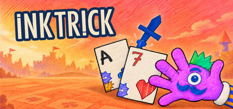
INKTRICK capsule

INKTRICK

INKTRICK is a handcrafted, cozy roguelike card game made of cards, ink and stamps. Win tricks, turn a weak 8 into a trump and unlock new possibilities hand after hand, such as stamp upgrades and mystery packs. Fibus deals, cheers you on and plays against you.

StrategyCard GameRoguelite
zweipilotQ1 2027

INKTRICK scores 87/100 — better than 98% of Strategy capsules (n=6,148).

Released Q1 2027 · By zweipilot

Quick text summary

INKTRICK scored 87/100 on Steam Analyzer — Excellent for a Strategy capsule. Top priority fix: [brand_consistency] Ensure Fibus character appears visibly in future hero images or capsule variants to establish a consistent character-based identity that reinforces game personality

Capsule scores by dimension

  • Genre Clarity: 9/10 — Card game mechanics immediately obvious. Playing cards, suit symbols, and a hand gesture with stamp mechanics are prominently displayed, unmistakably signaling a card-based strategy game. At tiny size, the card silhouettes and hand holding trump remain clearly readable and genre-defining. The visual language directly communicates trick-taking card gameplay without ambiguity.
  • Title Readability: 9/10 — Bold title reads perfectly at all sizes. INKTRICK uses large, clean sans-serif white lettering positioned in the upper left with excellent contrast against the bright blue background. The title remains fully legible at tiny size and does not compete with the illustration, maintaining strong hierarchy throughout all viewing scales.
  • Contrast & Color: 9/10 — Vibrant palette pops strongly. The bright blue background (#5BA3D0 range) provides excellent value separation from the cream-colored cards, orange burst elements, and purple hand. At small and tiny sizes, the warm orange and purple against cool blue create strong silhouette clarity and visual pop even in quick scrolling conditions.
  • Uniqueness & Polish: 8/10 — Handcrafted aesthetic with personality. The illustrative style, textured card design with hand-drawn suit symbols, and playful purple hand character convey a deliberately cozy, indie-crafted experience that aligns with the game's description of being 'handcrafted.' The ink stamp visual motif and organic bursting elements differentiate it from generic card game templates while maintaining clarity.
  • Brand Consistency: 8/10 — Consistent hand-drawn card-centric identity. The capsule establishes a recognizable visual identity through repeated card imagery, consistent use of suit symbols, and the distinctive purple hand character which likely appears throughout brand materials. The warm color palette and illustrated style create internal cohesion that should feel consistent with in-game assets and other promotional materials.
  • Composition: 9/10 — Well-balanced focal points across sizes. The composition uses the title as top-left anchor, centers the card cluster and purple hand as the primary focal point, and distributes orange burst elements as supporting guides. At tiny size, the arrangement remains uncluttered with clear depth layering (background blue, mid-ground cards, foreground hand gesture) and no critical elements endangered by Steam cropping.

What works

  • Instantly recognizable genre signaling. Multiple visible playing cards with suit symbols, stamp mechanics, and a hand gesture immediately communicate a card-based strategy game at any viewing size.
  • Excellent contrast and visual hierarchy. Bright blue background creates strong separation from warm orange and cream card elements, ensuring the design pops in quick scroll and remains clear at tiny thumbnail scale.
  • Coherent illustrative brand voice. The hand-drawn style, textured cards, and playful purple hand character establish a memorable indie aesthetic that feels intentional and premium compared to generic card game templates.
  • Clean, scalable layout. Title positioning, focal point placement, and supporting element distribution maintain clarity and readability across full header, small capsule, and tiny thumbnail sizes without crowding.

What hurts the capsule

  • Slightly busy visual field. The scattered orange burst particles and multiple card angles, while thematically appropriate, could reduce composition focus when mentally squinting or viewing at extreme tiny sizes.
  • No visible character protagonist anchor. While the purple hand is present, there is no clear character face or iconic mascot (like Fibus the dealer mentioned in description) that could serve as a stronger brand recognition anchor across other materials.

Priority fixes

  1. [brand_consistency] Ensure Fibus character appears visibly in future hero images or capsule variants to establish a consistent character-based identity that reinforces game personality
  2. [composition] Test the orange burst particle density at tiny thumbnail scale to confirm no clarity loss when squinting or during fast scrolling on Steam wishlist pages

Store copy priority fixes

  1. [hook_strength] Revise short description to lead: 'INKTRICK is a cozy roguelite card game where magical stamps let you turn weak cards into winners' — front-load gameplay before atmosphere.
  2. [audience_targeting] Add explicit line like 'Perfect for puzzle lovers seeking relaxing strategy without time pressure' to clarify who should buy after reading the detailed description.
  3. [feature_communication] Clarify difficulty progression by adding one sentence: 'Start with a forgiving tutorial, then face increasingly tricky opponents whose random traits demand new strategies each run.'

Related guides

  • Steam page optimisation — Capsule, copy, screenshots, tags — the full Steam page conversion stack.
  • Steam tags guide — Tag selection, ordering, and how it shapes Steam's recommendation rails.

Steam app ID: 5046690 · Tags: Strategy, Card Game, Roguelite, Deckbuilding, Roguelike