Scoring genre clarity...
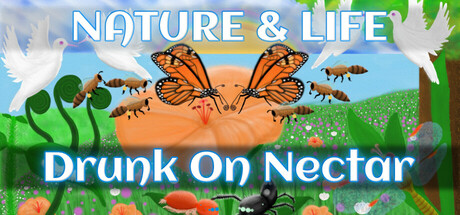
Play as Animals, Live in Nature! Multiple game modes include Realistic Lifecycles, Survival, Sandbox, Fantasy and Exploration. Unique gameplay for each species! Currently featuring Monarch Butterfly, Praying Mantis, Jumping Spider and other iconic creatures. Mammals, Birds, Reptiles coming soon!
$14.99Very Positive(262)
Life SimNatureSurvival
Venugopalan SreedharanMar 6, 2025