Scoring genre clarity...

Drunkn Bar Fight capsule

Drunkn Bar Fight

Drunkn Bar Fight is a simple, immersive, silly, rowdy game. Now with 4 player Co-op! The only limits to the mayhem is your imagination and your moral decency.

$17.99Mostly Positive(982)
ActionIndieVR
The MunkyJul 17, 2025

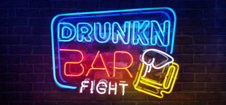
Drunkn Bar Fight scores 78/100 — better than 85% of Action capsules (n=8,534).

Mostly Positive (982 reviews) · $17.99 · Released Jul 17, 2025 · By The Munky

Quick text summary

Drunkn Bar Fight scored 78/100 on Steam Analyzer — Good for a Action capsule. Top priority fix: [genre_clarity] Ensure 'FIGHT' text maintains equal visual weight or add a subtle action-oriented icon (fist, impact effect) to reinforce the combat genre at TINY size.

Capsule scores by dimension

  • Genre Clarity: 7/10 — Casual action with party vibes clear. The neon bar setting, beer mug icon, and 'FIGHT' text immediately signal a bar-based action game with comedic intent. At TINY size, the neon aesthetic and mug silhouette still read as party/drinking game, though the specific 'brawler' subgenre is slightly ambiguous without the context of 'FIGHT' word being readable. The overall tone communicates silly action rather than serious combat.
  • Title Readability: 8/10 — Neon text legible across all sizes. The glowing cyan and red neon lettering provides strong contrast against the dark brick background, maintaining readability at full, small, and tiny sizes. The 'DRUNKN BAR FIGHT' text is clearly spaced and uses a bold, geometric font that doesn't collapse at reduction. The beer mug icon adds visual reinforcement, though the 'FIGHT' word becomes slightly harder to parse at TINY size due to smaller scale and angle.
  • Contrast & Color: 8/10 — Vibrant neon pops against dark background. The cyan, red, yellow, and white neon elements create excellent separation from the dark brick texture and dark blue background (#1b2838 equivalent). The color palette is saturated and uses high value contrast; each color channel reads distinctly even in grayscale. At SMALL and TINY sizes, the neon glow effect and bright silhouettes maintain clarity without blending into the background.
  • Uniqueness & Polish: 8/10 — Distinctive neon bar aesthetic, polished craft. The retro neon sign style is instantly memorable and perfectly aligned with the game's party-brawler tone, differentiating it from generic action game capsules. The glowing tube effect, proportional letter spacing, and beer mug icon integration show intentional craft and visual storytelling that communicates 'silly, social, immersive fun' without looking generic. The cohesive neon execution feels premium and branded rather than templated.
  • Brand Consistency: 8/10 — Iconic neon sign becomes brand identity. The neon sign style is a strong, instantly recognizable visual signature that communicates the game's identity as a rowdy, immersive bar experience. The cyan-red-yellow color trio and vintage neon aesthetic are distinctive and consistent with the game's irreverent tone. This visual treatment is memorable enough to anchor the brand across marketing materials and store pages.
  • Composition: 8/10 — Centered focal point with balanced elements. The neon sign occupies the center of the frame with intentional hierarchical balance; 'DRUNKN BAR' is emphasized in larger cyan text, while 'FIGHT' and the mug icon provide secondary visual anchors on the right. The dark brick texture background doesn't compete with the glowing foreground, and no critical text sits dangerously close to edges. At SMALL and TINY sizes, the neon cluster remains cohesive and the primary message 'bar fight game' reads immediately.

What works

  • High-contrast neon aesthetic. The glowing cyan, red, and yellow lettering stands out sharply against the dark background and maintains readability across all viewing sizes including TINY.
  • Strong brand identity signal. The retro neon sign style is instantly memorable, distinctive, and perfectly aligned with the game's rowdy, immersive bar party tone.
  • Clear visual hierarchy. The centered layout with 'DRUNKN BAR FIGHT' as primary focus and the beer mug icon as secondary element guides the eye effectively without clutter.
  • Intentional typography execution. The geometric, bold neon font doesn't lose legibility at small sizes and the spacing between letters is proportional and readable even at reduction.

What hurts the capsule

  • Genre specificity slightly soft. While 'bar' and 'fight' are clear, the neon aesthetic alone doesn't immediately distinguish this as an action brawler versus a drinking game simulator at TINY size.
  • 'FIGHT' text angle reduces clarity at TINY. The angled placement and smaller scale of the word 'FIGHT' relative to 'DRUNKN BAR' makes it slightly harder to parse when viewed at very small thumbnail sizes.

Priority fixes

  1. [genre_clarity] Ensure 'FIGHT' text maintains equal visual weight or add a subtle action-oriented icon (fist, impact effect) to reinforce the combat genre at TINY size.
  2. [title_readability] Straighten or rebalance the 'FIGHT' word orientation to match the horizontal axis of 'DRUNKN BAR' for consistent readability at all reduction levels.

Store copy priority fixes

  1. [hook_strength] & [genre_clarity] Rewrite the short description to lead with VR platform and core action verb: 'Drunkn Bar Fight is a VR brawler where you throw, smash, and hurl anything you can grab to create bar-wide chaos with up to 4 players.'
  2. [feature_communication] Remove the repetitive 'The only limits to the mayhem' tagline from the detailed description and replace the second and third instances with unique descriptions of specific gameplay scenarios or mechanics.
  3. [audience_targeting] Add 1-2 sentences explicitly addressing the VR experience (hand tracking, controller impact, immersion factor) to help solo players understand the visceral appeal beyond just the premise.

Related guides

Steam app ID: 528550 · Tags: Action, Indie, VR, Fighting, Multiplayer