Scoring genre clarity...

Two Point Hospital capsule

Two Point Hospital

Design stunning hospitals, cure peculiar illnesses and manage troublesome staff as you spread your budding healthcare organisation across Two Point County.

$29.99Very Positive(188)
SimulationManagementMedical Sim
Two Point StudiosAug 29, 2018

Two Point Hospital scores 85/100 — better than 96% of Simulation capsules (n=5,554).

Very Positive (188 reviews) · $29.99 · Released Aug 29, 2018 · By Two Point Studios

Quick text summary

Two Point Hospital scored 85/100 on Steam Analyzer — Excellent for a Simulation capsule. Top priority fix: [composition] Consider adding subtle background detail variation or building silhouettes to create more visual depth and environmental storytelling.

Capsule scores by dimension

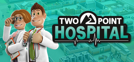
  • Genre Clarity: 9/10 — Exceptional genre and tone clarity. The two smiling doctors in white coats with stethoscopes, medical clipboard, and thermometer instantly communicate healthcare management simulation. The turquoise isometric hospital building layout in the background reinforces the management sim genre immediately. At tiny size, the character silhouettes and medical iconography remain unmistakable.
  • Title Readability: 9/10 — Highly legible logo with strong contrast. The 'TWO POINT HOSPITAL' logo uses bold white text with thick black outline and a distinctive heartbeat icon, positioned center-right on a clear background region. The logo remains readable even at tiny size due to high contrast and strategic placement away from busy background texture. Character positioning does not obscure any text.
  • Contrast & Color: 8/10 — Strong value contrast with cohesive palette. The white doctor coats and pale skin tones create excellent separation against the turquoise building background and dark Steam background #1b2838. The turquoise-to-white gradient provides clear depth layering. At small and tiny sizes, the white characters and black logo outline remain distinctly visible without muddy blending.
  • Uniqueness & Polish: 8/10 — Distinctive character design and premium craft. The stylized 3D character models with exaggerated features, warm skin tones, and confident poses communicate personality and charm that elevates beyond generic management sim templates. The medical props are clearly rendered with intentional detail. The overall execution feels premium and cohesive, not asset-flipped or template-based.
  • Brand Consistency: 8/10 — Recognizable visual identity and style. The warm, friendly character aesthetic with rounded proportions, the turquoise color palette, and the heartbeat icon motif form a distinctive visual signature. The art direction is consistent with a lighthearted, humanistic tone that differentiates it from clinical or darker management sims. These elements create a memorable identity within the genre.
  • Composition: 9/10 — Excellent hierarchy and focal point clarity. The two doctors anchor the left-center focal point with confident, forward-facing poses that immediately draw attention. The logo sits in the right upper area without competing for dominance. The isometric building fills the background effectively without clutter, creating clear depth separation between foreground characters and environment. Safe margins are maintained and no critical elements risk Steam cropping.

What works

  • Strong genre clarity through iconography. Medical props, doctor attire, stethoscopes, and isometric hospital layout instantly communicate management sim healthcare theme.
  • Excellent logo legibility and contrast. Black outline, white text, and heartbeat icon symbol remain readable at all sizes down to tiny thumbnail.
  • Premium character design and polish. Stylized 3D characters with warm personality and detailed props elevate the capsule beyond generic template aesthetics.
  • Clear focal point and composition balance. Two-character anchor draws eye immediately while logo and background support without competing for attention.

What hurts the capsule

  • Limited palette variation in background. Uniform turquoise background, while thematic, offers less visual dynamism than some top-performing competitors with layered environments.
  • No unique mechanic visual hook. While the design is polished, it does not explicitly hint at the quirky 'peculiar illnesses' or comedic management chaos that differentiates the game's core appeal.

Priority fixes

  1. [composition] Consider adding subtle background detail variation or building silhouettes to create more visual depth and environmental storytelling.
  2. [uniqueness_polish] Integrate a visual hint of the game's unique selling point (absurd illnesses or management chaos) through character expression, prop detail, or a thematic background element to increase memorability against competitors.

Related guides

Steam app ID: 535930 · Tags: Simulation, Management, Medical Sim, Building, Funny