Scoring genre clarity...
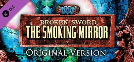
Broken Sword 2: Original Version capsule

Broken Sword 2: Original Version

Broken Sword 2 - the Smoking Mirror, the original game that released in 1997, emulated using ScummVM. This version does not contain the enhanced content or hints from the Remastered version, but offers an authentic experience for fans of the series.

Free to PlayPositive(30)
AdventurePoint & Click
Revolution Software LtdMar 10, 2017

Broken Sword 2: Original Version scores 72/100 — better than 47% of Adventure capsules (n=8,231).

Positive (30 reviews) · Free to Play · Released Mar 10, 2017 · By Revolution Software Ltd

Quick text summary

Broken Sword 2: Original Version scored 72/100 on Steam Analyzer — Good for a Adventure capsule. Top priority fix: [genre_clarity] Add a subtle iconic character silhouette or recognizable Broken Sword visual motif to the background to establish franchise identity and adventure specificity.

Capsule scores by dimension

  • Genre Clarity: 7/10 — Classic adventure clear, mystical vibe. The ornate gold title treatment, mosaic tile background with blues and greens, and glowing mystical orbs clearly signal a classic point-and-click adventure game with supernatural or fantasy elements. At TINY size, the geometric tile pattern and ethereal glow still communicate mystery and adventure, though specific genre subtype becomes less obvious due to the abstract nature of the mosaic imagery.
  • Title Readability: 8/10 — Strong legibility, elegant serif treatment. The main title 'BROKEN SWORD' and 'THE SMOKING MIRROR' use contrasting cream/gold serif text on a rich rust-brown ornate frame with excellent letter spacing and clear hierarchy. The subtitle 'ORIGINAL VERSION' is small but readable on dark background. At TINY size the main title remains legible due to the strong frame container, though the smaller subtitle becomes difficult to parse.
  • Contrast & Color: 8/10 — Vibrant mosaic with strong value separation. The bright cyan, turquoise, and lime green mosaic tiles create sharp value contrast against the warm rust and copper textures, all reading clearly against the dark Steam background. The glowing pink and white orbs provide luminous focal points that stand out in grayscale due to their brightness. At TINY size, the color blocks maintain visual separation and the design does not collapse into muddy mid-tones.
  • Uniqueness & Polish: 7/10 — Distinctive retro-modern treatment, polished craft. The ornate frame with weathered texture, combined with the modern neon mosaic tile aesthetic, creates a visually distinctive mashup that feels intentional and premium rather than generic. The craft is clearly executed with attention to texture, lighting, and color harmony. However, the design leans on decorative elements rather than communicating a specific mechanic or unique selling point beyond 'classic adventure remaster.'
  • Brand Consistency: 6/10 — Consistent style, limited signature identity. The ornate frame and color palette are cohesive and feel deliberately crafted for this specific release, but without reference to the original 1997 game's visual identity or recognizable brand icons, the design reads as a generic prestige adventure package rather than a distinctive Broken Sword signature. The mosaic and orbs are visually consistent within this capsule but do not establish a memorable character or symbol unique to the series.
  • Composition: 7/10 — Balanced focal point with clear hierarchy. The centered ornate frame containing the title acts as the primary focal point, with the glowing orbs and mosaic background providing supporting visual interest without overwhelming the hierarchy. The layout respects safe margins and the title remains well-positioned across all sizes. At TINY size, the frame container keeps the text legible and the overall composition reads as intentional, though fine detail in the mosaic becomes abstract noise.

What works

  • Title framing strategy. The ornate rust-brown frame creates a strong container that protects text legibility at all sizes and adds perceived premium value.
  • Color contrast and vibrancy. The turquoise, lime, and magenta tones create vibrant separation against the dark Steam background and maintain clarity even at tiny thumbnail sizes.
  • Polished texture work. The weathered ornate frame and detailed mosaic tiles demonstrate intentional craft and avoid the cheap-asset trap common in less-polished capsules.

What hurts the capsule

  • Generic adventure signaling. While visually polished, the mosaic and orb imagery do not clearly communicate what makes Broken Sword distinct—it reads as a generic mystical adventure rather than a specific franchise.
  • Small subtitle legibility at TINY. The 'ORIGINAL VERSION' tagline becomes nearly illegible at thumbnail size and adds noise without clear communicative value.
  • Abstract background detail. The ornate mosaic pattern becomes visual noise at TINY sizes, reducing the elegance and clarity of the overall composition.

Priority fixes

  1. [genre_clarity] Add a subtle iconic character silhouette or recognizable Broken Sword visual motif to the background to establish franchise identity and adventure specificity.
  2. [title_readability] Remove or simplify the 'ORIGINAL VERSION' subtitle, or integrate it into the main frame at a more readable scale.
  3. [uniqueness_polish] Introduce a signature element—such as a protagonist figure or adventure-specific prop—to differentiate this from generic prestige adventure capsules and strengthen brand recall.

Store copy priority fixes

  1. [hook_strength] Rewrite the opening to lead with the central conflict or intrigue (e.g., 'Uncover an ancient conspiracy across Europe and Mexico in this classic point-and-click adventure') rather than emulation details.
  2. [feature_communication] Add a dedicated detailed description that lists core gameplay elements: puzzle types, exploration, dialogue-driven story, locations, character relationships, and tone—currently all absent.
  3. [uniqueness] Explain why this original version matters: historical significance, nostalgia value, a specific narrative or mechanical element that defined the series, or what distinguishes it beyond 'it is the 1997 version.'
  4. [audience_targeting] Add a sentence welcoming newcomers and briefly explaining the appeal of classic point-and-click adventure games, not just existing fans.

Related guides

Steam app ID: 580440 · Tags: Adventure, Point & Click