Scoring genre clarity...
Empires in Ruins capsule

Empires in Ruins

The bastard child of Grand Strategy and Tower Defense, with a black humor infused plot, set in a grim, disillusioned world. Quell the rebellion, tame the Western Marches, disobey your orders and save your brandy. Not strictly in this order.

$3.59Mostly Positive(105)
WargameSandboxTower Defense
Hammer & RavensMar 25, 2021

Empires in Ruins scores 72/100 — better than 51% of Wargame capsules (n=437).

Mostly Positive (105 reviews) · $3.59 · Released Mar 25, 2021 · By Hammer & Ravens

Quick text summary

Empires in Ruins scored 72/100 on Steam Analyzer — Good for a Wargame capsule. Top priority fix: [uniqueness_polish] Introduce a distinctive character trait or visual quirk—such as a recognizable protagonist pose, scar, emblem, or comedic prop (e.g., brandy bottle silhouette)—that hints at the game's irreverent tone and sets it apart from generic RTS.

Capsule scores by dimension

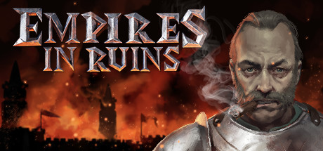
  • Genre Clarity: 8/10 — Clear strategy setting with medieval warfare. The burning castle silhouette, armored soldier with sword, and orange inferno immediately signal a medieval strategy or tactical game with serious tone. At TINY size the burning tower and warrior figure remain recognizable, though the exact blend of grand strategy and tower defense is not fully obvious from visuals alone. The grim, disillusioned aesthetic matches the game's dark humor pitch.
  • Title Readability: 7/10 — Readable metallic title with minor small-size softening. EMPIRES IN RUINS uses a bold, silver-chrome serif font with orange/copper beveling that contrasts well against the dark fiery background. The title remains legible at SMALL size and mostly readable at TINY, though the metallic 3D effect and letter spacing introduce slight softening that reduces crispness at minimal resolution. Placement in the upper-center region on a controlled background zone supports retention across scales.
  • Contrast & Color: 8/10 — Strong warm-cool separation with clear silhouettes. The bright orange and amber fire gradient against the dark brown-black sky creates excellent value separation. The armored character on the left and tower elements hold sharp silhouettes with clear edges in both color and grayscale. At TINY size the warm fire glow still reads distinctly, and the soldier figure maintains definition without merging into the murk.
  • Uniqueness & Polish: 7/10 — Polished medieval RTS aesthetic, somewhat familiar. The metallic chrome typography and cinematic fire destruction setup feel crafted with attention to detail and premium rendering. However, the visual language—burning fortress, armored warrior, warm apocalyptic fire—aligns closely with dozens of strategy and RTS games, making it competent but not distinctly memorable. The black humor and brandy-saving plot are not visually telegraphed in the capsule.
  • Brand Consistency: 6/10 — Consistent grim medieval tone without iconic markers. The armored figure, metallurgical title treatment, and dark flames create visual cohesion and reinforce the serious strategy setting. However, there are no distinctive character markers, signature symbols, or unique palette cues that would make this capsule instantly recognizable as Empires in Ruins versus other medieval strategy titles. Internal elements align well, but brand identity is generic within genre conventions.
  • Composition: 7/10 — Balanced focal hierarchy with minor edge hazards. The soldier on the left and burning tower in center-right create a clear depth structure with foreground subject, midground detail, and background inferno. Title placement is strategic and doesn't compete for attention. However, the right edge of the tower approaches the crop boundary, risking truncation on platform cropping, and the lower third feels slightly empty. Overall hierarchy reads well at SMALL and TINY scales.

What works

  • Excellent contrast against dark background. Warm orange fire and bright metallic title pop cleanly against the #1b2838 Steam background with strong silhouette separation.
  • Clear strategic warfare aesthetic. Medieval soldier, burning castle, and destruction imagery immediately signal a tactical or grand strategy game without ambiguity.
  • Polished metallic typography treatment. The silver-chrome beveled font with orange accents conveys premium production and intentional craft.
  • Readable at multiple scale sizes. Title and primary elements remain legible down to TINY thumbnail size with only minor softening in metallic detail.

What hurts the capsule

  • Generic strategy-game visual language. Burning fortress and armored warrior are overused tropes in RTS, strategy, and medieval games, offering no distinctive identity.
  • Black humor and unique setting not telegraphed. The capsule reads as standard medieval warfare rather than hinting at brandy-fueled rebellion, disobedience, or the game's irreverent tone.
  • Tower element risks edge cropping. The burning castle silhouette on the right edge approaches Steam crop boundaries and may be partially cut on some platforms.
  • Lower composition area underutilized. The bottom third of the frame contains mostly dark sky with no supporting secondary elements, creating slight compositional imbalance.

Priority fixes

  1. [uniqueness_polish] Introduce a distinctive character trait or visual quirk—such as a recognizable protagonist pose, scar, emblem, or comedic prop (e.g., brandy bottle silhouette)—that hints at the game's irreverent tone and sets it apart from generic RTS.
  2. [composition] Shift the burning tower and soldier slightly left to create safe margin clearance on the right edge and reduce crop risk across platforms.
  3. [brand_consistency] Add a recurring symbol, emblem, or color accent (e.g., a heraldic motif, unit insignia, or brandy-related icon) that could become a recognizable brand marker across future marketing assets.
  4. [contrast_color] Intensify the orange fire glow at the lower frame edge or introduce warm embers in the underutilized bottom-third area to create fuller compositional coverage and visual interest.

Store copy priority fixes

  1. [feature_communication] Add a 1-2 sentence explanation of real-time combat flow: 'In real-time battlefield phases, you place towers, manage resources, and deploy officers while enemies probe your defenses across multiple paths' to clarify the RTS-TD hybrid.
  2. [genre_clarity] Restructure the detailed description to open with gameplay loop: lead with 'manage your empire on the turn-based map, then fight battles in real-time tower defense combat' before worldbuilding, so core activity is immediately clear.
  3. [audience_targeting] Add a sentence specifying difficulty or player type: 'Built for strategy veterans seeking a plot-driven campaign with tactical depth, but Arcade mode welcomes tower defense fans new to grand strategy.'
  4. [feature_communication] Clarify the scope of empire management: specify how many provinces exist, what governor betrayal/execution mechanics actually do mechanically, and how resource flows fuel military campaigns in concrete terms.

Related guides

Steam app ID: 604510 · Tags: Wargame, Sandbox, Tower Defense, City Builder, RTS