PC Building Simulator scores 83/100 — better than 92% of Simulation capsules (n=6,076).

Quick text summary

PC Building Simulator scored 83/100 on Steam Analyzer — Good for a Simulation capsule. Top priority fix: [genre_clarity] Consider adding a subtle UI element (workbench, store counter, or diagnostic tool) to reinforce the 'repair enterprise' and business simulation layer beyond pure building.

Capsule scores by dimension

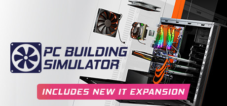
  • Genre Clarity: 9/10 — PC building instantly recognizable. The capsule immediately communicates simulation and PC building through real hardware components—CPU cooler, GPU with RGB lighting, case internals, and tools. At TINY size, the orange case and distinctive hardware arrangement remain unmistakably clear and genre-specific.
  • Title Readability: 9/10 — Bold logo anchors full visibility. The 'PC BUILDING SIMULATOR' title uses a clean, bold sans-serif with strong contrast against the light background, positioned clearly in the upper left. The logo remains fully legible even at TINY size, and the expansion tagline in the magenta banner maintains readability without crowding.
  • Contrast & Color: 8/10 — Strong value separation throughout. The light gray/white background creates excellent contrast against the dark hardware and orange case elements, with RGB lighting providing saturated accent colors. At SMALL and TINY sizes, the dark PC interior and bright RGB strips maintain clear silhouette separation that pops against the Steam dark background.
  • Uniqueness & Polish: 8/10 — Premium authentic hardware showcase. The capsule leverages real licensed PC components and an open-case perspective that immediately differentiates it from generic simulation games; the composition feels purposeful and professional rather than template-based. The inclusion of actual tools and detailed internals communicates the game's depth and authenticity.
  • Brand Consistency: 8/10 — Coherent tech-forward identity. The design maintains consistent rendering of realistic hardware, clean typography, and a professional tech aesthetic that aligns with the brand promise of authentic PC building. The orange accent color and hardware-focused framing create recognizable identity cues that would carry across marketing materials.
  • Composition: 8/10 — Balanced hierarchy with clear focal point. The logo anchors the left side while the open PC case occupies the dynamic center-right, creating strong focal depth with background/foreground separation. The magenta banner at the bottom provides call-to-action without overwhelming the composition, and critical elements remain safely within crop margins.

What works

  • Authentic hardware authenticity. Real licensed PC components immediately signal legitimacy and appeal to the core builder audience, differentiating from generic simulation visuals.
  • Clarity at small scales. The logo, case interior, and RGB lighting all remain clearly readable and distinctive even at TINY thumbnail size during quick scrolling.
  • Professional visual hierarchy. The left-aligned logo and centered hardware create balanced composition with a clear primary subject that doesn't feel cluttered or scattered.
  • Vibrant accent color strategy. The orange case and RGB lighting provide saturated visual interest that makes the capsule stand out against competitors without oversaturating the palette.

What hurts the capsule

  • Light background dependency. The design relies heavily on the light gray background for contrast; if cropped differently or displayed on certain backgrounds, some detail readability could suffer.
  • Minimal story or context. While the hardware is authentic and clear, the capsule doesn't communicate the 'grow your repair enterprise' narrative or convey gameplay progression and business simulation aspects.

Priority fixes

  1. [genre_clarity] Consider adding a subtle UI element (workbench, store counter, or diagnostic tool) to reinforce the 'repair enterprise' and business simulation layer beyond pure building.
  2. [uniqueness_polish] Add a subtle badge or icon indicating 'licensed components' or the expansion feature to increase perceived premium value and uniqueness.

Store copy priority fixes

  1. [hook_strength] Rewrite the short description opening to lead with the aspirational or relatable emotion: 'Finally build the gaming PC you've always dreamed of—or turn your PC passion into a thriving repair business' to create immediate resonance before explaining mechanics.
  2. [feature_communication] Restructure the detailed description into scannable sections (Career Mode, Building & Customization, Educational Features, Post-Build Gameplay) so players can quickly identify which features match their interests.
  3. [uniqueness] Add a sentence explicitly comparing this to alternatives: 'Unlike generic PC builders, PC Building Simulator uses real, licensed hardware from actual manufacturers and layers a business-management game on top—making it the only game where you truly run a PC empire.' to sharpen differentiation.
  4. [tone_match] Replace 'lovingly developed into a fully-fledged simulation' with a more direct, personality-driven statement reflecting indie passion: 'Built by PC enthusiasts, for PC enthusiasts and curious newcomers alike' to feel less corporate.

Related guides

Steam app ID: 621060 · Tags: Simulation, Education, Immersive Sim, Building, Management