Scoring genre clarity...

Injustice™ 2 capsule

Injustice™ 2

Build and power up the ultimate version of your favourite DC legends in INJUSTICE 2. This is your Legend. Your Journey. Your Injustice.

$49.99Very Positive(106)
FightingActionSuperhero
NetherRealm Studios, QLOCNov 30, 2017

Injustice™ 2 scores 87/100 — better than 80% of Fighting capsules (n=236).

Very Positive (106 reviews) · $49.99 · Released Nov 30, 2017 · By NetherRealm Studios

Quick text summary

Injustice™ 2 scored 87/100 on Steam Analyzer — Excellent for a Fighting capsule. Top priority fix: [uniqueness_polish] Consider subtle motion blur or glow enhancement on armor highlights to increase premium cinematic feeling at small sizes

Capsule scores by dimension

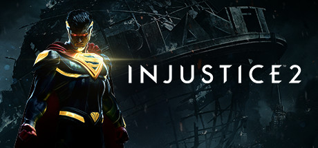
  • Genre Clarity: 9/10 — Superhero fighting game instantly readable. The iconic Superman-like character in gold and red armor with cape, dramatic heroic pose, and glowing energy effects immediately signal a high-stakes action fighting game. At tiny size, the silhouette of the armored figure with cape remains unmistakable and conveys power and combat heritage. The DC superhero aesthetic is the primary visual hook that dominates genre recognition.
  • Title Readability: 9/10 — Bold title placement reads perfectly small. INJUSTICE 2 is positioned in clean white sans-serif type on the right side against a dark, relatively uncluttered background. The letterforms maintain full clarity at small and tiny sizes due to generous tracking and bold weight. The strategic placement away from the character silhouette ensures the text never competes with or gets obscured by the hero.
  • Contrast & Color: 9/10 — Strong light-dark separation throughout. The gold and red armor on the character creates warm highlights that pop decisively against the cool dark teal and black industrial background. White title text contrasts sharply against the dark midtones. The glowing energy effects around the shoulders add additional luminous separation that remains visible even at tiny sizes and in grayscale squint test.
  • Uniqueness & Polish: 8/10 — Premium DC character showcase polish. The capsule demonstrates high production value with professional character rendering, intentional lighting design on the armor, and a cinematic composition that feels polished rather than templated. The industrial destructible background adds depth and context without feeling generic. While character-focused hero showcases are common in the fighting game space, the execution here is refined and premium-tier.
  • Brand Consistency: 8/10 — Strong DC identity with game branding. The Superman analog character in recognizable iconic costume, paired with the clean white INJUSTICE 2 logo, creates clear brand recognition for both the DC license and the game franchise. The color palette of gold armor, red cape, and cool industrial grays appears consistent with other Injustice marketing materials. The visual identity signals 'premium DC fighting game' effectively.
  • Composition: 9/10 — Excellent hierarchy with clear focal point. The character occupies the left-center primary zone with a strong heroic pose that draws immediate focus, while the title text anchors the right side without competing for attention. The layered background from foreground armor details to mid-tone industrial structures to dark sky creates effective depth. Safe margins protect critical elements from Steam cropping, and the asymmetrical balance feels intentional and premium.

What works

  • Iconic character silhouette. The recognizable superhero armor and cape create instant visual identity that reads flawlessly at all sizes and communicates the fighting game genre clearly.
  • Clean typography placement. White sans-serif title positioned on negative space background ensures perfect readability from full size down to tiny thumbnail without contrast loss.
  • Cinematic lighting and polish. Professional character rendering with glowing armor highlights and dramatic lighting creates a premium, high-production-value impression distinct from generic fighting game templates.
  • Strong value contrast hierarchy. The warm gold and red character against cool dark background provides excellent separation that survives grayscale conversion and quick-scroll evaluation.

What hurts the capsule

  • Background detail competes slightly at scale. The industrial structure background, while atmospheric, adds visual noise that dilutes focus slightly at small sizes, though this is minor compared to strengths.
  • Tagline omitted from capsule. The game description 'This is your Legend' or similar marketing messaging is absent from the visual, missing an opportunity for emotional narrative hook at full size.

Priority fixes

  1. [uniqueness_polish] Consider subtle motion blur or glow enhancement on armor highlights to increase premium cinematic feeling at small sizes
  2. [composition] Ensure critical title pixels maintain minimum safe margin of 10px from all edges to prevent Steam UI cropping across all contexts

Store copy priority fixes

  1. [hook_strength] Replace the generic tagline with a specific story or gameplay hook—e.g., 'Master iconic DC heroes' unique move sets or unlock legendary gear that transforms your playstyle.'
  2. [uniqueness] Expand the gear progression system explanation to clarify what makes it distinct—e.g., 'Gear-based progression lets you customize builds and playstyles in ways traditional fighting games cannot,' or compare it explicitly to peer titles.
  3. [feature_communication] Add 1–2 sentences describing the story campaign's scope, stakes, and narrative structure to justify the 'Story Rich' tag and give single-player-focused players a reason to engage.

Related guides

Steam app ID: 627270 · Tags: Fighting, Action, Superhero, Multiplayer, Local Multiplayer