Scoring genre clarity...

Sir Noggin capsule

Sir Noggin

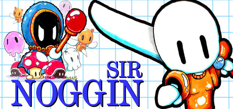
Sir Noggin is a platformer inspired by the glorious 8-bit days and in the style of the Master System. Relive the days where the controllers only had a couple of buttons and you'd have to re-tune in your television sets. 

$3.99Positive(29)
ActionAdventureAction-Adventure
Sinclair StrangeNov 5, 2025

Sir Noggin scores 73/100 — better than 58% of Action capsules (n=8,535).

Positive (29 reviews) · $3.99 · Released Nov 5, 2025 · By Sinclair Strange

Quick text summary

Sir Noggin scored 73/100 on Steam Analyzer — Good for a Action capsule. Top priority fix: [composition] Rebalance focal point distribution by shifting character left and title right, or scaling character slightly smaller to open negative space and improve visual equilibrium.

Capsule scores by dimension

  • Genre Clarity: 8/10 — Clear retro platformer identity. The capsule immediately communicates a 2D platformer through the large cartoon character silhouette, colorful enemy sprites (bomb, mushroom, small creatures), and bright primary colors typical of 8-bit aesthetics. At TINY size, the character pose and enemy cluster still register as classic platformer action, though fine details blur. The grid background reinforces the retro digital feel and helps establish genre authenticity.
  • Title Readability: 7/10 — Strong title with solid contrast. SIR NOGGIN uses bold blue lettering positioned in the lower-left, providing clear separation from the white background grid and character elements. The title reads cleanly at FULL and SMALL sizes with good letter spacing and weight. At TINY size, the text becomes compressed but remains legible due to high contrast and bold weight, though individual letter precision is lost.
  • Contrast & Color: 8/10 — Vibrant colors with strong value separation. The capsule uses bright saturated colors—orange, blue, red, pink, cyan—that pop effectively against white background and would stand out against Steam's dark #1b2838. Character silhouettes maintain clear definition through solid fills and bold outlines. At TINY size, the color clustering and bold shapes still separate, though individual element edges blur slightly.
  • Uniqueness & Polish: 7/10 — Charming retro style with personality. The art direction is deliberately stylized as authentic 8-bit pastiche with chunky pixels, simple geometry, and nostalgic color choices that differentiate it from modern indie platformers. The large rounded character head and expressive design convey charm and approachability rather than dark or complex themes. Character and enemy assets feel intentional and polished, though the overall composition could suggest higher visual innovation beyond nostalgic homage.
  • Brand Consistency: 7/10 — Cohesive retro aesthetic throughout. The capsule maintains consistent pixel art style, rounded character design language, and bright primary palette that align with Master System-era visual expectations. The grid background and chunky sprite rendering reinforce a unified retro brand identity. Without viewing the five store screenshots, the visual identity feels recognizable and distinctive within the retro platformer space, though the character itself is the primary memorable hook rather than a unique symbol or motif.
  • Composition: 7/10 — Clear focal point with balanced layout. The large character head dominates the right side as the primary focal point, while enemies and title occupy supporting roles on the left and lower areas. The grid background provides visual structure without competing for attention. At SMALL and TINY sizes, the character silhouette remains the clear hero, and title placement does not overlap key elements, though the composition leans right-heavy and could feel slightly unbalanced in dense Steam browsing contexts.

What works

  • Instant genre recognition. The combination of pixel art style, colorful enemy sprites, and character pose immediately signals 8-bit platformer without ambiguity.
  • Bold readable title treatment. SIR NOGGIN in solid blue maintains legibility from FULL down to TINY size due to weight, contrast, and strategic lower-left placement away from clutter.
  • Vibrant color palette. Bright oranges, blues, reds, and pinks create eye-catching appeal and strong separation against Steam's dark background.
  • Cohesive retro authenticity. Grid background, pixel art rendering, and nostalgic color choices reinforce a unified Master System-inspired visual identity.

What hurts the capsule

  • Right-heavy composition. Large character dominates right side while title and supporting elements cluster left, creating imbalanced spatial distribution.
  • Limited visual innovation. While well-executed, the capsule leans heavily on retro pastiche without communicating a unique mechanical hook or standout gameplay feature.
  • No signature brand symbol. The character design is charming but lacks a distinctive icon or motif that would make the game instantly recognizable in isolation.

Priority fixes

  1. [composition] Rebalance focal point distribution by shifting character left and title right, or scaling character slightly smaller to open negative space and improve visual equilibrium.
  2. [uniqueness_polish] Add a distinctive gameplay element or mechanical visual cue (e.g., a sword swing, power-up aura, or unique environment detail) to differentiate beyond generic retro homage.
  3. [brand_consistency] Develop a signature character marking or color accent that could serve as a recognizable brand symbol across future marketing and promotional materials.

Store copy priority fixes

  1. [hook_strength] Replace the opening sentence with an action-focused hook that leads with core gameplay—e.g., 'Slash through pixel-perfect platforming challenges with your gigantic sword and topple the evil Wizard Derek's minions' instead of starting with nostalgia and hardware references.
  2. [uniqueness] Add a sentence articulating the game's distinct mechanics or appeal—e.g., 'Combine melee combat with tight platforming' or 'Master your sword timing to overcome both enemies and environmental hazards' to differentiate from other retro platformers.
  3. [feature_communication] Expand power-up descriptions to explain what each does—e.g., 'Five power-ups including shield, speed boost, and invincibility to overcome different stage challenges' so players understand their strategic role.
  4. [audience_targeting] Add a sentence signaling accessibility and broader appeal—e.g., 'Whether you grew up with the Master System or are discovering retro platforming for the first time, Sir Noggin offers a welcoming challenge curve' to include modern and casual players.

Related guides

Steam app ID: 628360 · Tags: Action, Adventure, Action-Adventure, Arcade, Platformer