Scoring genre clarity...

Maneater capsule

Maneater

Experience the ultimate power fantasy as the apex predator of the seas - a giant Shark! Terrorize the coastal waterways. Tear swimmers and divers limb from limb, give the humans a reason to fear you!

$39.99Very Positive(415)
Open WorldDark HumorViolent
Tripwire InteractiveMay 25, 2021

Maneater scores 88/100 — better than 98% of Open World capsules (n=2,121).

Very Positive (415 reviews) · $39.99 · Released May 25, 2021 · By Tripwire Interactive

Quick text summary

Maneater scored 88/100 on Steam Analyzer — Excellent for a Open World capsule. Top priority fix: [composition] Reduce secondary particle count or blur distant debris slightly to ensure shark remains the unambiguous single focal point at small and tiny sizes.

Capsule scores by dimension

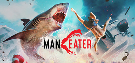
  • Genre Clarity: 9/10 — Chaotic action adventure immediately clear. The giant shark mid-attack with open jaws, human figures in distress, explosive destruction, and dynamic debris field instantly communicate an action-driven predator game. At tiny size, the shark silhouette and human panic remain unmistakable, clearly signaling an action adventure with comedic chaos as the core hook.
  • Title Readability: 8/10 — Logo readable with clever design integration. The 'MANEATER' text uses bold black sans-serif lettering with a red shark-mouth graphic replacing the 'E', creating strong contrast against the light sky background. At small and tiny sizes, the text remains legible and the shark-mouth pun works as a memorable logo anchor, though the red accent becomes slightly less distinct at thumbnail scale.
  • Contrast & Color: 9/10 — Excellent value separation and silhouette clarity. Bright turquoise-blue sky background creates strong luminance contrast against the tan-brown shark body, human flesh tones, and dark wreckage debris. The logo text in black and red pops crisply against the midtone blue, and grayscale simulation shows excellent edge definition between all key elements even at tiny sizes.
  • Uniqueness & Polish: 9/10 — Premium craft with distinctive comedic hook. The capsule combines professional-quality 3D rendering of the shark and destruction with a clear comedic tone—the role reversal of apex predator is the unique selling point, not a generic creature attack. The shark's exaggerated open-mouth expression, the desperate human poses, and the chaotic particle effects all reinforce the 'power fantasy' premise with polish and intentional art direction.
  • Brand Consistency: 9/10 — Iconic shark character with consistent identity. The large, distinctive shark becomes the brand anchor—aggressive, memorable, and consistent with the predator-focused gameplay identity. The warm explosion tones, blue water environment, and comedic tone align with the game's tone across marketing materials, creating immediate visual recognition that this is Maneater's unique property.
  • Composition: 9/10 — Balanced depth hierarchy with strong focal point. The shark anchors the left-center composition with the human figures and destruction supporting it in a clear background-midground-foreground layering that reads at all sizes. The 'MANEATER' logo is strategically placed in the center-right without obscuring the shark, and important elements avoid edge-crop zones; even at tiny size, the shark silhouette and title remain the dominant read.

What works

  • Instantly recognizable power fantasy premise. The reversed predator-prey dynamic with humans in panic communicates the core appeal immediately and sets Maneater apart from generic action games.
  • Shark-mouth logo integration is clever and readable. The red shark-mouth replacing the 'E' in MANEATER is both a visual pun and a strong brand recognition device that works even at thumbnail scale.
  • Strong chromatic contrast against dark Steam background. The bright sky and turquoise tones ensure the entire capsule pops against the #1b2838 Steam background with no muddy midtones.
  • Clear depth and composition hierarchy. Layering of shark, humans, wreckage, and sky creates a natural focal point that guides the eye and maintains clarity at all viewing sizes.

What hurts the capsule

  • Busy particle field risks visual clutter at small size. The scattered debris and explosion particles, while visually impressive at full size, become slightly noisy when compressed to small thumbnail, potentially reducing the shark as the sole focal point.
  • Logo placement slightly splits composition focus. While readable, the centered 'MANEATER' logo competes subtly with the shark silhouette for attention in the composition rather than reinforcing it as a supporting element.

Priority fixes

  1. [composition] Reduce secondary particle count or blur distant debris slightly to ensure shark remains the unambiguous single focal point at small and tiny sizes.
  2. [contrast_color] Verify the red shark-mouth logo maintains saturation and edge definition in compressed JPEG at 120x45 pixels to confirm readability at extreme thumbnail scale.

Store copy priority fixes

  1. [feature_communication] In the "Diverse, Compelling Combat" section, add a sentence explaining the core combat loop: e.g., 'Lock onto enemies, dodge and circle-strafe, execute devastating bite and special ability attacks as you grow stronger.' This gives players a mental model of how they actually play.
  2. [feature_communication] Expand "Evolve Into a Legend" with a concrete example of evolutionary choices: e.g., 'Specialize your shark as an armored tank, a speedy hunter, or a venomous killer by combining biological upgrades and equipment.' This clarifies the depth of customization.
  3. [audience_targeting] Add one sentence to the opening or end of the detailed description that clarifies intended audience, such as: 'Perfect for players who love power fantasy, dark humor, and bite-sized action sessions in a living open world.' This helps self-selection.

Related guides

Steam app ID: 629820 · Tags: Open World, Dark Humor, Violent, Underwater, Nature