Scoring genre clarity...

Risk of Rain 2 capsule

Risk of Rain 2

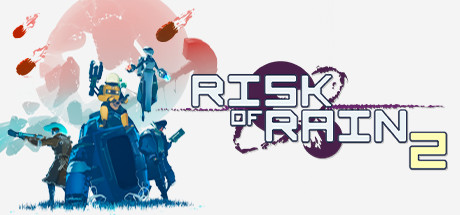
Escape a chaotic alien planet by fighting through hordes of frenzied monsters – with your friends, or on your own. Combine loot in surprising ways and master each character until you become the havoc you feared upon your first crash landing.

$8.24Overwhelmingly Positive(1,520)
Third-Person ShooterAction RoguelikeMultiplayer
Hopoo GamesAug 11, 2020

Risk of Rain 2 scores 63/100 — better than 5% of Third-Person Shooter capsules (n=530).

Overwhelmingly Positive (1,520 reviews) · $8.24 · Released Aug 11, 2020 · By Hopoo Games

Quick text summary

Risk of Rain 2 scored 63/100 on Steam Analyzer — Solid for a Third-Person Shooter capsule. Top priority fix: [title_readability] Increase title font weight or add a subtle glow/shadow effect to maintain legibility and presence at thumbnail scales without losing the geometric aesthetic.

Capsule scores by dimension

  • Genre Clarity: 7/10 — Action gameplay evident, sci-fi setting clear. The capsule communicates action-adventure through character silhouettes in combat poses, visible weapons, and a sci-fi alien landscape with grass and ruins. At tiny size, the blue-toned character group and chaotic composition read as action-oriented, though the exact roguelike/looter mechanics are not immediately obvious from visuals alone. The setting is distinctly sci-fi and hostile, which aligns with the genre.
  • Title Readability: 6/10 — Title readable at full, diminishes at tiny. The 'RISK OF RAIN 2' title uses a clean, geometric outline font positioned in the upper-center area with decent contrast against the soft pink circular background. At small and tiny sizes, the letterforms remain legible but the visual impact weakens considerably, and the thin outline style loses crispness. The placement over a controlled background region is strategic, but the font weight could be heavier for stronger presence at thumbnail scales.
  • Contrast & Color: 7/10 — Good separation with soft gradient base. The capsule uses a warm-to-cool gradient (pink to teal/blue) that provides clear value separation from the Steam dark background #1b2838. The blue characters in the lower section and teal accent colors contrast well against the lighter gradient. At tiny size the silhouette separation holds up adequately, though the soft gradient and multiple mid-tone areas reduce the crispness that would earn a higher score.
  • Uniqueness & Polish: 6/10 — Competent composition, generic action setup. The capsule shows polished execution with clean character rendering, layered depth, and professional gradient work, but the core concept—characters posed heroically against an alien landscape—is a common template in action game marketing. The visual storytelling communicates 'squad-based action' without a distinctive hook that separates Risk of Rain 2's unique roguelike identity or escalating difficulty mechanics. The craft is solid but the concept lacks memorable specificity.
  • Brand Consistency: 5/10 — Visual style present, limited identity cues. The color palette (cool teals and blues with warm accents) and character design style are internally cohesive, suggesting a recognizable art direction. However, without reference to other official capsules or in-game assets, the visual identity does not convey a strong memorable brand signal—no distinctive character silhouette, logo motif, or signature visual hook that would be instantly recognizable as Risk of Rain 2 across multiple marketing materials. The gradient and character style feel appropriate but generic to the action-adventure space.
  • Composition: 7/10 — Clear focal group with layered depth. The composition places the three-character group as the primary focal point in the lower-center, with supporting elements (projectiles, distant figures) creating secondary interest without overwhelming. Depth layering between background, character group, and foreground elements is effective. At small and tiny sizes, the character cluster reads clearly as the main subject, though some scattered projectile details on the edges risk visual noise that could reduce clarity under quick scroll.

What works

  • Layered depth composition. Clear foreground-midground-background separation with the character group anchoring attention and landscape providing context.
  • Color gradient effectiveness. The warm-to-cool gradient transitions smoothly and provides strong contrast against the Steam dark background without harsh edges.
  • Character pose clarity. The three-character silhouettes in varied poses read distinctly as action-oriented and convey squad gameplay at all sizes.

What hurts the capsule

  • Generic action template. The heroic team pose against an alien landscape is a common marketing approach that does not differentiate Risk of Rain 2's unique roguelike or escalating challenge mechanics.
  • Title font weight at scale. The thin outline style of 'RISK OF RAIN 2' loses visual impact and crispness significantly at small and tiny sizes, reducing discoverability in thumbnail contexts.
  • Scattered projectile details. The floating projectiles and secondary elements on the capsule edges introduce visual clutter that diverts attention from the primary focal point under quick-scroll conditions.

Priority fixes

  1. [title_readability] Increase title font weight or add a subtle glow/shadow effect to maintain legibility and presence at thumbnail scales without losing the geometric aesthetic.
  2. [uniqueness_polish] Introduce a distinctive visual hook—such as an iconic character design, equipment variation, or loot visual motif—that signals Risk of Rain 2's unique roguelike and progression identity rather than generic squad action.
  3. [composition] Reduce or refine floating projectile elements to minimize edge clutter and strengthen focus on the character group as the singular primary subject.

Store copy priority fixes

  1. [uniqueness] Add a sentence explaining what Risk of Rain 2 does differently with its scaling or item system compared to other action roguelikes—e.g., 'exponential difficulty keeps late-game runs unpredictable and rewarding' or 'item interactions create thousands of unique build paths.'
  2. [feature_communication] Clarify the scaling system's mechanical impact in the 'SURVIVE' section—specify whether the game has a difficulty ceiling or if runs can theoretically continue indefinitely with meaningful progression.
  3. [audience_targeting] Add one sentence in the short description or opening section that signals whether this is beginner-friendly or aimed at roguelike veterans, given the 110-item complexity.

Related guides

Steam app ID: 632360 · Tags: Third-Person Shooter, Action Roguelike, Multiplayer, Co-op, Roguelite