Scoring genre clarity...

Psychic Isolation Episode 1 capsule

Psychic Isolation Episode 1

Your mother sent you off to your holiday with a warm goodbye ... But when you return, nothing in your house feels warm anymore

$1.296 user reviews
ActionIndieViolent
thiefbug, NocthulusAug 11, 2025

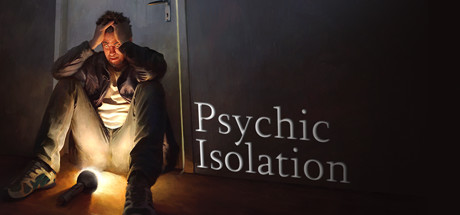
Psychic Isolation Episode 1 scores 62/100 — better than 3% of Action capsules (n=8,534).

6 user reviews · $1.29 · Released Aug 11, 2025 · By thiefbug

Quick text summary

Psychic Isolation Episode 1 scored 62/100 on Steam Analyzer — Solid for a Action capsule. Top priority fix: [genre_clarity] Add a subtle visual element (UI, object, or environmental detail) that signals the specific game mechanic or psychic/supernatural aspect to clarify the action-adventure gameplay hook.

Capsule scores by dimension

  • Genre Clarity: 5/10 — Psychological thriller, genre unclear. The image shows a distressed figure in an interior setting with dramatic lighting, which suggests psychological horror or thriller rather than action. However, the capsule communicates psychological horror more strongly than action, creating mixed messaging about the core gameplay loop. At tiny size, the silhouette and warm/cold lighting contrast read as 'something is wrong' but not what type of game to expect.
  • Title Readability: 7/10 — Clear serif title, good contrast. The white serif text 'Psychic Isolation' sits cleanly on the dark right portion of the composition with strong contrast against the background. At small and tiny sizes, the letterforms remain legible, though the thin serifs lose some crispness at minimal scale. The placement avoids the bright character area, supporting readability across all viewing sizes.
  • Contrast & Color: 7/10 — Strong warm-cold value separation. The orange-gold lighting on the character and floor creates distinct value separation against the cool dark walls and neutral tone of the figure's clothing. The silhouette reads clearly at small sizes due to the warm key light separating the subject from the dark background. In grayscale, the value range between lit areas and shadows remains clear, though mid-tones in the character's coat could be slightly richer.
  • Uniqueness & Polish: 6/10 — Competent cinematic framing, generic setup. The composition employs professional lighting and a cinematic pose (hand to head, distressed posture) that conveys psychological distress effectively. However, the 'lone figure in a dark room' setup is a common trope in psychological thriller marketing, lacking a distinctive visual hook or unique mechanics communication that would elevate it beyond baseline competence. The craft is solid but the visual story is familiar.
  • Brand Consistency: 5/10 — Atmospheric but no memorable identity. The capsule establishes a cool, introspective mood consistent with psychological themes, but offers no iconic character design, symbol, or signature palette that could anchor brand recognition across marketing materials. Without reference to the six store screenshots, the visual identity reads as a generic psychological thriller rather than a distinctive indie property. The color palette and mood are coherent internally but not particularly unique to this game.
  • Composition: 7/10 — Clear focal point, balanced layout. The distressed character on the left serves as the strong primary focal point, drawing immediate attention, while the title text anchors the right side, creating a stable left-right balance. The microphone and floor elements ground the scene and guide the eye downward, establishing a clear hierarchy. At tiny size, the composition remains readable with the figure as primary subject and text as secondary anchor, though the lower-left microphone becomes less distinct.

What works

  • Strong cinematic lighting. Warm golden key light on the character creates clear value separation and silhouette definition against cool dark walls, maintaining legibility at small and tiny sizes.
  • Clean title placement and contrast. White serif text sits on the neutral-dark right side away from the bright figure, ensuring readability across all viewing scales without competing with the focal point.
  • Clear focal point hierarchy. The distressed character immediately dominates visual attention, with supporting elements like the microphone and floor guiding the eye without creating competing centers of interest.

What hurts the capsule

  • Generic psychological thriller visual. The 'lone figure in distress in a dark room' composition is a familiar indie horror/thriller trope that lacks distinctive visual hooks or memorable branding elements.
  • Ambiguous genre communication. The image reads primarily as psychological horror or drama rather than action, creating potential mismatch with the action genre tag and potentially misleading browsing players seeking combat-focused gameplay.
  • Limited identity differentiation. No iconic character design, color signature, or visual motif is present that would make this capsule recognizable as specifically 'Psychic Isolation' versus any similar indie psychological game.

Priority fixes

  1. [genre_clarity] Add a subtle visual element (UI, object, or environmental detail) that signals the specific game mechanic or psychic/supernatural aspect to clarify the action-adventure gameplay hook.
  2. [uniqueness_polish] Introduce a signature color accent, character design detail, or environmental motif that is distinctive to this game's identity and visible at small/tiny sizes.
  3. [brand_consistency] Ensure the figure's clothing, pose, or surrounding environment includes a recognizable visual signature that will anchor brand recall across other store assets and marketing materials.

Store copy priority fixes

  1. [hook_strength] Move the explicit 'narrative survival horror game' genre label and the antagonist-perspective angle into the opening paragraph of the detailed description, or add it to the short description, to hook players before the travel narration.
  2. [feature_communication] Add 2-3 concrete sentences explaining core gameplay loop: what does 'hiding' involve, what does exploration entail, and how does story progression work mechanically.
  3. [uniqueness] Elevate the antagonist-perspective angle by rewriting to emphasize it as the lead differentiator: 'Experience survival horror from the perspective of those hunting you, uncovering what drove them to madness' rather than burying it mid-description.
  4. [genre_clarity] Restructure the detailed description to front-load genre signals and gameplay mechanics before narrative exposition, so players understand what they're playing within the first 100 words.

Related guides

Steam app ID: 650820 · Tags: Action, Indie, Violent, Survival Horror, Horror