Scoring genre clarity...

Echo Nine capsule

Echo Nine

Echo Nine is intended to be reminiscent of the old arcade classic space shooters like Galaga or Gaplus.

$4.99
ActionIndieCasual
EchoNineGamesAug 8, 2025

Echo Nine scores 78/100 — better than 85% of Action capsules (n=8,534).

$4.99 · Released Aug 8, 2025 · By EchoNineGames

Quick text summary

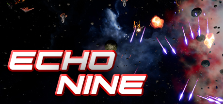
Echo Nine scored 78/100 on Steam Analyzer — Good for a Action capsule. Top priority fix: [genre_clarity] Incorporate a subtle gameplay mechanic hint (e.g., unique player ship design or ability effect) to differentiate from generic Galaga homage and signal what makes Echo Nine distinct.

Capsule scores by dimension

  • Genre Clarity: 8/10 — Classic arcade space shooter clearly signaled. The capsule immediately communicates a retro space shooter through multiple visual cues: enemy fighter silhouettes at top left, projectile trails in the center, explosions, and floating asteroids against a starfield. At tiny size, the geometric enemy ships and glowing projectiles are still recognizable arcade shooter iconography. The neon aesthetic and chaotic action layout reinforce the arcade action genre without ambiguity.
  • Title Readability: 9/10 — Bold neon lettering reads perfectly at all sizes. The title 'ECHO NINE' uses a strong neon-style italic sans-serif with consistent white fill and red/pink outline that creates excellent contrast against the dark background. The spacing is generous and the letterforms remain fully legible even at tiny thumbnail size due to the thick stroke weight and high value separation. The placement in the lower third on a relatively uncluttered background area ensures no overlap with busy particle effects.
  • Contrast & Color: 8/10 — Strong bright neon against dark space background. The red/pink neon title and bright orange explosions create sharp value contrast against the deep black starfield and dark nebula areas, with clear silhouette separation in grayscale. Enemy ships and projectile trails use bright cyan and orange that pop distinctly even when squinting. The right side red nebula provides some mid-tone density but does not significantly compete with the core focal elements.
  • Uniqueness & Polish: 7/10 — Polished retro aesthetic with arcade authenticity. The capsule demonstrates solid execution with intentional neon typography, layered particle effects, and a cohesive retro arcade visual language that feels premium rather than cheap. The geometric enemy ship designs and glowing projectile trails show craft and understanding of the source material. However, the overall composition relies on familiar arcade tropes and does not communicate a unique mechanical hook or narrative angle beyond 'space shooter nostalgia.'
  • Brand Consistency: 7/10 — Consistent neon arcade style across elements. The capsule maintains internal cohesion through a unified neon color palette (reds, pinks, cyans, oranges), consistent geometric rendering of ships and particles, and a signature retro-futuristic aesthetic. The bold italic title treatment is distinctive and could become a recognizable brand mark. Without access to all 7 screenshots, this score reflects strong stylistic consistency within this single asset, though repeated verification against other materials would refine this assessment.
  • Composition: 8/10 — Clear focal hierarchy with title anchored lower. The composition uses effective depth layering with starfield background, mid-ground nebula clouds and asteroids, and foreground action elements (ships, projectiles, explosions) that guide the eye naturally. The title placement in the lower third provides strong anchor with clear separation from the busier upper action zone. At small and tiny sizes, the composition remains readable with the neon title and centered bright explosions providing clear primary focus despite the scattered particle field.

What works

  • Neon title legibility at all sizes. Bold stroke weight and high contrast ensure 'ECHO NINE' remains fully readable even at tiny 120x45 thumbnail resolution.
  • Clear arcade shooter genre signaling. Enemy ship silhouettes, projectile trails, explosions, and starfield immediately communicate retro space shooter gameplay without ambiguity.
  • Strong value separation and pop. Bright neons and explosions create excellent silhouette clarity against the dark background with clear grayscale contrast.
  • Intentional composition hierarchy. Upper action zone and lower title anchor create natural eye flow and prevent the scattered particles from becoming chaotic at small sizes.

What hurts the capsule

  • Generic arcade nostalgia premise. The capsule communicates 'retro space shooter' but does not hint at unique mechanics, narrative tone, or what specifically differentiates Echo Nine from Galaga or other classics.
  • Right-side nebula creates slight mid-tone mudding. The red/pink nebula on the right adds atmospheric depth but introduces mid-tone density that slightly reduces the clean contrast of the neon elements.

Priority fixes

  1. [genre_clarity] Incorporate a subtle gameplay mechanic hint (e.g., unique player ship design or ability effect) to differentiate from generic Galaga homage and signal what makes Echo Nine distinct.
  2. [uniqueness_polish] Consider adding a signature visual motif or color accent that appears consistently across marketing to build brand recognition beyond standard neon retro aesthetic.
  3. [composition] Evaluate whether the upper left and upper right enemy ships and particles could be slightly refined to ensure maximum clarity when cropped by Steam storefront at 231x87 small size.

Store copy priority fixes

  1. [hook_strength] Rewrite the short description to lead with a specific, exciting reason to play—e.g., 'Dodge waves of evolving enemies, upgrade your ship mid-battle, and chase the high score in a brutal arcade shooter.' This adds action verbs and player agency.
  2. [uniqueness] Add 1-2 sentences explaining what Echo Nine does differently—e.g., how upgrades work uniquely, what makes enemy evolution special, or what makes the three game modes (Survival, Arcade, Campaign) a cohesive progression system that other classics don't offer.
  3. [feature_communication] Restructure the Survival mode explanation to answer: How long is a typical run? What is the core feedback loop each second? Add a sentence like 'Survive as long as you can against endless waves; each wave gets harder and faster, testing your reflexes and strategy with your equipped upgrades.'
  4. [tone_match] Replace the closing corporate line ('We hope you enjoy...') with either developer personality ('We've poured love into every difficulty spike and pixel') or remove it entirely to end on the game's confidence.

Related guides

Steam app ID: 652140 · Tags: Action, Indie, Casual, Adventure