Scoring genre clarity...

Prehistoric Kingdom capsule

Prehistoric Kingdom

Take on the role of park manager and design the ultimate zoo for nature's greatest creations.

24,99€Very Positive(159)
Early AccessDinosaursManagement
Blue Meridian27 Apr, 2022

Prehistoric Kingdom scores 78/100 — better than 84% of Early Access capsules (n=3,632).

Very Positive (159 reviews) · 24,99€ · Released 27 Apr, 2022 · By Blue Meridian

Quick text summary

Prehistoric Kingdom scored 78/100 on Steam Analyzer — Good for a Early Access capsule. Top priority fix: [uniqueness_polish] Add a subtle management UI element or park customization hint (e.g., fence outline, exhibit silhouette) to hint at the simulation depth and differentiate from generic dinosaur media.

Capsule scores by dimension

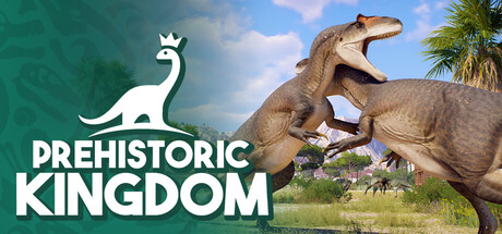
  • Genre Clarity: 9/10 — Dinosaur park management instantly clear. The capsule communicates tycoon/management simulation through multiple strong visual cues: a dinosaur character prominently featured in natural habitat setting, a zoo/park management framing via the title, and the white dino logo suggesting branding. At tiny size, the dinosaur silhouette and 'KINGDOM' text remain unmistakable, immediately signaling this is a dinosaur-themed management game with zero genre ambiguity.
  • Title Readability: 8/10 — Bold title legible at all sizes. The white 'PREHISTORIC KINGDOM' text uses strong, uppercase letterforms with excellent contrast against the mid-tone landscape background, maintaining legibility even at tiny 120x45 thumbnail size. The text placement on the left side avoids the busy dinosaur detail, and the supporting logo icon above provides visual hierarchy that guides reading without competing for attention.
  • Contrast & Color: 8/10 — Strong value separation and clarity. White text and logo pop decisively against the teal-green sky and tan landscape, creating clear silhouette separation in both color and grayscale evaluation. The dinosaur subject reads well in mid-tone browns against the sky gradient, and the overall composition maintains visual punch on Steam's #1b2838 dark background without muddy mid-tones or blending issues.
  • Uniqueness & Polish: 7/10 — Polished but relies on theme appeal. The capsule presents a clean, professional render of dinosaur park scenery with quality 3D asset presentation and intentional composition; the white branding logo shows craft and distinctiveness. However, the core concept—dinosaur zoo sim—is the primary differentiator rather than a visually unique stylistic hook, placing it in solid professional territory without standout visual storytelling that communicates a unique mechanical angle.
  • Brand Consistency: 7/10 — Recognizable dinosaur logo identity. The white dinosaur-head logo above the title establishes a memorable brand mark with consistent geometric simplicity; the warm-tan and teal color palette creates coherent visual identity. The rendering style is consistent across what appears to be marketing materials, though the capsule alone does not showcase enough distinctive character or motif repetition to reach excellence without broader brand context.
  • Composition: 8/10 — Clear hierarchy with safe framing. The composition places the white logo-text unit firmly in the left third with the dinosaur subject occupying the right and center, creating balanced visual weight and clear focal point hierarchy. Foreground dinosaur, midground habitat, and sky background layer effectively; text placement avoids edge-cutting risks and maintains readability at all zoom levels, with the natural horizon line providing depth cues that strengthen the overall read.

What works

  • Immediate genre recognition. The dinosaur imagery combined with 'KINGDOM' text instantly communicates dinosaur park management without ambiguity.
  • White logo stands out distinctly. The minimalist dinosaur head icon creates a recognizable brand mark that remains crisp at thumbnail size.
  • Safe text placement and legibility. Title text positioned on controlled background avoids clashing with detailed elements and maintains clarity from full to tiny sizes.
  • Strong layered composition. Clear foreground, midground, and background separation creates visual depth and guides the eye naturally.

What hurts the capsule

  • Generic theme presentation. While the dinosaur zoo concept is appealing, the visual execution relies on standard nature photography aesthetics rather than a distinctive art style or unique visual hook.
  • Limited narrative differentiation. The capsule does not visually communicate what makes this park manager experience different from other sims—no UI hints, signature mechanic visuals, or thematic twist are apparent.

Priority fixes

  1. [uniqueness_polish] Add a subtle management UI element or park customization hint (e.g., fence outline, exhibit silhouette) to hint at the simulation depth and differentiate from generic dinosaur media.
  2. [brand_consistency] Reinforce the logo with subtle repeated visual motifs or a signature palette across marketing materials to strengthen recognition and internal cohesion.

Store copy priority fixes

  1. [hook_strength] Rewrite the short description to lead with a specific gameplay verb and unique value: 'Revive extinct species and build a thriving dinosaur park—then explore it from ground level in first-person mode' avoids vague superlatives and highlights a distinctive feature.
  2. [uniqueness] Add a sentence explaining what makes this park sim different from competitors, such as emphasizing the real-time creature lifecycle system or the combination of building plus immersive first-person exploration.
  3. [audience_targeting] Include explicit signals for casual/family players and hardcore builders separately, such as 'Peaceful sandbox mode for creative builders' or 'Challenge mode for resource management veterans.'

Related guides

Steam app ID: 666150 · Tags: Early Access, Dinosaurs, Management, Building, Sandbox