Scoring genre clarity...
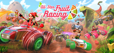
All-Star Fruit Racing capsule

All-Star Fruit Racing

A high-speed multiplayer racer with a unique power-up system! Combine different juices for a range of attacking and defensive abilities. Drift through looping bends. Soar over monumental jumps, and defy gravity around tubular tracks in an explosively colorful racer!

$0.99Mixed(186)
RacingArcadeSports
3DCloudsJul 13, 2018

All-Star Fruit Racing scores 85/100 — better than 94% of Racing capsules (n=790).

Mixed (186 reviews) · $0.99 · Released Jul 13, 2018 · By 3DClouds

Quick text summary

All-Star Fruit Racing scored 85/100 on Steam Analyzer — Excellent for a Racing capsule. Top priority fix: [composition] Increase focal depth by reducing the number of competing center-stage characters to create a single dominant vehicle or character anchor

Capsule scores by dimension

  • Genre Clarity: 9/10 — Vibrant kart racing immediately clear. The capsule instantly communicates arcade kart racing through multiple visual cues: colorful fruit-themed vehicles with exaggerated proportions, dynamic racing poses, fruit-themed environment design, and cheerful characters mid-action. Even at TINY size, the bright vehicles and chaotic track layout unmistakably signal a fun, accessible racing game rather than a serious sim.
  • Title Readability: 9/10 — Bold pink title highly legible. The 'All-Star Fruit Racing' title uses a thick, bright pink brush script font with clear yellow outlines and shadow effects that create strong contrast against the sky background. At TINY size, the title remains readable due to its bold weight and strategic placement in the upper-center safe zone, avoiding noisy textures.
  • Contrast & Color: 9/10 — Saturated palette pops distinctly. The capsule uses a vibrant, high-saturation color scheme with bright pinks, greens, oranges, and yellows that create excellent separation from the dark Steam background. The blue sky and colorful vehicles maintain clear value separation and readability even under quick-scroll conditions, with no muddy mid-tones that would cause blending.
  • Uniqueness & Polish: 8/10 — Polished arcade charm distinctive. The capsule demonstrates premium craft with consistent character design, purposeful fruit theming throughout vehicles and environment, and intentional comedic visual storytelling that communicates the juice power-up system premise. While not groundbreaking art style, the cohesive execution and playful energy feel distinctly above generic kart racers, though it lacks the 9+ polish reserved for industry-leading standouts.
  • Brand Consistency: 8/10 — Fruit theme consistently applied. The capsule establishes strong internal brand identity through the fruit-as-vehicle motif, consistent pastel-bright color palette, and cheerful character expressions that align with arcade racing expectations. The visual language is recognizable and distinctive within the kart racing subgenre without feeling derivative, though no single iconic symbol or character anchor makes it 9+ memorable.
  • Composition: 8/10 — Clear hierarchy well-balanced. The composition uses strong depth layering with background mountains, midground fruit vehicles and characters, and foreground track detail that creates clear focal points at all sizes. The title anchors the top with good margins, and the dense but organized vehicle arrangement at center-right naturally draws the eye without creating dead zones or awkward cropping at Steam's typical sizes.

What works

  • Instant genre recognition. Colorful fruit vehicles and chaotic track action unmistakably communicate arcade kart racing from full view down to TINY thumbnail.
  • Title durability across scales. Thick pink font with yellow outline remains clearly readable at TINY size due to bold weight and strategic sky placement.
  • High-saturation color clarity. Vibrant greens, pinks, and oranges create strong value separation against the dark Steam background with no muddy blending.
  • Playful visual storytelling. Fruit-themed vehicles and character poses effectively communicate the game's unique juice power-up system and arcade fun without being generic.

What hurts the capsule

  • Dense composition at TINY size. The abundance of vehicles, characters, and details creates visual noise that loses individual element clarity when scaled to thumbnail dimensions.
  • Limited iconic character anchor. While the fruit theme is consistent, no single standout character or symbol emerges as an immediately recognizable brand identity marker for the game.
  • Mid-ground element crowding. Multiple characters and vehicles at similar depth compete for attention in the center composition, reducing the sharpness of primary focal point.

Priority fixes

  1. [composition] Increase focal depth by reducing the number of competing center-stage characters to create a single dominant vehicle or character anchor
  2. [genre_clarity] Enhance the fruit power-up system visual communication with a subtle UI element or glow effect on key vehicles
  3. [brand_consistency] Develop one signature character or fruit-vehicle combo as the persistent brand anchor across future marketing materials

Related guides

Steam app ID: 673190 · Tags: Racing, Arcade, Sports, Cartoony, Multiplayer