Scoring genre clarity...

Boyfriend Dungeon capsule

Boyfriend Dungeon

Date your weapons! Romance swords, daggers, and polearms to level them up in this “shack-and-slash” dungeon crawling adventure.

$5.99Very Positive(18)
ComedyStory RichLGBTQ+
Kitfox GamesAug 11, 2021

Boyfriend Dungeon scores 75/100 — better than 66% of Comedy capsules (n=1,745).

Very Positive (18 reviews) · $5.99 · Released Aug 11, 2021 · By Kitfox Games

Quick text summary

Boyfriend Dungeon scored 75/100 on Steam Analyzer — Good for a Comedy capsule. Top priority fix: [genre_clarity] Add visual weapon elements (sword, dagger silhouette) integrated with the character to directly communicate the 'date your weapons' hook.

Capsule scores by dimension

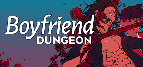
  • Genre Clarity: 7/10 — Anime romance visual novel hybrid. The stylized anime male character with dramatic red/pink color palette and the word 'Dungeon' clearly signal a fantasy RPG with visual novel elements. At TINY size, the character silhouette and dungeon text remain decipherable, though the romance angle is less explicit from visuals alone. The composition reads as character-driven narrative game rather than pure action RPG.
  • Title Readability: 8/10 — Clean italicized title readable at all sizes. The title 'Boyfriend Dungeon' uses white italicized sans-serif that contrasts sharply against the teal-to-purple gradient background. The text hierarchy clearly separates the bold 'Boyfriend' from the smaller 'DUNGEON' subtitle. At TINY size, both words remain legible without collapse, and the strategic placement on the upper left avoids character silhouette interference.
  • Contrast & Color: 8/10 — Strong warm-cool gradient with readable separation. The warm red-pink character illustration pops distinctly against the cool teal-purple background gradient, creating clear value separation in both color and grayscale. White title text achieves high contrast against the darker background zones. At SMALL and TINY sizes, the warm-cool contrast persists and aids silhouette clarity without muddiness.
  • Uniqueness & Polish: 7/10 — Polished anime aesthetic with clear premise hook. The art direction feels intentional and craft-focused with smooth gradient transitions, clean line work on the character, and a cohesive warm color palette overlaid on cool backgrounds. The core concept 'Date your weapons' is visually supported by the romantic character presentation, though the execution is more 'stylish anime game' than immediately distinctive within indie visual novel space. At SMALL size, the polish reads clearly, but the visual hook is not immediately unique.
  • Brand Consistency: 7/10 — Consistent anime art direction with recognizable style. The character rendering, color palette, and stylized illustration approach feel cohesive and would be recognizable across store screenshots as part of the same game brand. The romantic protagonist pose and dramatic lighting are signature to the visual novel presentation. However, there are no iconic motifs, symbols, or UI cues that make this capsule distinctly memorable as a standalone identity marker.
  • Composition: 8/10 — Strong focal hierarchy with centered character. The primary focal point is the character illustration positioned center-right, with title anchored upper left, creating clear visual hierarchy and avoiding dead space. The gradient background provides depth separation and supports the character without competing. At TINY size, the composition remains legible with the character silhouette and title both parsing clearly; safe margins around text are well-managed.

What works

  • White text title contrast. Bold white italicized text reads sharply against the gradient background at all viewing sizes.
  • Warm-cool color harmony. The red-pink character against teal-purple background creates visual interest and strong silhouette separation.
  • Clear visual hierarchy. Title placement and character focal point create immediate narrative focus without confusion or scattered attention.
  • Smooth gradient execution. The teal-to-purple background transitions cleanly without banding or harsh edges.

What hurts the capsule

  • Generic anime presentation. While competent, the visual style does not strongly differentiate from other anime visual novel games in the indie space.
  • Romance mechanic not visually communicated. The 'date your weapons' unique premise is not evident from the capsule alone; it reads as standard character-driven visual novel.
  • No distinctive brand symbol or motif. The capsule lacks an iconic character mark, UI element, or signature visual cue that would be immediately recognizable.

Priority fixes

  1. [genre_clarity] Add visual weapon elements (sword, dagger silhouette) integrated with the character to directly communicate the 'date your weapons' hook.
  2. [brand_consistency] Incorporate a distinctive UI frame or motif element (e.g., heart overlay, weapon glow, or character marking) that becomes a recognizable brand signature.
  3. [uniqueness_polish] Consider adding subtle interactive or romantic visual cues (e.g., hearts, romance particle effects, or affection indicators) to differentiate from generic visual novel aesthetic.

Store copy priority fixes

  1. [feature_communication] Add one sentence early in the detailed description clarifying the core gameplay loop: 'Clear procedurally-generated dungeons to find and unlock weapons, then romance them between runs to strengthen stats and unlock new abilities.'
  2. [uniqueness] Elevate the modding feature by moving it earlier and adding specificity: 'Create custom weapon skins and share them with friends' or describe what customization options are available.
  3. [genre_clarity] Explicitly state the roguelite structure (e.g., 'Permadeath? No. Reusable runs? Yes.') to set expectations for players unfamiliar with roguelite mechanics who might confuse this with traditional roguelikes.

Related guides

Steam app ID: 674930 · Tags: Comedy, Story Rich, LGBTQ+, Cute, Dating Sim