Scoring genre clarity...
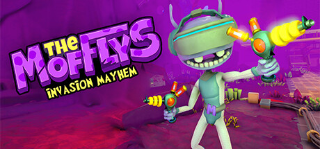
Join your alien squad on a thrilling mission to invade planet Earth and plunge the universe into chaos! Traverse through four iconic Earthly regions, each bursting with excitement, diverse objectives, and the opportunity to combat Earth's greatest defenders in epic battles.
Free to Play8 user reviews
VRActionCasual
Sindria WorldMar 10, 2025