Scoring genre clarity...

SiNKR capsule

SiNKR

SiNKR is a minimalist puzzler using various contraptions to sink pucks. Responsive ambient music. No holes left behind.

$3.99Very Positive(531)
StrategyPuzzleMinimalist
Robert WahlerOct 12, 2017

SiNKR scores 80/100 — better than 92% of Strategy capsules (n=5,436).

Very Positive (531 reviews) · $3.99 · Released Oct 12, 2017 · By Robert Wahler

Quick text summary

SiNKR scored 80/100 on Steam Analyzer — Good for a Strategy capsule. Top priority fix: [genre_clarity] Consider adding a subtle puck or contraption silhouette element within the grid to reinforce the sinking/physics mechanic at TINY size without breaking the minimalist aesthetic.

Capsule scores by dimension

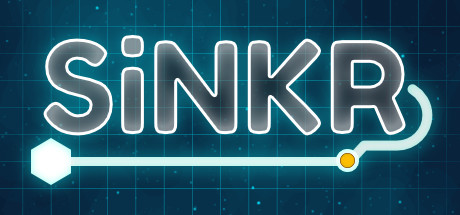
  • Genre Clarity: 7/10 — Puzzle mechanics readable, tech aesthetic clear. The neon circuit-board grid background and geometric hexagon/circle icons immediately signal a tech puzzle game. The minimalist interface language and clean geometric shapes align with casual puzzle expectations, though the specific 'puck-sinking' mechanic isn't visually obvious at tiny size. At TINY size, the tech aesthetic remains strong but the puzzle-specific purpose becomes less clear—it could be many puzzle types.
  • Title Readability: 9/10 — Bold neon outline, excellent legibility everywhere. The title 'SiNKR' uses a strong neon-outline stroke with clean sans-serif letterforms that maintain perfect clarity from full size down to TINY (120×45). The white-on-dark cyan background creates excellent contrast separation, and the letterforms are wide enough to avoid collapse at small scale. No tagline clutter—just the clean brand name with an integrated puzzle icon element as a visual accent.
  • Contrast & Color: 8/10 — Strong cyan-to-dark separation, glowing accent pops. The bright cyan grid and neon white title create high value contrast against the dark blue-teal background (#1b2838 equivalent), with the orange/yellow accent dot on the right adding a warm focal highlight. The geometric hexagon and circle icons in white read cleanly against the background. In grayscale, the neon outline still separates clearly from the dark grid due to pure value difference.
  • Uniqueness & Polish: 8/10 — Distinctive tech-minimalist identity, premium craft. The neon circuit-board aesthetic with integrated puzzle icon (hexagon-to-circle flow) communicates a distinctive tech-puzzle identity that avoids generic game-genre templates. The outlines, grid precision, and glow effects feel intentional and polished, not template-based. The integrated icon mechanic on the right side suggests interactive flow, adding visual storytelling beyond a static scene.
  • Brand Consistency: 8/10 — Cohesive tech aesthetic, memorable neon signature. The neon outline treatment, cyan grid, geometric shapes, and tech minimalism create a recognizable internal identity that should scale across marketing materials. The specific glow-and-outline style is distinctive and consistent throughout the composition. This would be immediately recognizable on subsequent store materials or social media due to the strong neon signature palette and geometric motif.
  • Composition: 8/10 — Balanced focal hierarchy, safe margins, clear center. The title sits in a prime upper-left-center area with the integrated flow-icon accent anchoring the right side, creating a left-to-right reading path without edge clutter. The grid background provides context depth without competing with the foreground text. Safe margins protect the design from Steam cropping, and the clean horizontal composition maintains clarity at SMALL and TINY sizes without scattered focal points.

What works

  • Title legibility at all sizes. The bold neon outline and clean sans-serif maintain perfect readability from full size to TINY (120×45) with zero collapse risk.
  • Distinctive tech-minimalist brand identity. The neon glow, cyan grid, and geometric icon treatment create a memorable and premium aesthetic that feels intentional rather than generic.
  • Strong contrast against dark Steam background. White neon title and cyan grid pop cleanly against dark blue, maintaining visual separation even at quick-scroll glance.
  • Integrated puzzle visual metaphor. The hexagon-to-circle flow icon on the right communicates game interactivity and mechanic purpose beyond a static scene.

What hurts the capsule

  • Genre specificity unclear at tiny size. While the tech-puzzle aesthetic reads, the actual 'puck-sinking' mechanic and casualness aren't immediately obvious at TINY—could be multiple puzzle types.
  • Minimal environmental context. The abstract grid background is stylistically consistent but doesn't ground the game in a tangible puzzle-board or physical contraption visual.

Priority fixes

  1. [genre_clarity] Consider adding a subtle puck or contraption silhouette element within the grid to reinforce the sinking/physics mechanic at TINY size without breaking the minimalist aesthetic.
  2. [composition] Ensure the accent flow-icon remains visible and readable at SMALL size; test cropping resilience on actual Steam storefront mockups at 231×87 to confirm no edge clipping.

Related guides

  • Steam page optimisationCapsule, copy, screenshots, tags — the full Steam page conversion stack.
  • Steam tags guideTag selection, ordering, and how it shapes Steam's recommendation rails.

Steam app ID: 676420 · Tags: Strategy, Puzzle, Minimalist, Casual, Indie