Scoring genre clarity...
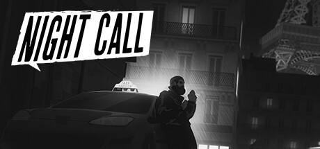
Night Call capsule

Night Call

Friend. Confidant. Therapist. Voyeur. As a cab driver working the Paris night shift, you are many things to different people. Your gift is getting people to talk; and in order to catch the serial killer who left you for dead, that’s exactly what you’ll need to do.

$2.99Mostly Positive(400)
IndieSimulationNoir
Monkey Moon, BlackMuffinJul 17, 2019

Night Call scores 73/100 — better than 56% of Indie capsules (n=11,761).

Mostly Positive (400 reviews) · $2.99 · Released Jul 17, 2019 · By Monkey Moon

Quick text summary

Night Call scored 73/100 on Steam Analyzer — Good for a Indie capsule. Top priority fix: [genre_clarity] Add a subtle visual cue of the passenger or conversation element (speech bubble, silhouette in backseat) to communicate the dialogue-driven narrative mechanic more clearly.

Capsule scores by dimension

  • Genre Clarity: 7/10 — Noir detective narrative game. The black-and-white film noir aesthetic with a solitary figure in an urban taxi environment clearly communicates a narrative-driven detective or story game set in a gritty city. At TINY size, the silhouette of the character, taxi, and distinctive Parisian architecture (Eiffel Tower visible) remain recognizable, though the specific 'cab driver' mechanic is less obvious without context. The monochromatic palette and moody lighting reinforce a crime or mystery subgenre expectation effectively.
  • Title Readability: 8/10 — Bold angled text, strong contrast. The title 'NIGHT CALL' uses a thick, italicized sans-serif in white with a dynamic angled composition that sits in a controlled top-left region with a dark background band behind it. At SMALL size (231×87) the letters remain clearly legible and the angled treatment reinforces energy without collapsing. At TINY size (120×45), the title remains readable due to bold weight and high contrast, though slight compression occurs but does not break recognition.
  • Contrast & Color: 8/10 — Strong monochromatic value separation. The black-and-white palette creates excellent contrast against the Steam dark background (#1b2838); the bright taxi interior lights, character silhouette, and white title text pop cleanly from deep grays and blacks. The grayscale treatment ensures no color saturation loss, and silhouette separation remains crisp at all sizes including TINY, where the lit taxi window and character pose remain distinct focal points. The Eiffel Tower in the background maintains mid-tone separation without muddying the foreground.
  • Uniqueness & Polish: 7/10 — Distinctive noir aesthetic, competent craft. The film noir treatment with authentic Paris landmarks (Eiffel Tower, taxi, period lighting) creates a cohesive and recognizable visual identity that stands apart from typical indie game capsules through deliberate stylistic choice rather than generic fantasy or sci-fi tropes. The composition and lighting demonstrate intentional art direction; however, the design leans on established noir conventions rather than introducing a truly unique hook or mechanic visual. This feels premium and intentional but not groundbreaking compared to top-tier capsules like DREDGE or DAVE THE DIVER.
  • Brand Consistency: 7/10 — Cohesive noir identity, strong internal consistency. The monochromatic noir style, taxi-centric framing, Paris setting, and character silhouette create a memorable and internally consistent visual identity that would be recognizable across multiple promotional materials. The style is distinctive enough to signal this specific game without confusion, and the mood is uniform throughout the composition. However, without seeing the 10 reference screenshots, there are no obvious iconic character motifs or signature symbols that would elevate this to a 9; it relies on the noir genre aesthetic as its primary identifier.
  • Composition: 7/10 — Clear focal point, good depth layering. The composition uses strong layering: foreground character in lit taxi, midground taxi interior and street elements, background Eiffel Tower; this creates clear depth and prevents flatness. The title placement in the top-left doesn't crowd the focal subject, and the character silhouette is the clear primary visual anchor even at TINY size. Safe margins are respected, though the right edge of the composition feels slightly loose with the Eiffel Tower; the overall balance is deliberate and functional, not scattered.

What works

  • Legible title at all sizes. Bold angled 'NIGHT CALL' in white maintains clarity and impact from full header down to TINY thumbnail without loss of recognition.
  • Strong monochromatic contrast. Black-and-white palette ensures excellent silhouette and text separation against Steam's dark background, with crisp edges even at compressed sizes.
  • Cohesive film noir branding. Unified aesthetic with Paris setting, taxi environment, and moody lighting creates a distinctive and recognizable visual identity for the game.
  • Clear focal point hierarchy. Character in lit taxi dominates attention while supporting elements (Eiffel Tower, urban setting) guide rather than compete, maintaining visual clarity at SMALL and TINY sizes.

What hurts the capsule

  • Genre mechanic not visually clear. While noir narrative is evident, the specific 'cab driver interrogation' mechanic is not immediately obvious from the visual alone; a passenger or dialogue cue might strengthen genre clarity.
  • Limited distinctive visual hook. The design relies heavily on established noir genre conventions rather than introducing a unique gameplay or thematic visual element that would make it stand out in a crowded indie market.
  • Right-edge composition slightly unbalanced. The Eiffel Tower in the background-right creates asymmetric weight that feels secondary rather than intentionally compositional; the empty right margin lacks purpose.

Priority fixes

  1. [genre_clarity] Add a subtle visual cue of the passenger or conversation element (speech bubble, silhouette in backseat) to communicate the dialogue-driven narrative mechanic more clearly.
  2. [uniqueness_polish] Introduce a distinctive character motif or iconic UI element (e.g., taxi meter, radio frequency visual, or unique typography treatment) that could become a brand signature across marketing materials.
  3. [composition] Rebalance the right-edge to either bring the Eiffel Tower closer to center-background or add supporting environmental detail to justify the asymmetry and fill empty space purposefully.

Related guides

Steam app ID: 680380 · Tags: Indie, Simulation, Noir, Story Rich, Visual Novel