Scoring genre clarity...

Cantata capsule

Cantata

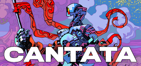
Crash-landed in the universe of Cantata, will you expand your empire or bring peace to the war torn planet? Grow your army, manage resources and discover the colourful planet of Shoal, its people, and the armed forces overrunning this land in this genre-defining Grand Tactics game.

$8.70Mixed(123)
StrategySandboxPixel Graphics
Afterschool StudioAug 15, 2023

Cantata scores 63/100 — better than 7% of Strategy capsules (n=5,232).

Mixed (123 reviews) · $8.70 · Released Aug 15, 2023 · By Afterschool Studio

Quick text summary

Cantata scored 63/100 on Steam Analyzer — Solid for a Strategy capsule. Top priority fix: [composition] Establish a single dominant central character or faction symbol as the primary focal point and reduce the equal-weight horizontal spread of all three figures to create clear hierarchy at tiny size.

Capsule scores by dimension

  • Genre Clarity: 5/10 — Faction war unclear genre mix. The three distinct armored factions posed in a standoff suggest conflict and strategy, but the psychedelic art style could read as an action brawler or RPG rather than a Grand Tactics game. At tiny size the faction differentiation collapses into a busy blob of color, making it hard to parse the strategic multi-faction premise. Genre cues like maps, grids, or unit tokens that signal tactics/strategy are entirely absent.
  • Title Readability: 8/10 — Bold white title reads well. The word CANTATA is set in a large, heavy sans-serif typeface in white across the bottom of the image, providing strong contrast against the busy illustrated background. At full size it is immediately legible, and at small capsule size it still holds up due to its scale and weight. At tiny size the letters compress but remain readable as a single bold word, which is a genuine strength.
  • Contrast & Color: 5/10 — Vibrant but muddy against dark Steam. The palette is highly saturated with purples, oranges, yellows, and reds, which creates internal vibrancy but competes with itself rather than separating cleanly against Steam's dark #1b2838 background. In a mental grayscale test, the three central figures blend into the background illustration because mid-tone values dominate the entire composition without a clear dark-to-light hierarchy. At small and tiny size the image reads as a flat colorful mass with no strong silhouette edge.
  • Uniqueness & Polish: 7/10 — Distinctive psychedelic comic style. The bold flat comic-book line art with psychedelic color fills is genuinely distinctive and does not look like a template or generic fantasy capsule. The three contrasting faction designs — organic, mechanical, and robotic — communicate a rich world with creative craft. However, the composition feels more like a piece of key art than a purpose-designed capsule, and the busyness slightly undermines the polish premium tier capsules like Hades II or Sea of Stars achieve.
  • Brand Consistency: 8/10 — Strong cohesive art identity. The flat line-art with saturated psychedelic fills is a recognizable and internally consistent visual identity that would carry well across screenshots, trailers, and other store assets. The three-faction motif and the distinctive color-coded character design (orange, yellow-green, blue) create a memorable signature palette. This style would be recognizable again in a scroll if seen before, which is a meaningful brand asset.
  • Composition: 5/10 — Crowded horizontal spread, no focal anchor. The three characters are spread across the full width in a roughly equal horizontal band, creating competing focal points rather than a single dominant hero element. The central yellow-green figure is slightly larger but not dominant enough to anchor the eye at small size. The CANTATA title sits low and close to the bottom edge, and the top half of the image is filled with background texture that competes equally with the foreground figures, collapsing badly at tiny thumbnail size.

What works

  • Bold, legible title type. The heavy white sans-serif CANTATA logo holds its readability even at small capsule sizes due to strong weight and scale.
  • Distinctive art style. The psychedelic flat comic-book illustration is genre-rare and immediately sets Cantata apart from typical strategy game capsules in the category.
  • Three-faction world-building. The three visually distinct armored factions communicate a multi-faction conflict premise that hints at the game's strategic depth.
  • Strong internal brand identity. Consistent line weight, fill style, and saturated palette create a coherent art identity that would be recognizable across store assets.

What hurts the capsule

  • No single focal hero. Three equally weighted characters spread horizontally means the eye has no anchor point, and the composition collapses into visual noise at tiny size.
  • Muddy silhouette separation. The characters do not separate cleanly from the busy illustrated background in grayscale or at reduced size, losing definition against Steam's dark UI.
  • Genre signal is ambiguous. Nothing in the image communicates tactics, strategy, or simulation — it reads closer to an action or RPG capsule, misaligning with the Grand Tactics genre.
  • Background competes equally with foreground. The decorative psychedelic background fills the same visual weight tier as the character foreground, creating a flat composition without depth hierarchy.

Priority fixes

  1. [composition] Establish a single dominant central character or faction symbol as the primary focal point and reduce the equal-weight horizontal spread of all three figures to create clear hierarchy at tiny size.
  2. [contrast_color] Darken the background values and add a subtle vignette or shadow behind the characters to create silhouette separation that reads in grayscale and against the #1b2838 Steam background.
  3. [genre_clarity] Incorporate a subtle strategy genre signal — such as a hex grid overlay, map territory lines, or unit token iconography — into the background or framing without disrupting the art style.
  4. [title_readability] Move the CANTATA title slightly higher from the bottom edge and add a thin dark shadow or semi-transparent backing strip to ensure it does not risk crop at small capsule dimensions.

Store copy priority fixes

  1. [hook_strength] Remove 'genre-defining' from the short description and replace with a concrete gameplay verb: 'Crash-landed on Shoal, you'll manage troops, build bases, and navigate a planet that fights back with its own weather and creatures each turn.'
  2. [feature_communication] Add a brief resource management bullet point in the GENRE DEFINING section to clarify what players actually manage: 'Balance supply lines, production capacity, and unit deployment across captured regions.'
  3. [uniqueness] Promote the 'planet as active threat' mechanic to the opening paragraph of the detailed description with a single sentence: 'Unlike other strategy games, Shoal itself is a third faction—taking turns, attacking with weather and fauna, forcing you to prepare for nature as well as enemies.'
  4. [audience_targeting] Add a single sentence after PLAY TOGETHER explicitly addressing solo vs multiplayer players: 'Campaign mode offers a deep single-player narrative across three factions; multiplayer delivers competitive and cooperative tactical scenarios.'

Related guides

  • Steam page optimisationCapsule, copy, screenshots, tags — the full Steam page conversion stack.
  • Steam tags guideTag selection, ordering, and how it shapes Steam's recommendation rails.

Steam app ID: 690370 · Tags: Strategy, Sandbox, Pixel Graphics, Management, Moddable