Planet Zoo scores 87/100 — better than 97% of Steam capsules we've analysed (n=24,959).

Quick text summary

Planet Zoo scored 87/100 on Steam Analyzer — Excellent for a Zoo capsule. Top priority fix: [contrast_color] Maintain current strong contrast strategy—no changes needed; this is a benchmark-level implementation.

Capsule scores by dimension

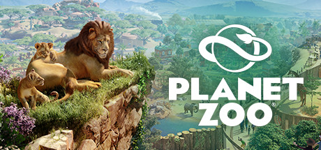
  • Genre Clarity: 9/10 — Zoo management instantly recognizable. The left side features a lion and cubs on a rocky outcrop with natural habitat vegetation, immediately communicating wildlife simulation. The background shows an expansive zoo landscape with rolling terrain, enclosures, and scenic vistas. At tiny size, the prominent lion silhouette and pastoral landscape clearly signal a zoo/management simulation genre without ambiguity.
  • Title Readability: 9/10 — Bold, clean, highly legible. The title 'PLANET ZOO' uses a thick, sans-serif font in pure white with strong contrast against the green background. The logo symbol (curved infinity-like design) sits cleanly above the text with ample breathing room. At small and tiny sizes, both the logo and text remain sharp and readable due to high contrast and strategic placement on a controlled color field.
  • Contrast & Color: 9/10 — Excellent value separation throughout. The composition uses a bright, saturated green landscape background that contrasts sharply with the warm brown lions on the left and the pure white typography. The grayscale squint test shows clear silhouettes: dark animal forms separate from midtone foliage, and the white text pops distinctly. Light, medium, and dark tones are well-distributed with no muddy blending.
  • Uniqueness & Polish: 8/10 — Premium, thematic, well-crafted. The capsule avoids generic template aesthetics by featuring authentic rendered animals in a handcrafted habitat scene rather than abstract icons. The soft, painterly landscape background combined with the detailed animal models conveys production quality and care. The integration of the logo symbol (suggesting interconnected ecosystems) adds a layer of visual storytelling that signals game depth without feeling generic.
  • Brand Consistency: 8/10 — Strong visual identity, cohesive palette. The soft, naturalistic color grading (cool greens, warm earth tones, blue atmospheric perspective) aligns with Planet Zoo's brand positioning as an authentic wildlife simulation. The curved logo motif and clean typography are consistent identity markers. The composition emphasizes peaceful coexistence between animals and landscape, reinforcing the game's core appeal of creating thriving, living ecosystems.
  • Composition: 9/10 — Excellent hierarchy, balanced depth. The left-side animal group (foreground) creates a clear primary focal point, with the expansive landscape (background) providing depth and context without competing for attention. The title is positioned on the right in the lower third with the logo above it, leaving the wildlife tableau unobstructed. Safe margins are respected; no critical elements hug edges, and the composition remains readable and impactful at all tested sizes.

What works

  • Instantly communicates genre. The prominent lion and habitat elements remove any ambiguity about the game being a zoo management simulation.
  • Typography is exceptionally clear. Bold white text on controlled green background maintains legibility from full size down to tiny thumbnail without collapsing.
  • Premium production aesthetic. Rendered animals and painted landscape convey a high-quality, thoughtfully designed game rather than a template asset collection.
  • Well-layered spatial composition. Foreground animals, midground habitat detail, and background scenic vistas create visual depth that guides the eye naturally.

What hurts the capsule

  • Busy background may compete slightly. The detailed landscape in the background, while beautiful, contains many overlapping elements that could distract at very quick glances.
  • Limited cool-toned palette variety. Heavy reliance on greens and blues, while thematically appropriate, provides less visual variety than some competitor capsules in the genre.

Priority fixes

  1. [contrast_color] Maintain current strong contrast strategy—no changes needed; this is a benchmark-level implementation.

Store copy priority fixes

  1. [feature_communication] Move the "About the Game" paragraph (starting with "Build a world for wildlife...") to immediately follow the Deluxe Edition section, before the animal details, to re-center the player's focus on core gameplay.
  2. [uniqueness] Add one sentence explicitly claiming a unique mechanic or design choice: e.g., "Dynamic animal AI learns from player behavior, ensuring no two zoos feel identical" or clarify the conservation/breeding endgame as a concrete goal.
  3. [feature_communication] Expand the conservation release mechanic with one clarifying sentence: explain whether it impacts your zoo's reputation, unlocks content, or serves purely as an aspirational goal.
  4. [genre_clarity] In the short description, optionally prepend a micro-verb: "Design, build, and manage a living zoo in Planet Zoo..." to front-load the creative action even more clearly for skim readers.

Related guides

Steam app ID: 703080 · Tags: Zoo, Management, Simulation, Building, Sandbox