Scoring genre clarity...
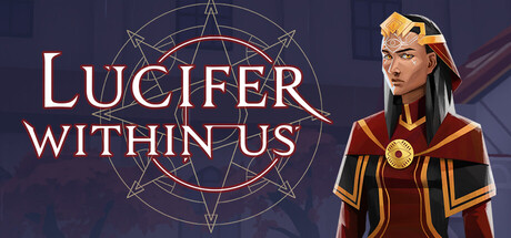
Lucifer Within Us capsule

Lucifer Within Us

Solve 3 increasingly intricate murders by examining the evidence -- find the motive, the means, and the opportunity. Use testimonies of the suspects as evidence by examining every detail for contradictions... and signs of sin. Purify the possessed. Purge the daemons.

$2.99Mostly Positive(619)
InvestigationDetectiveDemons
Kitfox GamesOct 15, 2020

Lucifer Within Us scores 73/100 — better than 62% of Investigation capsules (n=774).

Mostly Positive (619 reviews) · $2.99 · Released Oct 15, 2020 · By Kitfox Games

Quick text summary

Lucifer Within Us scored 73/100 on Steam Analyzer — Good for a Investigation capsule. Top priority fix: [uniqueness_polish] Introduce a subtle signature visual element or UI detail (e.g., evidence board motif, unique daemonic glyph pattern) that signals the deduction mechanic and differentiates from generic occult-mystery templates.

Capsule scores by dimension

  • Genre Clarity: 7/10 — Mystery detective with occult overlay. The pentagram and demonic aesthetic signal supernatural mystery or dark fantasy investigation, while the character's robes and formal pose suggest investigation or ritual. At tiny size, the occult iconography reads clearly enough to imply mystery-adjacent gameplay, though the strategy layer is not visually obvious from imagery alone. The combination of detective elements and supernatural framing works reasonably well to communicate the core theme.
  • Title Readability: 8/10 — Clear serif title, strong contrast placement. The title 'LUCIFER WITHIN US' uses a clean serif font with warm gold/cream color positioned in the upper left against a dark gradient background, ensuring excellent legibility at full size and remaining readable at small size. The tagline placement does not compete with the main title. At tiny size the letterforms maintain clarity due to the high contrast and serif construction, though some fine serifs may blur slightly.
  • Contrast & Color: 8/10 — Strong warm-cool separation, readable silhouettes. The warm gold/orange tones of the title and character clothing create clear separation from the cool dark blue background (#1b2838), while the red pentagram adds tonal variety and visual anchor. The character's warm-toned robes and golden accents pop effectively against the cool background even at small size. In grayscale, the value separation between character and background remains distinct, supporting strong silhouette clarity.
  • Uniqueness & Polish: 7/10 — Polished occult aesthetic, slight generic foundation. The illustrated character with detailed robes and the intricate pentagram display solid craft and intentional art direction, creating a premium indie feel. However, the 'mysterious robed figure + occult circle' formula is moderately familiar in indie horror and mystery games, reducing distinctiveness. The execution is clean and memorable for the specific subgenre, but does not break new ground visually compared to top-tier indie titles.
  • Brand Consistency: 6/10 — Coherent internal palette, limited identity markers. The warm gold, dark blue, and red color scheme is internally consistent, and the pentagram serves as a recognizable motif throughout the visual language. However, without reference to other store assets, the character and style feel more thematic than iconic—there are no obvious signature design elements that would distinguish this from other occult-mystery titles. The rendering style is consistent but not immediately memorable as a branded identity.
  • Composition: 8/10 — Clear focal point, balanced layout, safe margins. The character occupies the right side as a strong focal point, while the pentagram and title anchor the left-center, creating effective visual balance and hierarchy. The title sits in a clear, uncluttered region with adequate safe margins, and the composition remains readable at small and tiny sizes without critical elements crowding edges. The layering of text, symbol, and character creates good depth separation, guiding the eye naturally across the capsule.

What works

  • High-contrast warm-cool color palette. Gold and orange tones read powerfully against the dark blue background, maintaining silhouette clarity at small size and creating visual pop during quick scrolls.
  • Strong character illustration with detail. The robed figure is well-rendered with clear shading, defined edges, and distinctive costume elements that communicate identity and mystique even when scaled down.
  • Balanced composition and safe title placement. The title sits in a controlled upper-left region with adequate margins, ensuring legibility and resilience to cropping across viewing sizes.
  • Coherent pentagram iconography. The intricate pentagram serves as a recognizable visual anchor that reinforces the supernatural mystery theme and adds compositional depth.

What hurts the capsule

  • Moderate uniqueness in crowded subgenre. The occult-detective-mystery aesthetic is familiar across indie titles, and the capsule does not break new ground in visual storytelling or distinctive hooks.
  • Limited brand identity beyond theme. While internally consistent, the visual language lacks a signature character, symbol system, or art direction that would create immediate recognition outside the occult-mystery category.
  • Genre strategy element not visually obvious. The capsule emphasizes supernatural mystery over the strategy/deduction mechanics, which may not fully communicate the investigative puzzle-solving gameplay loop to first-time viewers.

Priority fixes

  1. [uniqueness_polish] Introduce a subtle signature visual element or UI detail (e.g., evidence board motif, unique daemonic glyph pattern) that signals the deduction mechanic and differentiates from generic occult-mystery templates.
  2. [genre_clarity] Enhance strategy/investigation signal by adding a small iconic object (e.g., magnifying glass, suspect silhouettes, evidence card) at a secondary focal point to reinforce detective gameplay, not just supernatural theme.
  3. [brand_consistency] Ensure the pentagram or a related recurring motif appears consistently across store screenshots and social assets to build a recognizable branded identity beyond the color palette.

Store copy priority fixes

  1. [hook_strength] Rewrite the detailed description's opening line to lead with the core interaction: "Investigate murders by examining contradictions in testimonies and reconstructing timelines—then enter the minds of the possessed to unmask the truth." This front-loads gameplay before atmosphere.
  2. [uniqueness] Add a sentence in the "Real mystery-solving" or "Banish daemonic A.I." section that explicitly explains what makes the daemonic mind-reading mechanic distinct from other detective games, e.g., "Unlike standard detective games, you can directly access suspects' subconscious and see their desires, forcing you to distinguish between lies and demonic corruption."
  3. [audience_targeting] Insert a single sentence about scope or difficulty level, e.g., "Designed for players seeking deep deduction without hand-holding, featuring 3 solvable cases that reward careful observation and logical reasoning." This clarifies who this is for without deterring newcomers.
  4. [feature_communication] Reduce worldbuilding paragraph ("Built on the rubble...") or merge it with a mechanical explanation of how the digital network system affects gameplay, so setting informs rather than distracts.

Related guides

Steam app ID: 717560 · Tags: Investigation, Detective, Demons, Experimental, Dark