Scoring genre clarity...

Overcooked! 2 capsule

Overcooked! 2

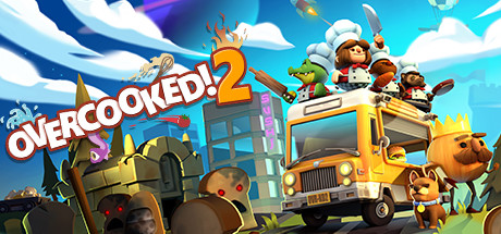
Overcooked returns with a brand-new helping of chaotic cooking action! Journey back to the Onion Kingdom and assemble your team of chefs in classic couch co-op or online play for up to four players. Hold onto your aprons… it’s time to save the world again!

$6.24Very Positive(618)
MultiplayerLocal Co-OpOnline Co-Op
Ghost Town Games Ltd., Team17Aug 7, 2018

Overcooked! 2 scores 78/100 — better than 78% of Multiplayer capsules (n=2,948).

Very Positive (618 reviews) · $6.24 · Released Aug 7, 2018 · By Ghost Town Games Ltd.

Quick text summary

Overcooked! 2 scored 78/100 on Steam Analyzer — Good for a Multiplayer capsule. Top priority fix: [composition] Simplify the scene by reducing background character count so the food truck and chef cluster read as a single dominant focal point at tiny size

Capsule scores by dimension

  • Genre Clarity: 9/10 — Chaotic co-op cooking game. The yellow food truck, chef-hat-wearing cartoon characters wielding knives and pans, and giant anthropomorphic food enemies (burger, hot dog) instantly communicate a cooking-themed action game. At tiny size the food truck silhouette and chef characters still read clearly enough to imply cooperative kitchen chaos. The whimsical cartoon style reinforces casual co-op gameplay without any genre confusion.
  • Title Readability: 8/10 — Bold logo reads well small. The white outlined red lettering of OVERCOOKED! 2 sits in the upper left against a relatively clean sky-blue background area, giving strong contrast and legibility at full size. At small capsule size the logo still reads clearly due to the thick white stroke and bold font weight. At tiny thumbnail size the text becomes strained but the exclamation mark and large numeral 2 help it remain partially distinguishable.
  • Contrast & Color: 8/10 — Warm saturated palette pops on dark. The bright yellow food truck is a strong anchor element that separates well from Steam's dark #1b2838 background. The warm orange, red, and yellow tones of the characters and vehicle contrast effectively against the cool blue sky. In grayscale the food truck silhouette and character cluster on top maintain clear separation from the background, though some midground elements like the grey building can blend slightly.
  • Uniqueness & Polish: 7/10 — Charming but familiar genre look. The capsule has strong polish with a coherent cartoon 3D render style, lively character staging, and a densely packed scene full of personality and visual storytelling. The food truck as a central vehicle with chefs on top is a memorable and specific visual hook that communicates the game's premise directly. Compared to top-performing indie capsules like DAVE THE DIVER or Hades II it feels slightly busy and less graphically refined, but it confidently stands out from generic casual game art.
  • Brand Consistency: 8/10 — Strong recognizable visual identity. The chunky cartoon 3D characters, the signature yellow food truck, the flame-topped logo, and the warm saturated palette form a recognizable and consistent visual identity that carries through clearly from the first game. The recurring chef character designs and the onion kingdom aesthetic with giant food enemies reinforce series recognition. Internal cohesion is strong with a unified rendering style and consistent tonal palette across all visible elements.
  • Composition: 7/10 — Energetic but slightly crowded. The yellow food truck acts as a strong central focal point with the character cluster on top drawing the eye upward and the large burger and hot dog enemies framing the left and right sides effectively. The title is placed in the upper left with decent breathing room against the sky. At small and tiny sizes the scene becomes dense and the many supporting characters and background elements compete for attention, reducing the clarity of the primary focal hierarchy slightly.

What works

  • Instantly recognizable genre cues. Chef hats, knives, pans, food truck, and giant food enemies communicate cooking co-op chaos within one second of viewing.
  • Strong logo contrast. The white-outlined red OVERCOOKED! 2 logo sits against a clean blue sky area giving reliable legibility down to small capsule size.
  • Memorable central vehicle anchor. The bright yellow food truck is a distinctive and brand-consistent focal point that separates cleanly from Steam's dark background.
  • Cohesive cartoon art style. All characters, vehicles, enemies, and environment share a unified chunky 3D cartoon rendering with no jarring style inconsistencies.

What hurts the capsule

  • Scene density hurts tiny readability. At 120x45 the many characters, enemies, and background elements compress into visual noise making it hard to identify a single clear subject.
  • Background building adds mid-tone clutter. The grey SUSHI building in the center background adds a muddy mid-tone that slightly weakens the value contrast between the truck and the environment.
  • Right side framing feels edge-crowded. The large hot dog character on the far right sits very close to the edge and may be partially cropped in certain Steam display contexts.
  • Competing focal elements at small size. The burger enemy on the left, the food truck center, and the character group on top create three competing points of interest that dilute hierarchy at small sizes.

Priority fixes

  1. [composition] Simplify the scene by reducing background character count so the food truck and chef cluster read as a single dominant focal point at tiny size
  2. [contrast_color] Darken or desaturate the grey building in the midground to push it back and strengthen the value separation around the yellow food truck
  3. [title_readability] Slightly increase the logo size or shift it closer to center-left to improve legibility at 120x45 thumbnail size
  4. [uniqueness_polish] Add a subtle vignette or darkened edge treatment to prevent the busy scene edges from competing with the central subject at small sizes

Store copy priority fixes

  1. [uniqueness] Expand the 'new threats' narrative and list 2-3 specific novel features (e.g., 'dish-sharing kitchens' or 'rival teams') that differentiate Overcooked 2 from the original, replacing generic 'save the world again' language.
  2. [feature_communication] Add one sentence after 'ROMAINE CALM!' explaining the mechanical consequence of dynamic kitchens—do they increase difficulty, force cooperation, or change strategy mid-level?
  3. [audience_targeting] Include a brief signal about difficulty progression, e.g., 'from casual dinner party to legendary feasts' or 'solo-friendly to hardcore co-op challenges' to set expectations for skill levels.

Related guides

Steam app ID: 728880 · Tags: Multiplayer, Local Co-Op, Online Co-Op, Co-op, Cooking