Scoring genre clarity...

Counter-Strike 2 capsule

Counter-Strike 2

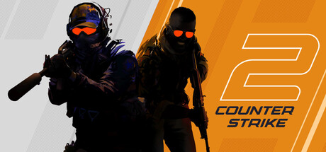
For over two decades, Counter-Strike has offered an elite competitive experience, one shaped by millions of players from across the globe. And now the next chapter in the CS story is about to begin. This is Counter-Strike 2.

Free to PlayVery Positive(73,376)
FPSShooterMultiplayer
Valve21 Aug, 2012

Counter-Strike 2 scores 92/100 — better than 100% of FPS capsules (n=1,321).

Very Positive (73,376 reviews) · Free to Play · Released 21 Aug, 2012 · By Valve

Quick text summary

Counter-Strike 2 scored 92/100 on Steam Analyzer — Excellent for a FPS capsule. Top priority fix: [contrast_color] Increase edge contrast on the dark operator silhouettes against the left panel by adding a subtle light rim or vignette separation so they remain crisp at tiny 120x45 size

Capsule scores by dimension

  • Genre Clarity: 10/10 — Tactical FPS instantly recognizable. Two heavily armed military operators in tactical gear holding rifles communicate competitive tactical shooter immediately, even at tiny size. The iconic CS silhouette language, orange goggle glow, and weapon loadouts are unmistakable genre signals. At tiny 120x45 the dual-character armed pose still reads as a competitive shooter without ambiguity.
  • Title Readability: 9/10 — Bold logo reads at all sizes. The large bold '2' numeral paired with 'COUNTER STRIKE' in clean sans-serif stacked below sits on the high-contrast orange right panel, ensuring excellent legibility. At small 231x87 both the '2' and 'COUNTER STRIKE' text remain fully readable with strong contrast against the orange background. At tiny size the dominant '2' still registers as a recognizable brand signal even if the smaller text collapses.
  • Contrast & Color: 9/10 — High contrast orange split pops strongly. The bold orange right panel creates immediate separation from Steam's dark #1b2838 background, making the capsule leap off the page in a quick scroll. The dark-clad operators are silhouetted well against the lighter left panel with diagonal stripe texture, and the orange goggle accents create a strong focal glow. In grayscale the value split between the characters, orange field, and light background remains clear and distinct.
  • Uniqueness & Polish: 8/10 — Clean iconic rebrand, slightly safe. The diagonal split-panel design with the oversized '2' is a confident, clean rebrand that feels premium and deliberate rather than generic. The orange stripe motif and glowing goggle signature are distinctive identity elements that elevate it above typical shooter capsules. However compared to the cinematic painterly work of benchmarks like Black Myth or Hellblade II, the design is more graphic-design-forward than artistically unique, keeping it from a 9.
  • Brand Consistency: 10/10 — Iconic CS identity fully realized. The orange and dark color scheme, tactical operator silhouettes, and the glowing red-orange goggles form an instantly recognizable signature that CS2 has maintained consistently across all its branding. The diagonal stripe motif and bold numeral treatment are cohesive with the broader CS2 brand identity seen across its UI, promotional materials, and in-game aesthetic. Any returning CS player would recognize this capsule as Counter-Strike immediately from the palette and character design alone.
  • Composition: 9/10 — Strong diagonal split with clear hierarchy. The vertical diagonal split creates a natural left-to-right reading flow from characters to title, with the two operators occupying the left two-thirds and the bold typographic lockup anchoring the right. The foreground CT operator overlaps the background T operator creating depth layering, while the diagonal stripe texture adds motion without clutter. At small and tiny sizes the composition crops resiliently with the characters and the '2' remaining the dominant readable elements within safe margins.

What works

  • Instant genre recognition. Dual armed tactical operators in full gear communicate competitive shooter genre without any ambiguity at every size.
  • Orange panel contrast against Steam dark UI. The bold orange split panel makes this capsule pop distinctly against #1b2838 in any scroll context.
  • Dominant '2' numeral anchors brand at tiny size. Even when text collapses at 120x45, the oversized '2' on orange background functions as a standalone brand identifier.
  • Glowing goggle signature creates visual hook. The orange-red goggle glow on both operators serves as a unique recurring identity motif that is instantly associated with CS2.

What hurts the capsule

  • Left panel characters can blend at tiny size. The dark-clad operators against the grey-white striped left panel lose some edge definition at 120x45, reducing silhouette crispness.
  • Typography is functional but not artistically distinctive. The 'COUNTER STRIKE' stacked text uses a clean but unremarkable sans-serif that lacks the crafted character of top benchmark capsule logos.
  • Diagonal stripe texture adds minimal value. The grey diagonal stripe pattern on the left background panel reads as filler texture rather than meaningful visual information at small sizes.
  • Composition slightly conservative versus AAA benchmarks. Compared to cinematic capsules like Hellblade II or Black Myth, the flat graphic design approach lacks the atmospheric depth that could push polish scores higher.

Priority fixes

  1. [contrast_color] Increase edge contrast on the dark operator silhouettes against the left panel by adding a subtle light rim or vignette separation so they remain crisp at tiny 120x45 size
  2. [uniqueness_polish] Consider adding subtle atmospheric depth or lighting effects to the characters to elevate the capsule from graphic-design-forward toward the cinematic quality of top AAA benchmarks
  3. [title_readability] Add a very slight weight increase or tracking adjustment to 'COUNTER STRIKE' text so it remains fully legible at small 231x87 rather than requiring the '2' alone to carry recognition
  4. [composition] Reduce or simplify the diagonal stripe texture on the left background panel to reduce visual noise and improve character silhouette readability at small sizes

Store copy priority fixes

  1. [hook_strength] Rewrite the opening to lead with a concrete gameplay benefit: 'Counter-Strike 2 upgrades the world's most played tactical FPS with dynamic smokes, 128-tick servers, and a new competitive ranking system — free for all CS:GO players.'
  2. [uniqueness] Add a paragraph distinguishing CS2 from other tactical shooters: explain what 'objective-focused gameplay' means and why smoke physics or 128-tick matters vs competitors.
  3. [audience_targeting] Include a sentence signalling entry point for new players: 'Whether you're climbing the competitive ladder or learning the ropes, Counter-Strike 2 rewards teamwork and skill.'
  4. [feature_communication] Expand one feature with player impact: 'Dynamic smoke grenades respond to explosions and gunfire, turning pre-set utility into tactical improvisation.'

Related guides

Steam app ID: 730 · Tags: FPS, Shooter, Multiplayer, Competitive, Action