Scoring genre clarity...

Escape from Monkey Island™ capsule

Escape from Monkey Island™

Fourth in the legendary Monkey Island series of graphic adventures!

$2.44Mixed(668)
AdventurePoint & ClickComedy
LucasArtsNov 16, 2018

Escape from Monkey Island™ scores 85/100 — better than 98% of Adventure capsules (n=8,231).

Mixed (668 reviews) · $2.44 · Released Nov 16, 2018 · By LucasArts

Quick text summary

Escape from Monkey Island™ scored 85/100 on Steam Analyzer — Excellent for a Adventure capsule. Top priority fix: [composition] Ensure supporting characters on the right maintain silhouette clarity at 120x45 resolution by increasing outline weight or color separation from background

Capsule scores by dimension

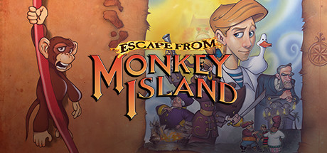
  • Genre Clarity: 9/10 — Classic adventure game instantly recognizable. The iconic monkey character with rope, cartoonish art style, and tropical island setting immediately signal a lighthearted point-and-click adventure. At tiny size, the bold character silhouettes and warm color palette distinctly communicate adventure genre with clear visual personality. The presence of multiple characters and comedic visual tone leaves no doubt this is narrative-driven adventure, not action or puzzle-focused.
  • Title Readability: 9/10 — Bold title dominates with excellent contrast. The title 'ESCAPE FROM MONKEY ISLAND' is rendered in large, orange serif letterforms with strong gold outlines that cut through the background cleanly. At tiny size, the text remains legible and the word 'MONKEY ISLAND' maintains clear shape recognition. The 'ESCAPE FROM' tagline above is smaller but still readable at small sizes due to high contrast against the warm background.
  • Contrast & Color: 8/10 — Warm palette pops against dark Steam background. The orange, red, and yellow color scheme creates strong value separation against the dark Steam background (#1b2838). The monkey character in burgundy-red silhouette reads distinctly even at tiny size, and the golden text outlines ensure title visibility. A grayscale squint test shows solid light-dark separation, though the orange-to-yellow gradient transitions are somewhat gradual in the background.
  • Uniqueness & Polish: 8/10 — Distinctive retro adventure charm with polish. The hand-drawn art style and character design feel authentic to the Monkey Island legacy, not generic adventure asset reuse. The composition shows intentional character placement and professional coloring, with clear visual hierarchy between the main monkey protagonist and supporting characters. The art direction conveys personality and humor rather than defaulting to template-style composition.
  • Brand Consistency: 9/10 — Iconic series identity strongly reinforced. The recognizable monkey character with distinct facial features and pose is a franchise hallmark, and the art style matches the established Monkey Island visual language. The warm tropical color palette and cartoonish rendering are consistent with series branding across store screenshots. The title treatment with gold accents feels proprietary to the franchise and would be identifiable as Monkey Island even without the text.
  • Composition: 8/10 — Clear focal hierarchy with balanced elements. The prominent monkey on the left provides strong primary focus, while supporting characters on the right create visual flow without competing for attention. The central title placement anchors the composition and maintains readability across all sizes. The depth layering (foreground character, midground action, background elements) creates visual interest, though at tiny size some secondary character details blur into background noise.

What works

  • Iconic character recognition. The distinctive monkey protagonist is instantly recognizable and carries strong brand equity from the series legacy.
  • Excellent title contrast and legibility. Bold golden-orange text with outlines maintains perfect readability from full size down to tiny thumbnail due to high contrast.
  • Genre clarity through visual storytelling. The art style, character design, and tropical setting communicate adventure genre unambiguously without requiring text reading.
  • Professional art direction and polish. Clean hand-drawn rendering, consistent color palette, and intentional character placement signal high-quality production values.

What hurts the capsule

  • Secondary character legibility at tiny size. The right-side supporting characters and background elements lose definition at thumbnail scale and become visual noise.
  • Background gradient lacks distinctiveness. The orange-to-yellow gradient background, while warm and cohesive, does not create memorable visual separation compared to other adventure game capsules.
  • Limited compositional depth at small sizes. While layering works at full size, the complexity compresses into a unified warm shape at tiny thumbnail, reducing visual interest.

Priority fixes

  1. [composition] Ensure supporting characters on the right maintain silhouette clarity at 120x45 resolution by increasing outline weight or color separation from background
  2. [contrast_color] Add subtle secondary accent color (cool tone) to background to create more pop against Steam's dark interface and reduce visual monotony
  3. [composition] Confirm critical character details (monkey face, rope) remain sharp at tiny size through edge enhancement or selective contrast increase

Store copy priority fixes

  1. [hook_strength] Rewrite the short description to lead with a core gameplay or emotional promise: e.g., 'Solve hundreds of pirate-themed puzzles in a wickedly funny return to Monkey Island' instead of just naming the series.
  2. [uniqueness] Add a sentence explicitly differentiating this installment: what new story territory, mechanics, or scope does this fourth game explore that players won't find elsewhere?
  3. [audience_targeting] Add a 1-2 sentence welcome for new players after the memoir excerpt, clarifying what prior knowledge (if any) is needed to enjoy the story.
  4. [feature_communication] Replace or follow vague adjectives ('lusciously rendered,' 'challenges') with concrete gameplay examples: e.g., 'Use inventory items and clever dialogue to unlock puzzles' or 'Match wits with colorful characters through absurdist humor.'

Related guides

Steam app ID: 730830 · Tags: Adventure, Point & Click, Comedy, Classic, Singleplayer