Scoring genre clarity...

Truberbrook / Trüberbrook capsule

Truberbrook / Trüberbrook

Enjoy an adventurous vacation to a 1960's parallel universe! A Sci-Fi-Mystery Adventure Game with handmade scenery.

$2.99Mostly Positive(11)
AdventurePoint & ClickIndie
btfMar 12, 2019

Truberbrook / Trüberbrook scores 73/100 — better than 61% of Adventure capsules (n=7,970).

Mostly Positive (11 reviews) · $2.99 · Released Mar 12, 2019 · By btf

Quick text summary

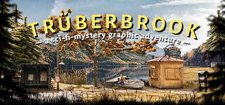
Truberbrook / Trüberbrook scored 73/100 on Steam Analyzer — Good for a Adventure capsule. Top priority fix: [genre_clarity] Add a subtle sci-fi visual cue (e.g., a retro-futuristic device, strange light anomaly, or displaced object) to signal the parallel-universe element at SMALL and TINY sizes.

Capsule scores by dimension

  • Genre Clarity: 7/10 — Mystery adventure clear, sci-fi subtle. The lakeside setting with wooden structures, calm water, and forested environment immediately signal adventure and mystery themes. The subtitle 'a sci-fi-mystery graphic adventure' anchors the genre, but at TINY size the sci-fi element is not visually apparent—the aesthetic reads as rural adventure or period mystery first. The handmade art style supports adventure game expectations effectively.
  • Title Readability: 8/10 — Strong yellow title, readable at all sizes. The yellow uppercase 'TRÜBERBROOK' title has excellent contrast against the blue sky and uses bold letterforms that maintain legibility even at TINY size. The subtitle text below is small and harder to read at reduced scales, but the primary title dominates and reads clearly. At SMALL size the full composition remains readable without collapse.
  • Contrast & Color: 8/10 — Bright yellow pops against cool background. The warm yellow title creates strong value separation from the cool blue-toned sky and forest environment, ensuring the key text element stands out in quick scroll. The golden-brown wooden structures in the midground contrast well with the blue water and darker treeline, creating visual depth. At TINY size, the yellow title remains the dominant read despite overall scene complexity.
  • Uniqueness & Polish: 7/10 — Handmade aesthetic distinctive, scene generic. The visible handmade/diorama quality of the scenery—evident in the wooden shacks, careful landscape composition, and soft lighting—sets this apart from digitally-rendered adventure games and conveys craft and charm. However, the lakeside cabin scene itself is a familiar adventure game setting and does not communicate a unique mechanical hook or story promise beyond the mysterious atmosphere. The art direction is polished but the concept is archetypal.
  • Brand Consistency: 7/10 — Cohesive handmade art, recognizable identity. The diorama-like handcrafted aesthetic is consistent and memorable, creating a distinctive visual signature that could be recognized across materials. The warm, pastoral color palette and the specific mix of retro 1960s architecture with naturalistic landscape establish a coherent brand voice. This style is reinforced by the game's core promise of handmade scenery, making it internally consistent.
  • Composition: 7/10 — Clear focal point, balanced but busy. The lake and wooden structure cluster in the center-right form a clear focal point that guides the eye, with the tall trees framing left and right edges. The title is well-positioned in the upper portion without obscuring key scene elements. However, the scene is fairly dense with detail across the entire composition; at TINY size some secondary elements (distant mountains, right-side structure) compete slightly for attention, though the center remains dominant.

What works

  • Title contrast and legibility. Bright yellow uppercase text maintains excellent readability from FULL to TINY size against the cool-toned background.
  • Distinctive handmade aesthetic. The diorama-like crafted scenery visually communicates the game's core promise and creates a memorable, recognizable brand signature.
  • Atmospheric depth and layering. Clear foreground (grass), midground (structures and water), and background (trees and mountains) create visual hierarchy and draw the viewer into the scene.

What hurts the capsule

  • Sci-fi element not visually apparent. The pastoral 1960s landscape reads as period mystery rather than sci-fi at first glance; the parallel-universe concept is not communicated through visual cues.
  • Subtitle text too small at reduced sizes. The tagline 'a sci-fi-mystery graphic adventure' becomes illegible at SMALL and TINY scales, losing the genre clarification.
  • Generic lakeside adventure setting. While beautifully executed, the calm lake with cabins is a familiar indie game backdrop that does not immediately suggest a unique mechanic or story promise.

Priority fixes

  1. [genre_clarity] Add a subtle sci-fi visual cue (e.g., a retro-futuristic device, strange light anomaly, or displaced object) to signal the parallel-universe element at SMALL and TINY sizes.
  2. [title_readability] Either enlarge the subtitle or replace it with a single icon/glyph that reads at TINY size to reinforce the sci-fi-mystery hook without text collapse.
  3. [composition] Consider slightly reducing clutter in the periphery (far-right structure or distant mountains) to ensure the primary focal point (central lake and shacks) remains unambiguous at TINY size.

Store copy priority fixes

  1. [hook_strength] Remove the verbatim repetition of the short description in the detailed section and replace it with a hook that emphasizes the core mystery or emotional stakes (e.g., 'But Hans soon discovers his lottery win is no accident—and the world's fate hangs in the balance.').
  2. [feature_communication] Consolidate the handmade scenery explanation into 1–2 focused sentences early in the description, then move immediately to gameplay: 'You'll navigate Hans through this miniature world solving puzzles, persuading locals, and uncovering conspiracies.'
  3. [audience_targeting] Add a sentence explicitly addressing puzzle difficulty and the balance of story vs. challenge (e.g., 'Perfect for story-first players who enjoy leisurely puzzle-solving without time pressure') to help the right audience self-identify.
  4. [uniqueness] Lead the detailed description with a single differentiation statement (e.g., 'Trüberbrook is the only adventure game built from handmade diorama scenery, blending analog craftsmanship with digital storytelling') before diving into setting and plot.

Related guides

Steam app ID: 757300 · Tags: Adventure, Point & Click, Indie, Singleplayer, Exploration