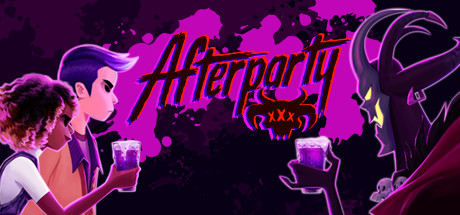
Afterparty scores 75/100 — better than 69% of Indie capsules (n=11,449).

Quick text summary

Afterparty scored 75/100 on Steam Analyzer — Good for a Indie capsule. Top priority fix: [title_readability] Increase title outline weight by 15% and consider adding a subtle drop shadow to lock it against background noise at tiny sizes

Capsule scores by dimension

  • Genre Clarity: 8/10 — Strong narrative adventure with party vibes. The neon-lit bar setting, character silhouettes holding drinks, and vibrant magenta/purple palette immediately signal a stylized indie adventure with social or comedic undertones. At tiny size, the drink-holding pose and supernatural character design (demon-like figure on right) clearly communicate an unconventional narrative game rather than action or puzzle genres. The visual language reads as adventure-comedy rather than generic indie.
  • Title Readability: 7/10 — Bold logo readable at small, minor blur at tiny. The 'Afterparty' title uses a thick, angular magenta font with white outline placed centrally over negative space, making it legible at small capsule size with good separation from background chaos. At tiny size (120x45), the letterforms still register but begin to compress slightly and the outline loses some clarity due to pixel density limits. The logo placement avoids the busy particle effects on edges, which helps sustain readability across sizes.
  • Contrast & Color: 8/10 — Vibrant magenta pops cleanly against dark background. The neon magenta title, character outlines, and drink highlights create strong luminance separation against the dark purple void (#1b2838 context), with the bright pink characters reading distinctly even at small scale. In grayscale, the silhouettes maintain clear definition and the character profiles create recognizable shapes through value contrast alone. The saturation control keeps neon elements from feeling garish while maintaining visual pop during quick scroll.
  • Uniqueness & Polish: 7/10 — Stylized art with distinctive visual hook. The hand-drawn, anime-influenced character style combined with neon aesthetic and the specific drinking-challenge framing creates a memorable identity distinct from generic adventure capsules. The demon antagonist silhouette and casual friend-group body language telegraph the game's irreverent tone and core mechanic (outdrinking Satan) without over-explanation. Craft is clean but not groundbreaking—it feels intentional and cohesive rather than premium-boutique level.
  • Brand Consistency: 8/10 — Cohesive neon-noir indie aesthetic throughout. The magenta-purple neon palette, hand-drawn character rendering, and graffiti-style title treatment establish a consistent visual identity that aligns with indie adventure games like Slay the Princess or Hades II. The character designs (casual modern humans + supernatural demon) and drinking-focused iconography create recognizable brand signals that would carry across promotional materials. Internal elements (background texture, character silhouettes, typography) all reinforce a unified neon-noir tone.
  • Composition: 7/10 — Clear focal point with balanced secondary elements. The left-side human characters and right-side demon create a balanced compositional triangle with the centered title serving as the primary anchor point. At small and tiny sizes, the two character groups remain visually distinct enough to guide the eye without competing for dominance, and the title placement in negative space prevents text-subject collision. The background particle effects sit deep enough to support rather than clutter, though some detail loss occurs at tiny scale where mid-ground elements blur together.

What works

  • Neon magenta title pops against dark void. Bold outline treatment and strategic placement in negative space ensures legibility at small capsule sizes without fighting background elements.
  • Character silhouettes telegraph game premise. The contrasting human friends versus demon antagonist immediately communicates the supernatural adventure premise and core relationship dynamic.
  • Cohesive anime-influenced visual identity. Hand-drawn style and neon-noir palette create a recognizable brand aesthetic that stands apart from generic indie adventure capsules.
  • Balanced left-right compositional structure. Character placement on opposing sides with centered title creates natural visual hierarchy that reads cleanly even when compressed to tiny dimensions.

What hurts the capsule

  • Background particle clutter reduces tiny readability. Scattered dark splatter effects blend together at thumbnail size, creating visual noise that competes for attention despite sitting in background.
  • Secondary tagline/stars become illegible at tiny. The small decorative stars and any supporting text below the main title compress and blur at 120x45 scale, adding visual complexity without benefit.
  • Character detail loss at compressed sizes. Fine linework on character faces and clothing become muddled when the capsule scales down, reducing the charm of the hand-drawn aesthetic.

Priority fixes

  1. [title_readability] Increase title outline weight by 15% and consider adding a subtle drop shadow to lock it against background noise at tiny sizes
  2. [composition] Reduce background particle density or increase their opacity so they recede further, allowing character silhouettes to dominate visual hierarchy at all scales
  3. [contrast_color] Test title outline in pure white instead of current treatment to maximize legibility contrast when capsule is scaled to 120x45

Store copy priority fixes

  1. [uniqueness] Clarify how the drinks mechanic uniquely drives gameplay—e.g., 'each drink subtly changes your personality and dialogue options, making every sip a narrative choice' to differentiate from standard branching systems.
  2. [feature_communication] Add 1-2 sentences explaining the exploration structure and how the underworld world is traversed, so players understand the pacing between dialogue scenes and navigation.
  3. [genre_clarity] Lead the detailed description with 'A narrative adventure where every conversation choice and drink you order rewrites your fate,' to immediately ground the conversation system as the primary mechanic before layering in features.

Related guides

Steam app ID: 762220 · Tags: Indie, Dialogue Heavy, Narrative, Supernatural, Comedy