Scoring genre clarity...
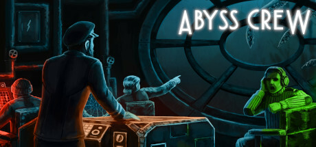
Abyss Crew is a multiplayer coop game aboard a steampunk submarine. Each player is a member of the submarine crew - pilot, gunner, sonar, or engineer. Explore the abyss to find precious mineral - but beware, as sprawling menaces lurk in the darkness...
$9.99Mostly Negative(10)
SubmarineUnderwaterCo-op
PGM Studio, Deep Slap StudioMar 31, 2025