Scoring genre clarity...
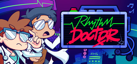
Save patients with your rhythm mastery! Rhythm Doctor is a rhythm game where you heal patients by defibrillating in time to their heartbeats. Learn each patient's unique heartbeat and defeat boss viruses trying to sabotage your rhythm, all set to heart-pumping, soul-soothing music.
$19.99Overwhelmingly Positive(259)
RhythmMusicPixel Graphics
7th Beat GamesDec 6, 2025