Scoring genre clarity...
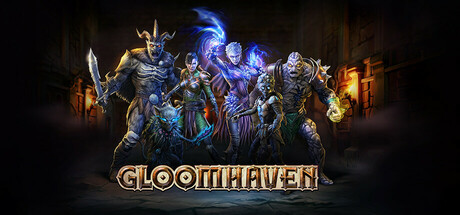
Gloomhaven capsule

Gloomhaven

Lead your band of mercenaries in the land of Gloomhaven, work with unsavoury individuals, shape the fate of the region, fight your way through horrific places and get rich or die trying in this ruthless Tactical-RPG.

$34.99Very Positive(56)
DifficultOnline Co-OpTurn-Based Combat
Flaming Fowl Studios, Saber InteractiveOct 20, 2021

Gloomhaven scores 87/100 — better than 93% of Difficult capsules (n=1,463).

Very Positive (56 reviews) · $34.99 · Released Oct 20, 2021 · By Flaming Fowl Studios

Quick text summary

Gloomhaven scored 87/100 on Steam Analyzer — Excellent for a Difficult capsule. Top priority fix: [composition] Consider slightly increasing background darkening or blur to reduce architectural detail competition and push character silhouettes further forward

Capsule scores by dimension

  • Genre Clarity: 9/10 — Tactical RPG with dark fantasy. The capsule immediately communicates tactical-RPG through a lineup of distinct character archetypes in armor and robes with visible weapons and magical effects. At tiny size, the silhouettes of multiple party members with varied gear and the glowing magical auras clearly signal party-based strategy gameplay. The dark gothic architecture and demonic character designs reinforce the dark fantasy adventure setting unmistakably.
  • Title Readability: 9/10 — Bold golden title excellent clarity. The title 'GLOOMHAVEN' uses a thick, outlined golden serif font positioned prominently at the bottom center with strong value separation from the dark background. At both small and tiny sizes, the outline and weight maintain perfect legibility, and the strategic placement on a relatively clear lower region prevents overlap with character detail. The letterforms remain crisp and recognizable even at thumbnail scale due to confident stroke weight and spacing.
  • Contrast & Color: 9/10 — Excellent value and saturation separation. The palette uses warm golden/orange tones for characters and title contrasted against cool deep blue/purple magic effects and dark backgrounds, creating strong value separation that reads well at any size. In grayscale, the light armor pieces and character silhouettes stand distinctly apart from the dark background and architecture. The glowing magical effects add additional luminosity contrast that maintains visual pop even at tiny sizes on the Steam dark background.
  • Uniqueness & Polish: 8/10 — Polished fantasy RPG presentation. The composition showcases professional character art with layered lighting, distinct personality per character (horned demon warrior, mage with spell effects, armored knight, etc.), and coherent dark-fantasy aesthetics that feel intentional rather than generic template work. The integration of magical effects with character silhouettes and the careful balance of detail creates a premium feel. While character party presentations are familiar in RPG marketing, the execution here is clean and distinctive without feeling derivative.
  • Brand Consistency: 8/10 — Strong internal cohesion and identity. The capsule maintains consistent rendering style across all five character figures with matching lighting direction, consistent color grading (warm golds and cool blues), and a unified dark-gothic art direction that reinforces the Gloomhaven brand identity. The demonic and mercenary character archetypes align with the game's core theme of unsavory individuals, and the visual language is cohesive enough to be recognizable as Gloomhaven-specific rather than generic fantasy. The golden title treatment becomes a signature element tied to brand recognition.
  • Composition: 9/10 — Clear hierarchy with strong focal point. The five characters form a balanced horizontal arrangement with natural hierarchy—the horned demon warrior on the left provides a strong anchor, the mage with active spell effects in the center draws focus, and supporting characters frame the composition without competing for attention. The title placement at the base grounds the design and provides clear visual closure without overlapping critical character detail. The depth layering (background architecture, character midground, foreground title) creates a professional layered read that holds together at all sizes.

What works

  • Exceptional title legibility. Golden outlined serif font maintains perfect readability at tiny thumbnail size with confident letterform weight and clear value separation.
  • Strong genre communication. Multiple distinct party member archetypes with visible weapons, armor variance, and magical effects instantly signal tactical RPG gameplay at any viewing size.
  • Premium visual polish. Professional character rendering with consistent lighting, color grading, and dark-fantasy art direction creates a polished, cohesive brand presentation.
  • Excellent color contrast. Warm golds and cool blues create strong value separation that pops against the Steam dark background and reads clearly even in grayscale at tiny sizes.

What hurts the capsule

  • Architectural detail becomes noise. The background buildings, while atmospheric, introduce visual clutter that could potentially distract from character focus at small scrolling speeds during quick browsing.
  • Character count density. Five characters in one frame, while visually impressive, can feel slightly crowded at tiny thumbnail size and may make individual character details indistinguishable.

Priority fixes

  1. [composition] Consider slightly increasing background darkening or blur to reduce architectural detail competition and push character silhouettes further forward
  2. [genre_clarity] Ensure the mage's active spell effects remain the primary focal point with subtle framing adjustments to guide eye movement at small sizes

Store copy priority fixes

  1. [uniqueness] Expand on what makes the digital adaptation distinct from the board game—specifically highlight 1–2 mechanics or features that only the video game version enables and why they matter to strategy players.
  2. [feature_communication] Replace generic dark fantasy language ("horrific," "dreadful") with one concrete example of dungeon mechanic or environmental puzzle that reinforces tactical depth.
  3. [hook_strength] Strengthen the opening line by leading with the core decision loop (e.g., "Every card you play is a life-or-death choice") instead of settling for the mercenary premise alone.
  4. [feature_communication] Clarify how the Guildmaster mode differs from the main campaign mechanically—does it introduce new mission types, enemy types, or progression systems players should expect?

Related guides

Steam app ID: 780290 · Tags: Difficult, Online Co-Op, Turn-Based Combat, Dark Fantasy, Tactical RPG