Scoring genre clarity...

DOOM Eternal capsule

DOOM Eternal

Hell’s armies have invaded Earth. Become the Slayer in an epic single-player campaign to conquer demons across dimensions and stop the final destruction of humanity. The only thing they fear... is you.

$29.99Very Positive(566)
GoreFPSAction
id SoftwareMar 19, 2020

DOOM Eternal scores 90/100 — better than 98% of Gore capsules (n=1,085).

Very Positive (566 reviews) · $29.99 · Released Mar 19, 2020 · By id Software

Quick text summary

DOOM Eternal scored 90/100 on Steam Analyzer — Excellent for a Gore capsule. Top priority fix: [title_readability] Increase the size or weight of the ETERNAL wordmark slightly so it remains legible at the 120x45 thumbnail crop.

Capsule scores by dimension

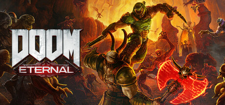
  • Genre Clarity: 10/10 — Unmistakable hellish action shooter. The armored Doom Slayer dominates the center in a dynamic combat pose wielding a blade, surrounded by swarming demonic enemies against a fiery hellscape backdrop. Even at tiny size the combat action, demonic enemies, and armored protagonist instantly communicate fast-paced action FPS. Genre iconography is industry-recognized and leaves zero ambiguity.
  • Title Readability: 9/10 — Bold logo reads at all sizes. The DOOM logotype uses massive, heavy metallic letterforms with strong dark outlining placed cleanly over a relatively controlled mid-left background zone, and ETERNAL sits beneath in a clean serif-style font with good contrast. At tiny size DOOM still reads clearly due to its massive weight and iconic silhouette, though ETERNAL becomes very small and may compress to near illegibility at 120x45. The stacked logo hierarchy works well under quick scroll conditions.
  • Contrast & Color: 8/10 — Strong warm fire tones pop on dark background. The fiery orange-red hellscape background creates strong warm contrast against Steam's dark #1b2838 background, and the Slayer's green armor silhouette provides a complementary color contrast anchor. The red glowing axe on the bottom right adds a hot accent that draws the eye. In grayscale the Slayer's armored silhouette separates clearly from the busy background, though the left edge demons blend slightly into the darker mid-tones under squint conditions.
  • Uniqueness & Polish: 9/10 — Premium AAA execution with iconic identity. The capsule delivers a cinematic action composition with detailed character rendering, layered lighting, and a sense of overwhelming scale as the Slayer dominates enemies. The specific green armor design, the chaotic demon swarm, and the hellfire palette are all signature DOOM Eternal brand elements that feel intentional and premium. Compared to benchmark titles like Warhammer Space Marine 2 or God of War Ragnarök, this holds its own with distinct identity and strong visual storytelling of the power fantasy.
  • Brand Consistency: 10/10 — Instantly recognizable DOOM brand identity. The iconic DOOM logotype, the unmistakable Doom Slayer armor design, the demonic enemy roster, and the hellfire palette are all deeply established brand signals that are consistent with the game's visual identity across all marketing materials. The green armor against hellish orange-red is a signature color pairing recognizable even without text. Internal cohesion between character rendering style, environment, and logo treatment is seamless.
  • Composition: 8/10 — Dynamic center-right hero with clear hierarchy. The Slayer occupies the dominant center-right position in a powerful upward-angled pose that creates strong directional energy, while the DOOM ETERNAL logo anchors the left third in a classic rule-of-thirds split. Background demons create depth layering from foreground claws to midground bodies to background flying creatures. At small sizes the logo and hero remain the clear primary read, though the bottom-right demon with the glowing axe competes slightly for attention and some edge elements feel tight against the frame crop.

What works

  • Iconic logo weight. The massive DOOM logotype is immediately readable even at tiny thumbnail size due to its extreme letterform weight and metallic contrast treatment.
  • Unmistakable protagonist silhouette. The Doom Slayer's green armor is a globally recognized game character design that communicates brand identity without needing any text.
  • Fiery hellscape palette. The orange-red fire tones create strong pop against Steam's dark blue-grey interface background, ensuring the capsule stands out in scroll.
  • Depth and scale storytelling. The layered composition of foreground demons, midground Slayer, and background flying creatures communicates the overwhelming scale of combat effectively.

What hurts the capsule

  • ETERNAL subtitle compresses at tiny size. The word ETERNAL beneath the DOOM logo becomes very difficult to read at 120x45 thumbnail size due to its thinner weight relative to the DOOM letters.
  • Left edge demons blend into dark zone. The darker-toned demon claws and bodies along the left edge lose definition against the darker background in grayscale and under squint conditions.
  • Bottom-right glowing axe competes for focus. The bright red glowing axe held by a foreground demon creates a secondary focal hotspot that slightly competes with the primary Slayer hero at small sizes.
  • Background detail noise at tiny size. The busy midground of multiple demons and rock formations creates visual noise that reduces clarity of the overall scene at 120x45.

Priority fixes

  1. [title_readability] Increase the size or weight of the ETERNAL wordmark slightly so it remains legible at the 120x45 thumbnail crop.
  2. [contrast_color] Darken or vignette the left edge demon cluster to better separate them from the background at small sizes and in grayscale.
  3. [composition] Reduce the visual intensity of the bottom-right glowing axe element to ensure the Slayer remains the single dominant focal point at small sizes.
  4. [genre_clarity] Consider a subtle darkening of the extreme background corners to push all peripheral elements back and sharpen the Slayer's central dominance.

Store copy priority fixes

  1. [feature_communication] Move the "Unholy Trinity" and combat mechanics section immediately after the opening hook and before any cosmetics or edition content to prioritize gameplay over merchandising.
  2. [feature_communication] Replace one instance of the repeated opening paragraph with a sentence describing campaign scope: length, number of missions, or enemy types encountered across dimensions.
  3. [uniqueness] Add a sentence explicitly contrasting the push-forward combat style with traditional cover-based shooters to strengthen differentiation from competitors.

Related guides

Steam app ID: 782330 · Tags: Gore, FPS, Action, Great Soundtrack, Fast-Paced