Scoring genre clarity...
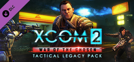
XCOM 2: War of the Chosen - Tactical Legacy Pack capsule

XCOM 2: War of the Chosen - Tactical Legacy Pack

The XCOM 2: War of the Chosen - Tactical Legacy Pack includes a collection of new game modes, maps, weapons, armors, Photobooth options, and more that honors the legacy of the XCOM series.

$6.39Mostly Positive(307)
StrategyTacticalTurn-Based Combat
Firaxis Games, Feral Interactive (Mac), Feral Interactive (Linux)Dec 3, 2018

XCOM 2: War of the Chosen - Tactical Legacy Pack scores 85/100 — better than 98% of Strategy capsules (n=5,310).

Mostly Positive (307 reviews) · $6.39 · Released Dec 3, 2018 · By Firaxis Games

Quick text summary

XCOM 2: War of the Chosen - Tactical Legacy Pack scored 85/100 on Steam Analyzer — Excellent for a Strategy capsule. Top priority fix: [title_readability] Simplify or enlarge the subtitle stack—remove 'TACTICAL LEGACY PACK' or reduce to smaller supporting text to maintain 'WAR OF THE CHOSEN' clarity at thumbnail size.

Capsule scores by dimension

  • Genre Clarity: 8/10 — Tactical strategy with sci-fi soldiers clear. The capsule immediately communicates tactical sci-fi strategy through armed soldiers in tactical gear, sci-fi weapons, and a military command aesthetic. The protagonist's pose and equipment, combined with armored units on both sides, signals turn-based tactical combat. At tiny size, the soldier silhouettes and weapons remain recognizable, though the specific genre (tactical strategy vs action) becomes slightly ambiguous without the title.
  • Title Readability: 9/10 — Bold cyan logo pops with strong hierarchy. The XCOM 2 title uses a thick, glowing cyan geometric font that stands out aggressively against the dark background with excellent luminosity contrast. The subtitle 'WAR OF THE CHOSEN' and 'TACTICAL LEGACY PACK' remain readable even at small size due to solid white and red text placement on a dark band. At tiny size, the main XCOM 2 logo remains distinctly legible and memorable.
  • Contrast & Color: 9/10 — Cyan glow and warm lighting create separation. The cyan neon XCOM 2 logo generates exceptional contrast against the dark teal-blue background, with warm orange and yellow environmental lights creating clear value separation. The center soldier benefits from rim lighting and warm tones that lift him from the cooler background. At tiny size, the glowing cyan title and bright soldier silhouette remain highly distinct and scannable.
  • Uniqueness & Polish: 8/10 — Recognizable XCOM style with professional execution. The capsule leverages the established XCOM 2 aesthetic with sci-fi military hardware, neon-lit urban environment, and procedural glow effects that feel intentional rather than generic. The composition avoids cliché by centering the character amid tactical combat readiness cues. While the visual language is specific to the XCOM franchise, the execution is polished and cohesive, though it relies on existing brand recognition rather than introducing entirely fresh visual storytelling.
  • Brand Consistency: 9/10 — Iconic XCOM neon cyan identity maintained. The distinctive cyan neon logo treatment is a signature XCOM 2 brand element that appears consistently across materials and is instantly recognizable to franchise fans. The tactical soldier pose, sci-fi weaponry, and industrial military aesthetic align perfectly with XCOM's established visual identity. The color palette of cyan, warm golds, and dark teals creates a cohesive, memorable brand mark.
  • Composition: 8/10 — Strong center focal point with balanced frames. The commander figure in the center is the clear primary focal point, with flanking soldiers (left with railgun, right with rifle) creating compositional balance and framing depth. The XCOM 2 logo sits prominently above without blocking the character, and subtitle text is positioned low with good margin safety. At small and tiny sizes, the composition remains coherent with clear hierarchy, though the flanking soldiers compete slightly for attention at the smallest scale.

What works

  • Iconic cyan neon branding. The glowing cyan XCOM 2 logo is instantly recognizable, highly legible at all sizes, and creates a strong visual anchor that screams premium sci-fi tactical strategy.
  • Excellent value contrast and silhouettes. Soldiers and environmental lights pop distinctly against the dark background, with rim lighting and warm tones creating clear depth separation that reads well even at tiny thumbnail size.
  • Balanced three-figure composition. The center commander flanked by two armed soldiers creates visual interest and depth without appearing cluttered, with each element serving a compositional purpose.
  • Clear tactical sci-fi genre communication. Weapons, armor, military postures, and command-center lighting immediately convey turn-based tactical strategy with no ambiguity about gameplay type.

What hurts the capsule

  • Subtitle text readability at tiny size. The 'WAR OF THE CHOSEN' and 'TACTICAL LEGACY PACK' text becomes difficult to parse at thumbnail sizes, with the red band and white lettering losing clarity in quick scroll.
  • Flanking soldiers compete for focal attention. The left and right soldiers draw eye equally to the center character at small sizes, slightly diluting the primary focal point hierarchy.
  • Generic sci-fi military scene without unique hook. While well-executed, the capsule relies entirely on established XCOM franchise identity rather than showcasing what makes the Tactical Legacy Pack specifically distinctive (new modes, weapons, photobooth features).

Priority fixes

  1. [title_readability] Simplify or enlarge the subtitle stack—remove 'TACTICAL LEGACY PACK' or reduce to smaller supporting text to maintain 'WAR OF THE CHOSEN' clarity at thumbnail size.
  2. [uniqueness_polish] Add a subtle visual hint of the pack's unique content (weapons loadout icon, cosmetic variant, or map terrain) to differentiate from base game capsules.
  3. [composition] Consider tightening the right-side soldier slightly or desaturating flanking units to strengthen the center commander as the sole focal point.

Store copy priority fixes

  1. [hook_strength] Rewrite the opening to lead with the most compelling gameplay hook: 'Command iconic XCOM operatives through five new campaign scenarios, or build your own missions with the included Skirmish editor' instead of 'includes a collection of.'
  2. [feature_communication] Add a brief explanation of gameplay benefit for legacy content, e.g., 'Relive classic maps and weapons from the original XCOM series, plus unlock new cosmetics for the main campaign' to connect nostalgia to player motivation.
  3. [feature_communication] Break the detailed description into visually scannable sections with consistent formatting and short benefit statements under each mode (e.g., under Skirmish Mode: 'Create unlimited custom missions with full control over difficulty, enemies, and objectives').

Related guides

  • Steam page optimisationCapsule, copy, screenshots, tags — the full Steam page conversion stack.
  • Steam tags guideTag selection, ordering, and how it shapes Steam's recommendation rails.

Steam app ID: 785300 · Tags: Strategy, Tactical, Turn-Based Combat