Scoring genre clarity...

Razerwire:Nanowars capsule

Razerwire:Nanowars

A modern revisitation of the 80s arcades. Use your Razerwire to cut through waves of nanobugs with a rogue-like inspired progression.

$0.69Very Positive(83)
Arena ShooterBullet HellShoot 'Em Up
Hammer & RavensFeb 28, 2018

Razerwire:Nanowars scores 80/100 — better than 90% of Arena Shooter capsules (n=571).

Very Positive (83 reviews) · $0.69 · Released Feb 28, 2018 · By Hammer & Ravens

Quick text summary

Razerwire:Nanowars scored 80/100 on Steam Analyzer — Good for a Arena Shooter capsule. Top priority fix: [title_readability] Increase NANOWARS tagline size by 15-20% or use outline/glow to ensure legibility at TINY size without sacrificing main title prominence

Capsule scores by dimension

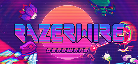
  • Genre Clarity: 8/10 — Strong arcade action vibe. The neon synthwave aesthetic, geometric spacecraft/weapon assets, and bright energy effects immediately signal a sci-fi arcade shooter. At TINY size, the glowing circular sun, colorful enemy silhouettes on the right, and energetic weapon shapes communicate action gameplay clearly. The retro-futuristic palette and particle effects reinforce the 80s arcade callback without ambiguity.
  • Title Readability: 8/10 — Bold neon title, readable at scale. RAZERWIRE is rendered in large, bright magenta and cyan gradient letters with a strong horizontal glow effect that stands out against the dark purple background. The title remains legible at SMALL and TINY sizes due to high contrast and thick letterforms. The smaller 'NANOWARS' tagline is less readable at TINY size but the main title carries the brand recognition.
  • Contrast & Color: 9/10 — Excellent neon pop and separation. The capsule uses vibrant cyan, magenta, and hot orange against a deep purple background, creating strong value separation in both color and grayscale modes. The glowing sun, neon title, and bright enemy assets all have crisp silhouettes that remain distinct at TINY size without muddiness. The layered glow effects reinforce depth while maintaining clarity.
  • Uniqueness & Polish: 8/10 — Distinctive synthwave aesthetic, cohesive style. The capsule commits fully to 80s arcade synthwave with intentional neon color grading, horizontal scanline effects on the title, and period-appropriate geometric enemy designs. The visual identity feels premium and specific rather than generic, with clean craft evident in the gradient work and glow layering. The stylization successfully communicates both nostalgia and modern polish.
  • Brand Consistency: 7/10 — Strong aesthetic consistency, limited signature. The synthwave neon palette, cyan-magenta color scheme, and geometric sci-fi asset style are internally consistent and suggest a recognizable visual identity. However, without reference to store screenshots, there are no immediately iconic character, motif, or symbol cues that would make this capsule uniquely memorable as the franchise's signature look. The style is cohesive but the brand hook is still being established.
  • Composition: 8/10 — Clear focal hierarchy, balanced layout. The large glowing sun behind the title serves as a strong central focal point, with the title anchored cleanly in the middle-upper region. Enemy assets scatter around the edges (upper left weapon, right side enemies, lower left ship) creating frame interest without overwhelming the core message. At SMALL and TINY sizes, the composition remains readable with the title as primary focus and supporting elements providing visual rhythm without clutter.

What works

  • Neon pop against dark background. Magenta, cyan, and orange elements create excellent contrast that survives the Steam dark theme and reads clearly at all sizes including TINY.
  • Intentional retro-futuristic style. Scanline effects, geometric shapes, and synthwave palette work together to create a distinctive visual identity that feels premium and purposeful rather than derivative.
  • Strong title placement and readability. RAZERWIRE is positioned on a controlled background (behind the sun glow) with sufficient size and contrast to remain legible at TINY size without losing impact.
  • Balanced composition with layered depth. Assets are distributed across the canvas with clear foreground/midground/background separation, avoiding dead space while maintaining visual hierarchy.

What hurts the capsule

  • Secondary tagline loses readability at TINY. NANOWARS text beneath the title becomes too small and low-contrast to read at thumbnail size, reducing ability to communicate the full brand.
  • Limited brand recognition without iconography. While the aesthetic is cohesive, there are no distinctive character, weapon, or symbol elements that would make this capsule instantly recognizable as the Razerwire franchise.
  • Heavy reliance on fine detail glow effects. The scanline effects and subtle glow layers may compress poorly or blur during Steam's asset processing, potentially reducing crispness at SMALL and TINY scales.

Priority fixes

  1. [title_readability] Increase NANOWARS tagline size by 15-20% or use outline/glow to ensure legibility at TINY size without sacrificing main title prominence
  2. [brand_consistency] Introduce a more distinctive signature visual element (iconic weapon design, character silhouette, or symbol) that anchors the franchise identity and survives at SMALL/TINY scale
  3. [contrast_color] Test scanline and glow effects through Steam asset compression to confirm they remain crisp and don't become muddy at thumbnail sizes

Store copy priority fixes

  1. [hook_strength] Move the core gameplay loop (protect generators, cut nanobugs with the wire) to the opening of the detailed description before any autobiography, leading with 'Use a monomolecular filament to defend your generators against endless waves of nanobugs' instead of personal history.
  2. [uniqueness] Add one sentence after the short description explaining what makes the wire mechanic unique—e.g., 'Unlike traditional shooters, you control a single strand of energy rather than a ship, rewarding precision over firepower.'
  3. [audience_targeting] Insert a sentence clarifying the difficulty curve and playstyle: specify whether this is a 'relaxing arcade game for casual 30-minute sessions' (matching the Relaxing tag) or a 'competitive skill-based shooter for leaderboard chasers.'
  4. [feature_communication] Reduce or move the credits and sci-fi lore section to a footer; the detailed description should stay focused on gameplay and progression systems in the first 300 words to maintain player attention.

Related guides

Steam app ID: 788930 · Tags: Arena Shooter, Bullet Hell, Shoot 'Em Up, Roguelite, Shooter