Scoring genre clarity...
112 Operator capsule

112 Operator

Manage emergency services in any city in the world! Take calls and dispatch rescue forces. Handle difficult situations, now depending on the weather, and traffic. Help the citizens through cataclysms and natural disasters, becoming a better emergency number operator every day!

$4.99Very Positive(46)
SimulationRealisticCasual
Jutsu GamesApr 23, 2020

112 Operator scores 70/100 — better than 27% of Simulation capsules (n=5,423).

Very Positive (46 reviews) · $4.99 · Released Apr 23, 2020 · By Jutsu Games

Quick text summary

112 Operator scored 70/100 on Steam Analyzer — Good for a Simulation capsule. Top priority fix: [uniqueness_polish] Introduce a distinctive visual hook such as a stylized operator character silhouette, a unique UI design language, or a signature emergency dispatch motif that differentiates this capsule from generic management game templates.

Capsule scores by dimension

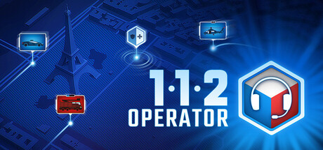
  • Genre Clarity: 7/10 — Emergency dispatch simulation clear. The central hexagonal badge with a red emergency symbol and floating monitor/communication icons clearly signal an emergency management or dispatch game. At TINY size, the red hexagon and tech aesthetic communicate a control/management theme, though the specific emergency dispatch focus is less obvious without the text. The blue tech environment and scattered UI elements reinforce the simulation/management genre.
  • Title Readability: 8/10 — Bold title, strong contrast. The '112 OPERATOR' text is rendered in a clean, bold sans-serif font positioned in the center-right with strong white-on-blue contrast. At SMALL and TINY sizes, the large numerals '1 1 2' remain legible and distinctive, though the word 'OPERATOR' shrinks noticeably at TINY size but remains readable due to the geometric letterforms. The layout avoids cluttered backgrounds directly behind the text, maintaining clarity across all viewing sizes.
  • Contrast & Color: 8/10 — Bright blue and red pop well. The dominant blue gradient background (#1b2838 compatible) is punctuated by bright cyan accents, white text, and a vibrant red hexagon badge that stands out distinctly in value and hue. The grayscale silhouette test shows strong separation between the light central elements (white text, red badge) and the darker blue background, maintaining clarity even at TINY size. The glowing light rays and floating UI elements add depth without creating muddy mid-tones.
  • Uniqueness & Polish: 6/10 — Competent tech aesthetic, generic execution. The design uses a polished tech UI theme with circuit board patterns, floating icons, and glowing effects that feel professional but align closely with common indie strategy/management game aesthetics. The hexagonal badge and floating monitors are functional visual devices but lack a distinctive or memorable hook that differentiates this capsule from similar simulation games like Taxi Life or Supermarket Simulator. The craft is clean but the overall composition reads as well-executed within a familiar template rather than offering a standout visual identity.
  • Brand Consistency: 6/10 — Tech interface consistent, not iconic. The internal design shows coherent blue-and-red color palette, consistent glowing UI styling, and repeated monitor/communication iconography that creates visual harmony. However, there are no distinctive brand identity signals such as an iconic character, signature symbol, or unique visual motif that would make this game instantly recognizable outside this capsule context. The aesthetic is solidly functional but generic enough that it could apply to multiple emergency or management titles without modification.
  • Composition: 7/10 — Clear focal point, balanced layout. The design uses a strong central hierarchy with the hexagonal badge and '112 OPERATOR' text anchoring the middle-right area as the primary focal point, supported by secondary floating monitors and glowing elements that guide the eye without competing. At SMALL and TINY sizes, the composition holds well with the large numerals and red badge remaining the clear visual anchor. The scattered UI elements (top-left monitor, bottom-left UI screens) provide context without creating clutter, and safe margins are maintained away from likely crop zones on a horizontal banner.

What works

  • Strong numerical clarity. The '1 1 2' numerals are rendered in large, geometric letterforms that maintain instant readability even at TINY sizes and create a memorable visual shorthand for the game's core mechanic.
  • Cohesive tech-blue palette. The consistent blue gradient, cyan accents, and glowing effects create a unified, professional aesthetic that reinforces the emergency dispatch theme across all viewing sizes.
  • Effective value separation. White text, red hexagon, and bright cyan elements clearly separate from the darker blue background in both color and grayscale, ensuring visibility during quick scrolls.

What hurts the capsule

  • Generic management aesthetic. The floating monitors, circuit patterns, and glowing UI effects closely match common indie strategy game templates, reducing distinctiveness compared to top-performing capsules in the genre.
  • No iconic brand marker. The design lacks a memorable character, signature symbol, or unique visual motif that would create instant brand recognition or differentiate it from similar simulation titles.
  • Secondary text shrinks significantly. The 'OPERATOR' word becomes difficult to parse at TINY sizes, relying primarily on '112' for recognition and creating potential ambiguity about the game's specific purpose.

Priority fixes

  1. [uniqueness_polish] Introduce a distinctive visual hook such as a stylized operator character silhouette, a unique UI design language, or a signature emergency dispatch motif that differentiates this capsule from generic management game templates.
  2. [brand_consistency] Develop and reinforce an iconic symbol or character element that appears consistently across store assets to build immediate brand recognition and memorability.
  3. [title_readability] Consolidate the title to emphasize '112' as the primary identifier, or use a distinctive logotype design that reads cohesively at TINY size without requiring the secondary 'OPERATOR' text.

Related guides

Steam app ID: 793460 · Tags: Simulation, Realistic, Casual, Moddable, Time Management