Scoring genre clarity...
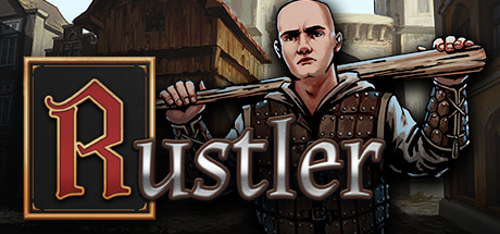
Rustler (Grand Theft Horse) capsule

Rustler (Grand Theft Horse)

Become a medieval thug in a crazy open-world action game, full of pop-culture references. Complete insane quests, kill heroes, steal horses, fight guards, rob peasants, listen to some bard music, and much more! All packed in old-school gameplay style!

$4.99Mostly Positive(14)
Open WorldCrimeFunny
Jutsu GamesAug 31, 2021

Rustler (Grand Theft Horse) scores 73/100 — better than 58% of Open World capsules (n=1,598).

Mostly Positive (14 reviews) · $4.99 · Released Aug 31, 2021 · By Jutsu Games

Quick text summary

Rustler (Grand Theft Horse) scored 73/100 on Steam Analyzer — Good for a Open World capsule. Top priority fix: [genre_clarity] Enhance horse visibility or add a secondary visual element (treasure, wagon, NPC) that clearly signals the open-world sandbox nature and comedic tone at small sizes.

Capsule scores by dimension

  • Genre Clarity: 7/10 — Medieval action-comedy clearly conveyed. The character's period costume, studs, crossbow, and dramatic pose immediately signal a medieval-themed action game with comedic intent. The silhouetted horse in the background reinforces the 'steal horses' mechanic promise. At tiny size, the character and weapon remain identifiable, though the horse silhouette becomes less distinct and the comedy tone is slightly lost.
  • Title Readability: 8/10 — Strong logo placement and legibility. The 'Rustler' title uses a distinctive ornate red letterform with gold outline on a contained dark background to the left, creating excellent contrast against the Steam dark background. The logo maintains clarity at small size due to bold outlines and high saturation, though at tiny size individual letterforms blur slightly. The placement avoids competition with the character figure and remains readable down to small thumbnail sizes.
  • Contrast & Color: 8/10 — Strong value separation and silhouettes. The light-skinned character figure pops clearly against the dark blue-black gradient background, with warm beige and brown armor tones creating additional separation. The red-and-gold logo contrasts sharply against the dark frame. In grayscale, the character maintains clear silhouette separation; at tiny size the figure remains readable as a distinct light form against dark surroundings.
  • Uniqueness & Polish: 7/10 — Polished character art with personality. The character portrait demonstrates solid rendering quality with detailed armor texturing, expressive facial features, and a distinctive pose that conveys attitude and comedic personality. The ornate logo treatment adds production value. However, the overall composition leans toward a standard character-portrait-plus-logo formula seen in many action game capsules, lacking a truly distinctive visual hook that communicates the game's 'crazy open-world' or pop-culture reference identity.
  • Brand Consistency: 6/10 — Competent but generic medieval styling. The capsule uses consistent brown, red, and gold color palette with a coherent medieval-Western aesthetic. The character design and armor styling appear intentional, but there are no immediately memorable iconic symbols, motifs, or signature visual elements that would distinguish Rustler from other medieval action games in a second viewing. The brand identity relies on the character portrait rather than a distinctive visual trademark.
  • Composition: 8/10 — Well-balanced focal point and hierarchy. The character figure dominates the right two-thirds as the clear primary focal point, while the logo anchors the left side, creating natural left-to-right reading flow. The horse silhouette provides secondary support in the upper background without competing. Safe margins are respected, and the logo sits well away from edges. At small and tiny sizes, the hierarchy remains intact with the character and logo both legible; the composition does not collapse under reduction.

What works

  • Clear character-driven focal point. The protagonist figure is positioned and lit to dominate attention, creating immediate visual interest and a strong central identity.
  • Ornate logo with excellent contrast. The red-and-gold framed title uses bold outlines and high saturation to remain highly readable against dark backgrounds and at reduced sizes.
  • Good value separation against background. The light character silhouette and warm armor tones contrast sharply with the dark blue gradient, maintaining clarity even at tiny thumbnail size.

What hurts the capsule

  • Generic medieval action template feel. The composition and visual language follow standard character-portrait-plus-logo conventions seen in many action games, lacking a distinctive hook that communicates the game's unique comedic or pop-culture identity.
  • Limited storytelling of core gameplay. While the character and crossbow hint at action, the capsule does not clearly communicate the open-world GTA-like mechanics, quest variety, or comedic tone that define the game's unique selling point.
  • Horse silhouette lacks impact at small sizes. The shadowy horse figure in the background becomes ambiguous and nearly invisible at tiny thumbnail size, reducing the reinforcement of a key game mechanic.

Priority fixes

  1. [genre_clarity] Enhance horse visibility or add a secondary visual element (treasure, wagon, NPC) that clearly signals the open-world sandbox nature and comedic tone at small sizes.
  2. [uniqueness_polish] Introduce a distinctive visual motif, color accent, or UI element that creates brand recognition and differentiates from generic medieval action games.
  3. [brand_consistency] Develop a recognizable signature palette or icon (e.g., a heraldic shield, unique weapon design, or comedic emblem) that could serve as a memorable brand identifier across marketing materials.

Related guides

Steam app ID: 844260 · Tags: Open World, Crime, Funny, Medieval, Top-Down Shooter